Birmingham has highest rate of income inequality in Southeast Michigan

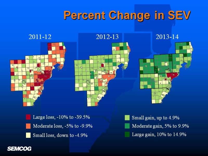
The GINI Index is a statistical representation of income equality that is measured between 0 and 1. The closer a place is to 1, the higher income inequality is; with 0 signifying that total income equality is 0 (for a more in-depth explanation on the GINI Index and its background please click here). Just because income inequality is high in one area does not mean its income levels are low, or high. Rather, it represents the disparities between any and all income levels in a certain place. In this post we compare the seven counties, along with the municipalities and Census Tracts in the region, to the state and national GINI Index. In 2012, the GINI Index in Michigan was .4554 and the nation’s was .4712.

Thus, the GINI Index measures differentials in income levels in some area. Therefore it may also provide useful perspective to examine the income levels in areas across the region. These are explained in an earlier blog post here.

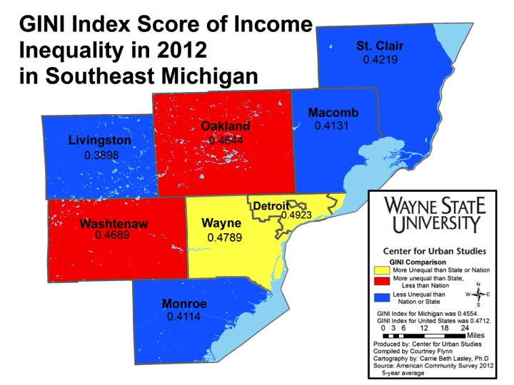
Wayne County, which is home to the city of Detroit, had a GINI Index of .4789 which was higher than the index for both the state, at .4554, and nation, at .4712. This score, according to the World Bank, is comparable to nations like Kenya, Nigeria and Zimbabwe.

Oakland and Washtenaw Counties’ indices were above that of the state but lower than that of the nation at .4644 and .4689, respectively.

Livingston County had the lowest GINI Index in the region at .3898. On a national scale, this index is similar to those of Israel, Lithuania, Turkey and Thailand.

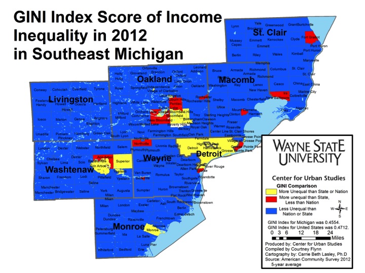
When looking at all the communities that make up the region, there were only a few with a GINI Index above (higher income differentials) that of the state and nation. In Wayne County, these communities were Detroit (.4923), Hamtramck (.474) and Highland Park (.4996). In Oakland County, these communities were Bloomfield (.5057), Bloomfield Hills (.5258), Orchard Lake Village (.5112) Birmingham (.5088). The four communities in Washtenaw County with a GINI Index above that of the state and nation were Ann Arbor (.4996), Barton Hills (.5002), Superior (.4905) and Ypsilanti (.4813). The only community in Monroe County with this characteristic was the township of Monroe (.4723).

Oakland and Washtenaw counties both had four communities with a GINI Index above national and state averages. All of the communities in Oakland County with such a characteristic had a GINI Index above .5; Birmingham had the highest index in the region. Such high GINI Index numbers in places like Birmingham and Bloomfield show that disparity is not isolated to just poor communities.

Again, the high GINI Indices of places like Birmingham and Bloomfield show that income inequality is not only prevalent in lower income areas. By clicking here, you can see what income levels are in cities a high or a low GINI Index. For example, in 2009 Birmingham’s median household income was about $96,000, the city of Monroe’s was about $45,000 and the city of Detroit’s was about $34,000.

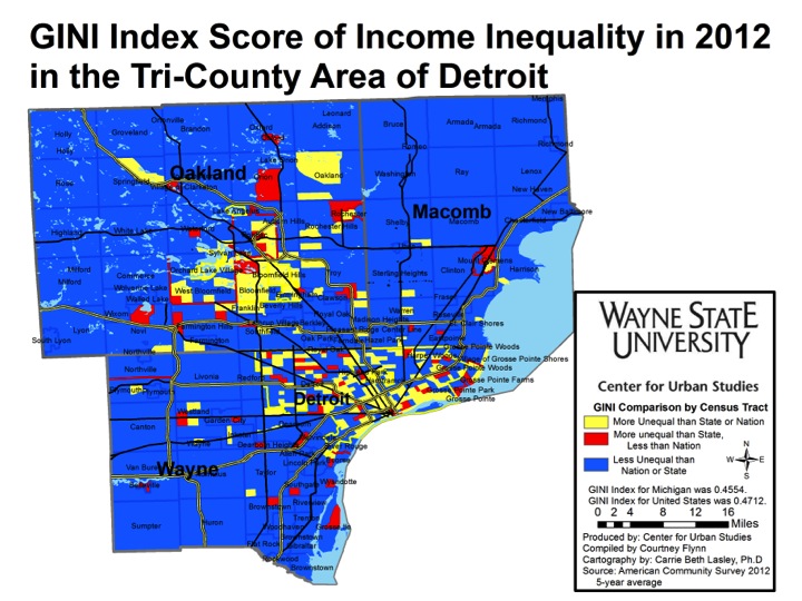
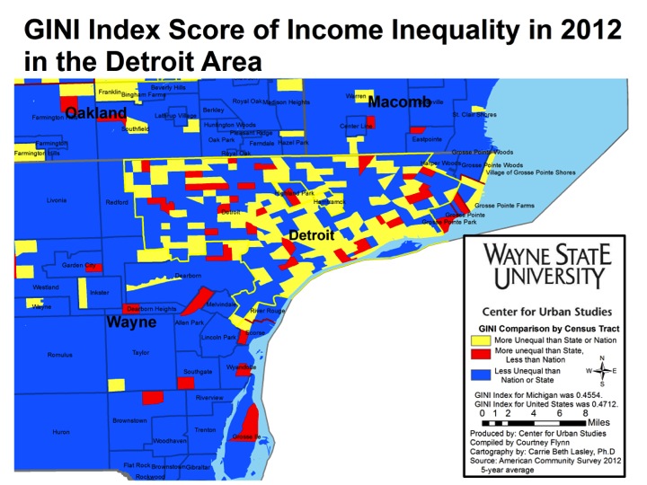
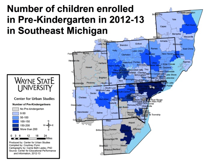
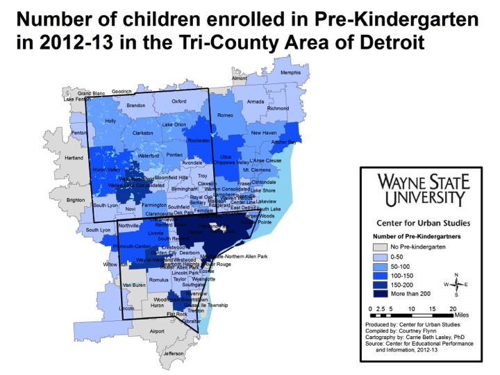
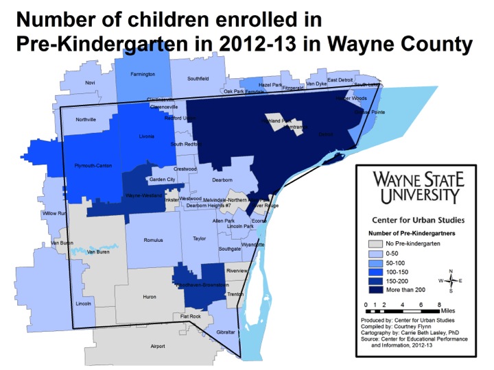
When focusing in on Census tracts in the tri-county region, it becomes clear that there were more areas that had a GINI Index above that of the state and nation than the aggregated data indicates. The above map shows that higher rates of income inequality existed in some sections of a community, but not others. For example, the northwest portion of Oakland Township had a higher rate of income inequality than the aggregated data indicates. There were also several neighborhoods in Detroit where income inequality was below that of the state and nation. Areas with substantial income inequality in Detroit were found in the Downtown, Midtown and Riverfront areas.

Not only does income inequality exist in Detroit and the surrounding areas, but also across the country. In an article from The Atlantic, it’s described how the top 10 percent of America’s wealthiest residents earned more than half of the country’s income. This is particularly exemplified in places such as New York, L.A. and San Francisco. In 2012 there were more than 19 metro-areas with a GINI coefficient above .50.

SEMCOG: Property taxable values and state equalized values increase throughout region

According to information recently released by the Southeast Michigan Council of Governments, majority of the communities in the region have experienced an increase in their property tax values and state equalized values. In total, 207 communities gained SEV. To read more click here

Wayne County loses more residents than gains

From 2007 to 2011, Wayne County consistently decreased in population, according to the U.S. Census Bureau’s American Community Survey 5-year estimates for the period. The results indicate a net total of more than 45,000 people left the county, with 53,000 residents leaving and 8,000 new residents moving into Wayne County during that period.

This week, we will explore the overall domestic migration patterns. In a later post, we will examine the data behind Wayne County migration to better understand who is coming into and departing.

First, we will examine the net numbers. From 2007 to 2011, Wayne County had a net loss of residents to the rest of Michigan and to 41 other states.   There was also a net gain of residents from 8 states. Across all states, a total of 813 counties gained residents from or lost residents to Wayne County. The majority (566 counties) gained residents from Wayne County. The map below shows the rate of loss or gain in the counties that had residents relocate to or from Wayne County during that period.

Slide03

From 2007 to 2011, a total of 28,252 Wayne County residents chose to relocate within their home state of Michigan. No other state gained more than 2,000 Wayne County residents. The most popular relocation states for Wayne County residents are listed below with their total of out-migrants from Wayne County. Neighboring Ohio gained the second highest number of out-migrants from Wayne County, followed by eight southern states. Except for California, Arizona and Texas, these states are largely those Southern states from which the Great Migration came into Michigan came in the early part of the 20th Century.

Slide05

Out-migration also had three distinct patterns, as listed in the chart below. Neighboring counties received the largest numbers of Wayne County out-migrants. Just under half of all departing residents chose Oakland, Macomb or Washtenaw for their destination. Noted retirement centers in the West and South also drew a fair amount of Wayne residents, as did smaller municipalities in other parts of Michigan.

Slide07

From 2007 to 2011, there were eight states that were sources of in-migration of residents to Wayne County. These states, listed in the table below, were more rural with predominantly cooler weather conditions. Sparsely-populated Alaska was the largest source of in-migration to Wayne County from 2007-2011, relocating 680 residents to the Detroit area.

Slide09

When considering the counties that were the source of the most in-migrants to Wayne County, as shown in the chart below, three patterns emerged. First, other large cities contributed many residents to the area – including Anchorage, the Bronx, Chicago and Minneapolis. Wayne County also had in-migrants from some of the most rural areas in Michigan, including Berrien County, Eaton County and Newaygo County. Military outposts such as Annapolis and Fort Payne are also contributors to the Wayne County population, possibly representing residents returning to the area after service.

Slide11


The next map takes a closer look at the regional patterns. Wayne County had a net gain of residents from counties that border the Great Lakes and other larger cities, including Chicago, St. Louis, Buffalo and the New York metro area. It is still a net-loser of residents to most of the region’s small cities and interior rural areas.

Slide12

Next week we will continue to look at migration as relates to Wayne County. The upcoming post will drill down on the sex, age and income levels of residents leaving and moving to the region.


Gap exists between pre-k and kindergarten in Southeastern Michigan

A quick glance at the numbers seems to state the obvious: pre-kindergarten (pre-k) numbers are highest in areas with the highest population. However, a closer look shows in certain circumstances, this is not the case. Rather, the larger issue appears to be the gap that exists between the number of children enrolled in pre-k versus the number of children enrolled in kindergarten.

It should also be noted there are several school districts throughout the region that do not offer pre-kindergarten through the public school district. This occurs not only in the region, but throughout the state because Michigan does not mandate pre-k, despite the positive effects shown by participation in the program.

In this post we examine the number of students enrolled in pre-k classes and kindergarten classes across the region to show where gaps exist.

As noted above, there are several districts in the region that do not offer pre-kindergarten classes. The majority of these districts are located in the more rural areas, such as Monroe and Livingston counties. St. Clair County, which is also rural, has low participation in pre-k. The Port Huron and East China school districts are the only districts within St. Clair County with more than 50 children enrolled in pre-k. The Port Huron School District covers both the city of Port Huron and Port Huron Township, while the East China School District welcomes students from Marine City, the city of St. Clair, St. Clair Township, China Township, East China Township and Cottrelleville Township. Even though the East China district covers so many communities, it only had about 25 more children participate in pre-kindergarten than larger single community school districts like Dearborn City Schools. In Dearborn, 30 students were enrolled in pre-kindergarten from 2012-13 and in East China 56 students were enrolled.

The Village of New Haven, which has a smaller population than the City of Dearborn and many of the townships encompassed by the East China School District, had 85 students enrolled in pre-kindergarten. The Great Start Readiness Program, which is a larger feeder for pre-k programs, is based on income eligibility. According to the guidelines, households trying to enroll children in the pre-k through this program need to be at at least 100 percent of the poverty level. This shows why districts such as the New Haven Schools enroll more students per capita than places such as Anchor Bay School District (both are located in Macomb County).

Both the chart and map above show how large the gap is between pre-k and kindergarten enrollment. Even in the Detroit City Public Schools, which had the highest pre-k enrollment in the region at 409, kindergarten enrollment (4,144) was 90 percent higher.

The importance of pre-k enrollment cannot be overstated. Research has shown that it has effects on students’ readiness to learn in elementary school and beyond. According to the Center for Public Education, children who participated in pre-k, rather than being in daycare, scored better on math and reading exams later in life. As noted before, pre-k is not mandated in the State of Michigan.

In 2012, The Bridge Magazine wrote a series of stories for their feature piece “The Forgotten 30,000.” These articles detail the importance of pre-k education and discuss the gap between pre-school and kindergarten attendance. Even with Michigan’s $65 million reinvestment in the Great Start Readiness Program, it is clear that hundreds of children in Southeast Michigan are not receiving the early education that many feel is necessary for greater academic success later in life.