Detroit receives about 49,000 more commuters than it loses

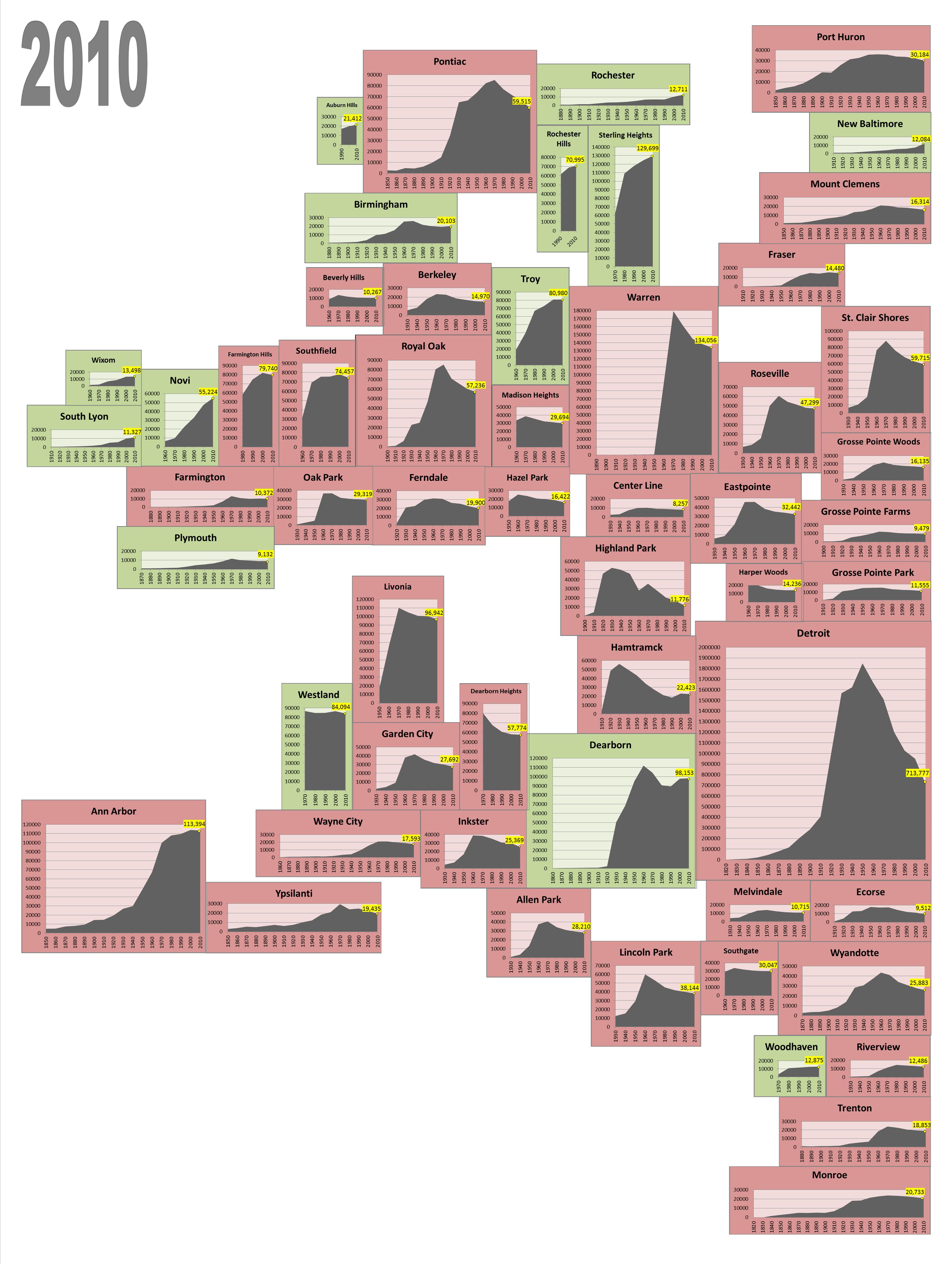
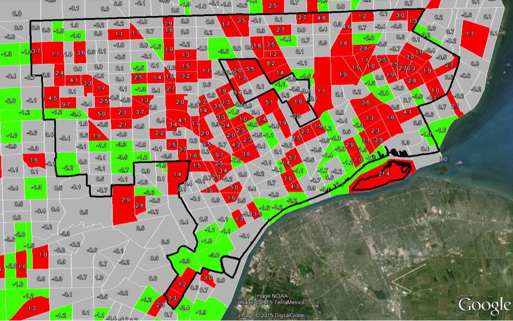
This post examines work-related, commuting patterns for Southeastern Michigan. In 2010, the majority of the commuting within the region was either to or from the city of Detroit or the area directly around it. Interestingly, 228,000 commuters left the city of Detroit each work day to work in another jurisdiction, but at the same time, 277,000 commuters from the suburbs also traveled to the city to work, according to data provided by the Southeastern Michigan Council of Governments and the American Community Survey. A deeper dive into the data shows that the city of Southfield received the highest number of commuters (12,600) from Detroit, but it also sent the highest number of commuters to Detroit (8,800).

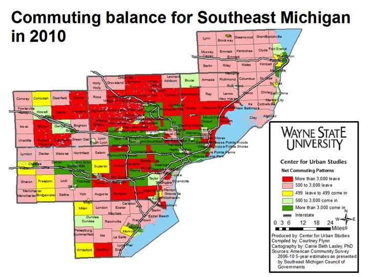
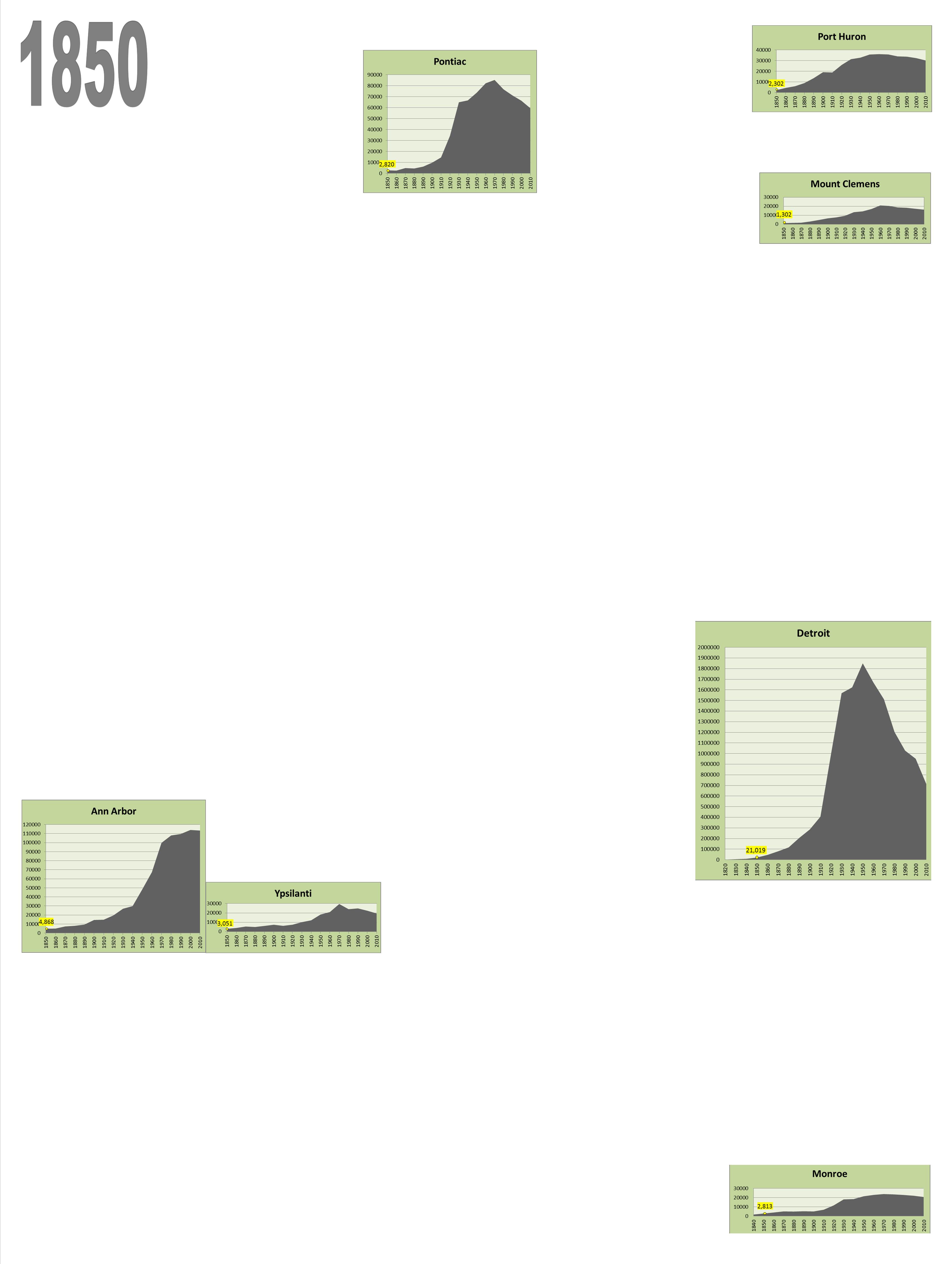
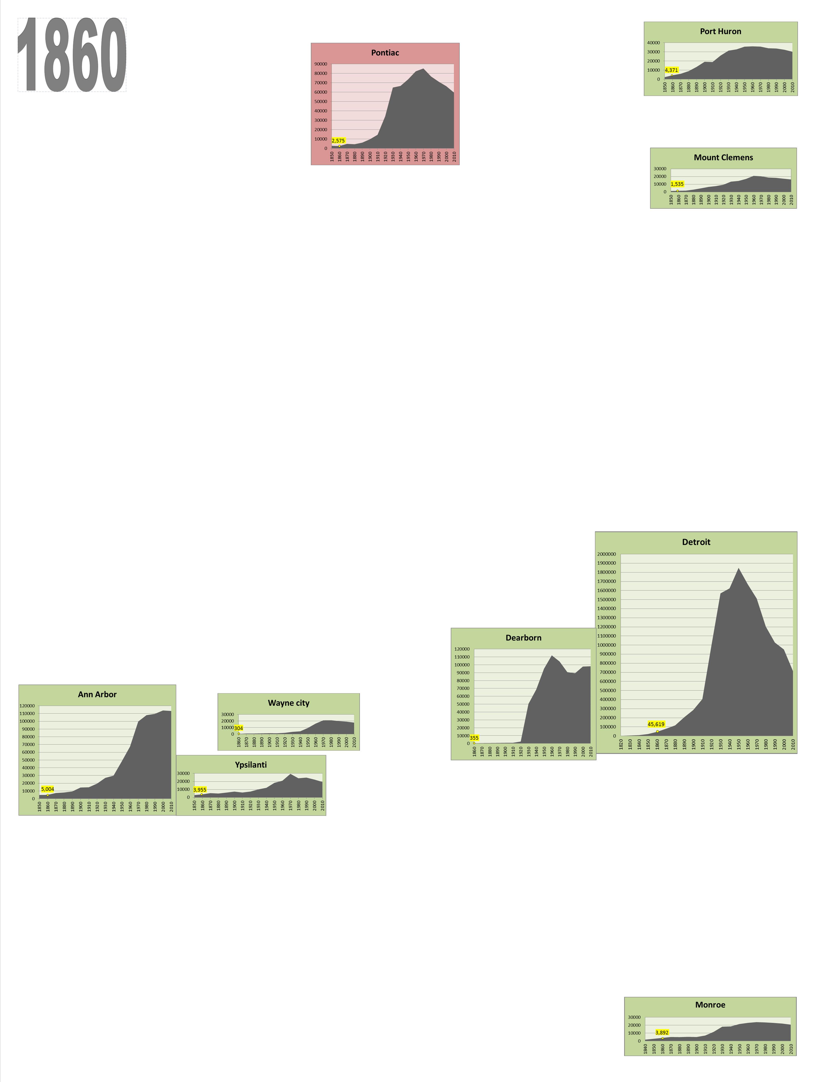
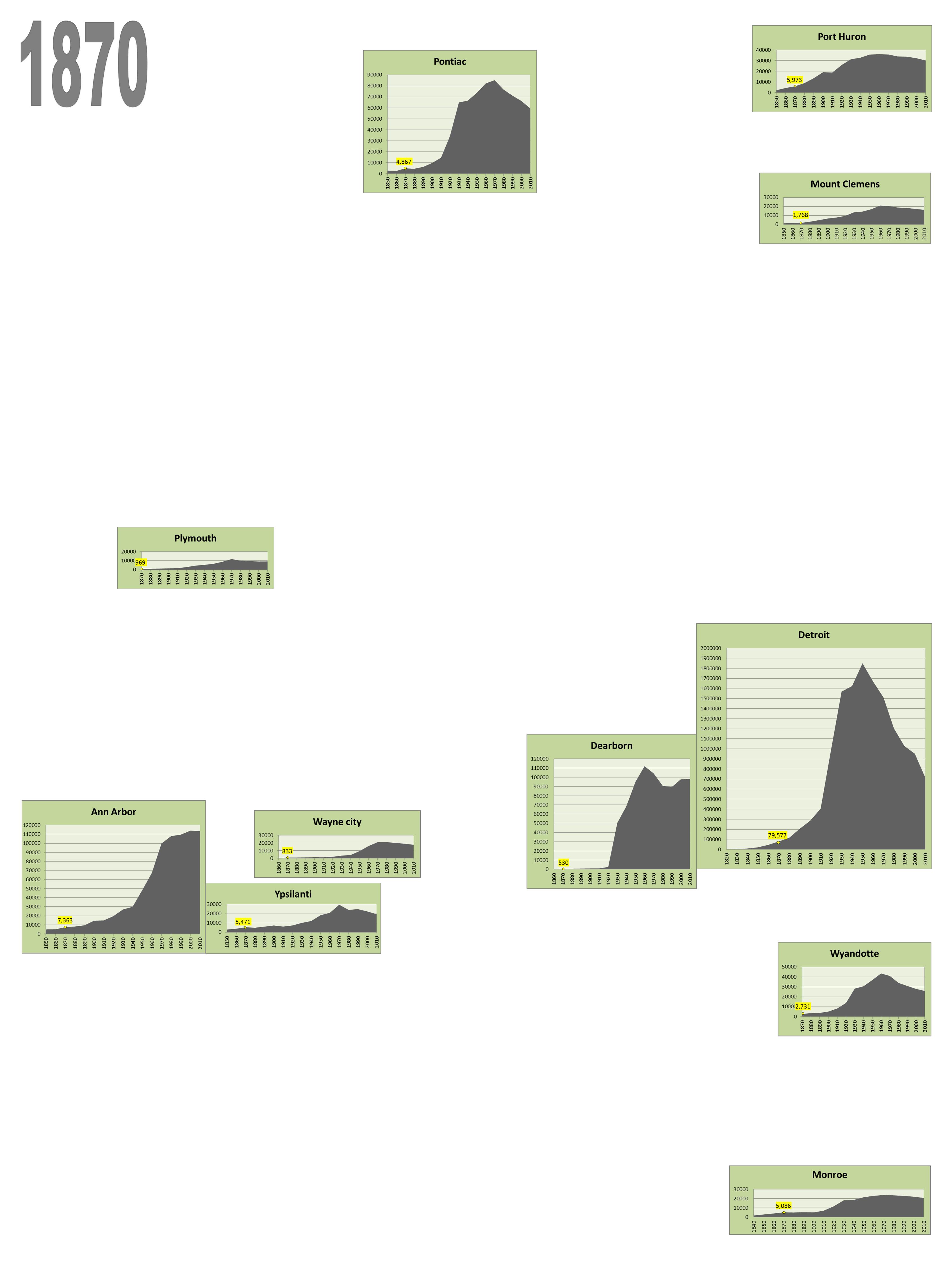
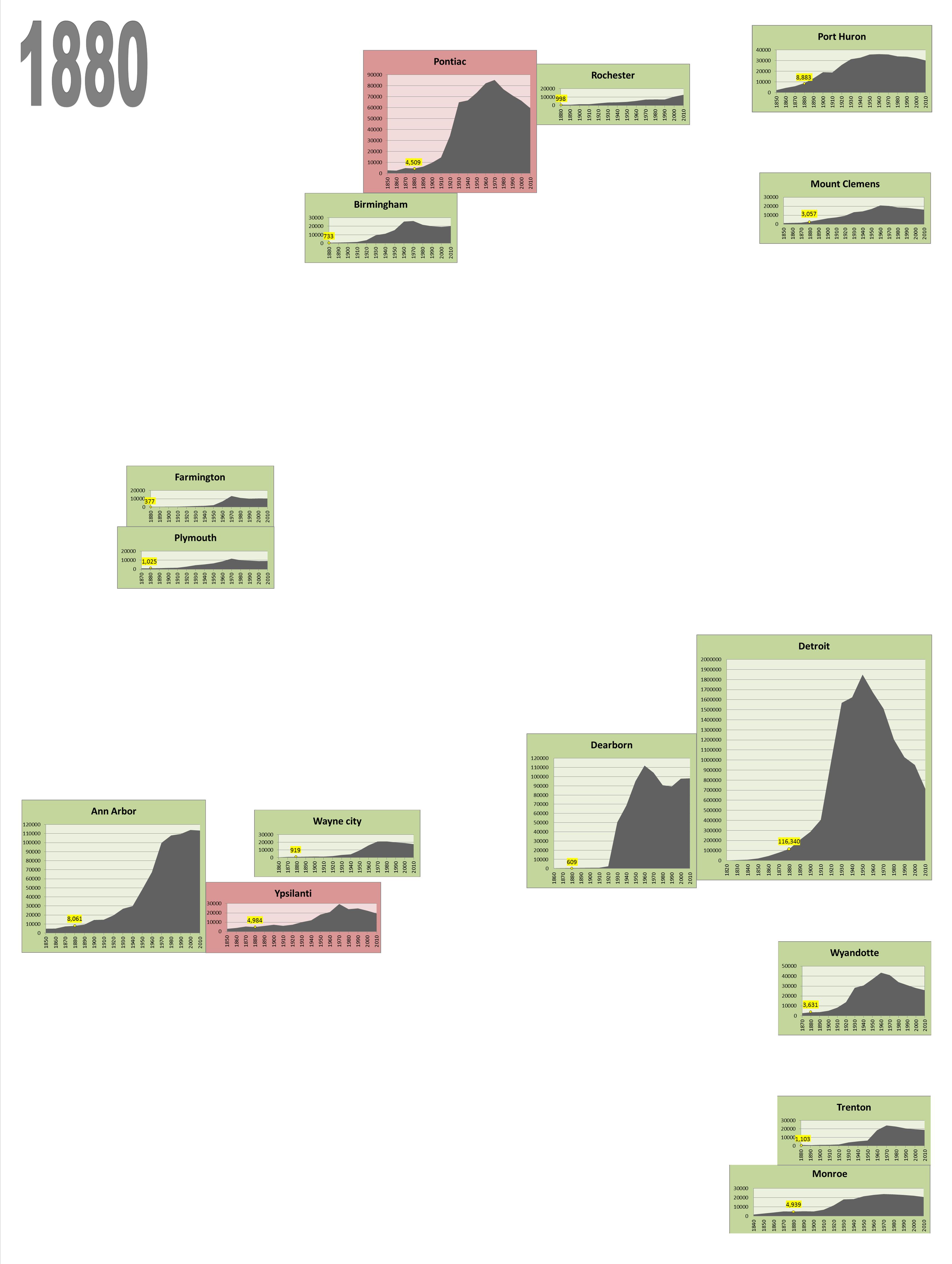
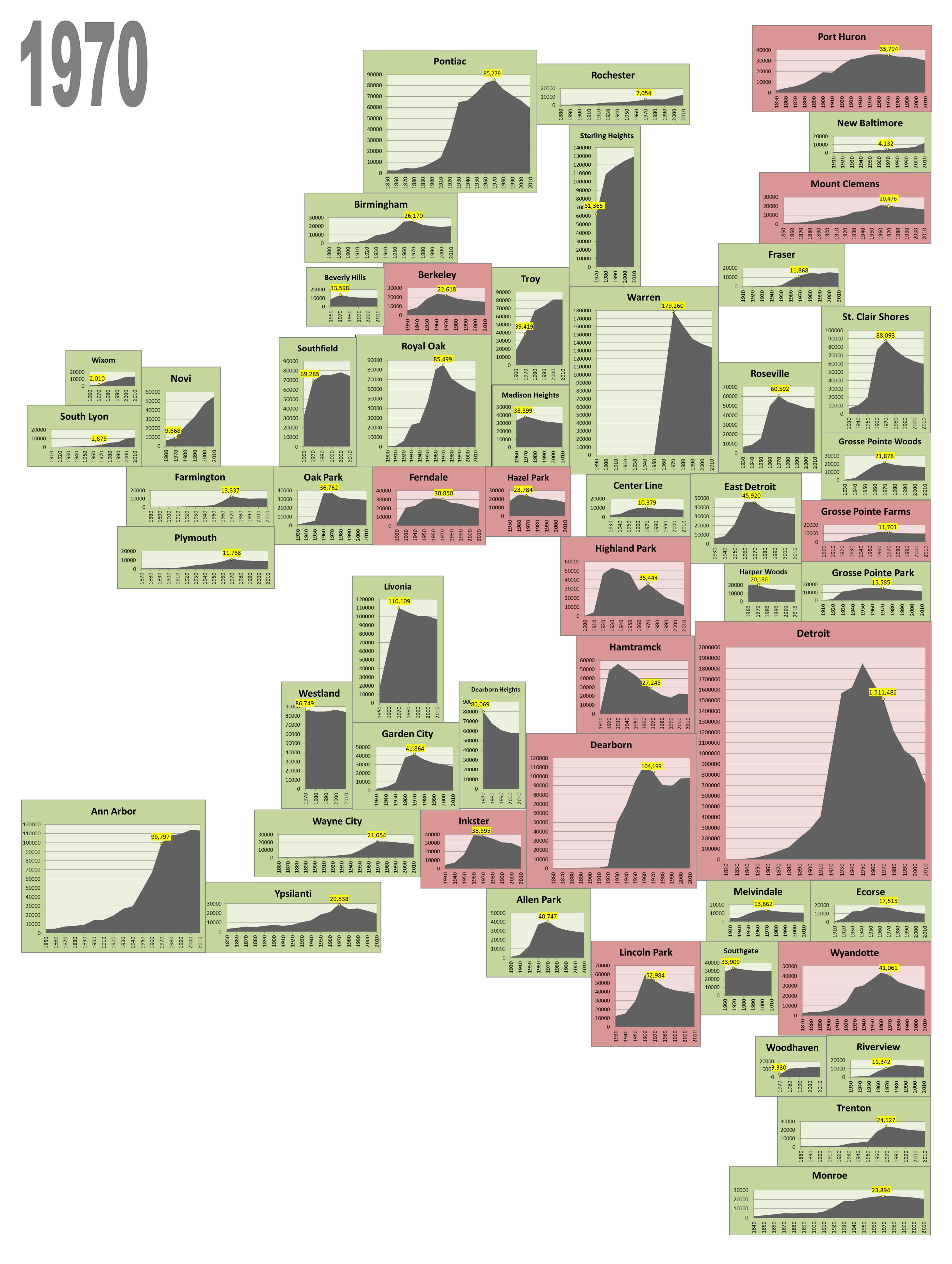
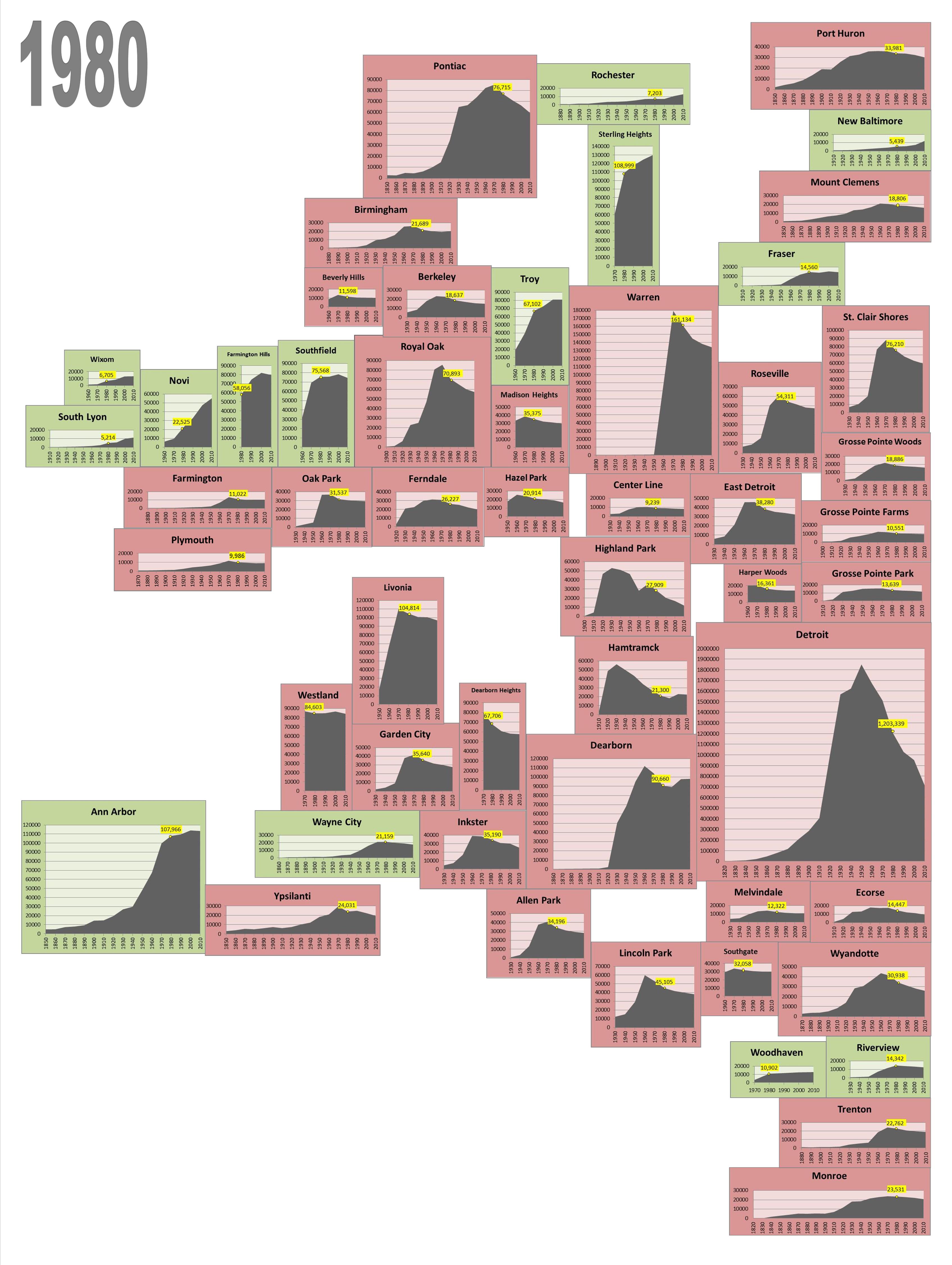
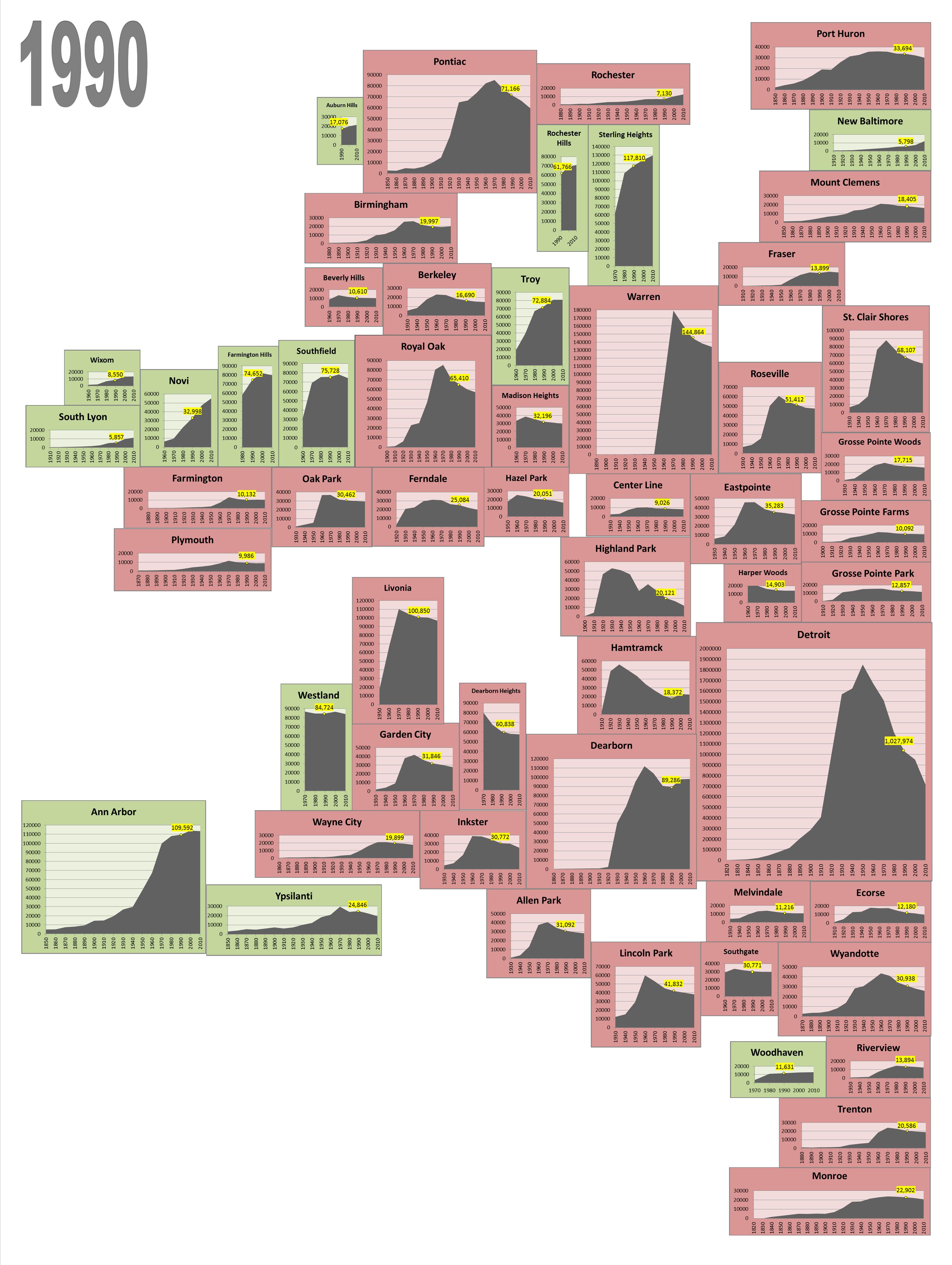
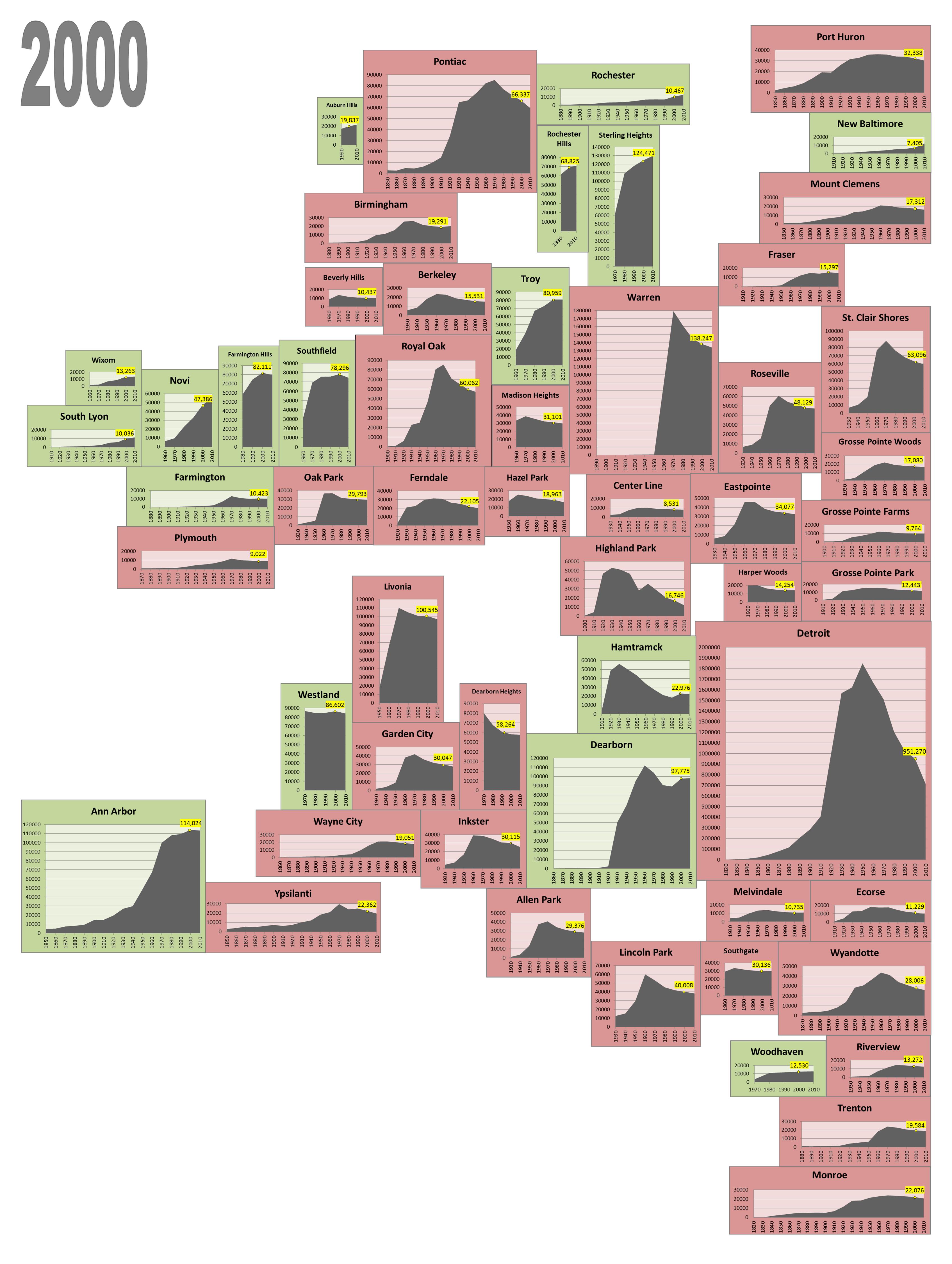
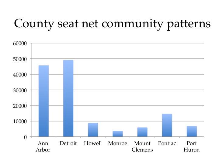
The above map shows the net commuting patterns for the region in 2010 and we see that the county seats in each county (Howell, Mount Clemens, Pontiac, Port Huron, Ann Arbor, Detroit and Monroe) all have net positive commuting patterns of more than 3,000. This means that more individuals are coming into that that city than leaving.

A few of the inner ring suburbs of Detroit, like Dearborn, Warren, and Southfield also have net positive commuting patterns of more than 3,000 commuters, along with other communities like Troy, Romulus (which is where the Detroit Metropolitan Airport is located), Livonia, and Novi.

On the other side of the spectrum, we see that there are about two dozen communities where 3,000 or more commuters leave their place of residence to commute elsewhere (a net negative). Particularly in Wayne, Oakland, and Macomb counties, we see that the communities with a higher loss of commuters surrounds the communities that receive upwards of 3,000 daily commuters.

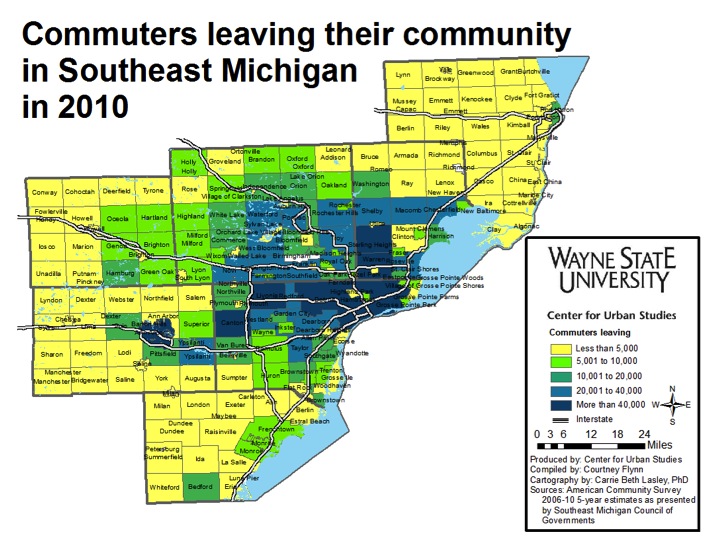
In addition to the dark red signifying the loss of 3,000 or more commuters a day, the lighter red shows that the more rural outskirts of the region (which are also less populated) tend to lose between 500 and 3,000 commuters a day. This shows that, overall, a majority of the communities within the Southeast Michigan region are losing commuters, rather than gaining them.

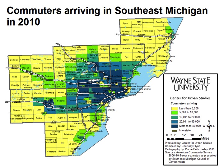
As already noted, in 2010, a large number of motorists from the region commuted to Detroit each day for work. From the first map, we know that the city gained more commuters than it lost. The second map shows it received substantially more than 40,000 commuters each work day (277,145 total). Other Detroit suburbs that received 40,000 or more commuters are Southfield (82,643), Sterling Heights (55,097), Warren (82,442), Troy (87,193), Livonia (72,663), and Dearborn (83,005). But, as noted in the map below, Sterling Heights also loses more than 40,000 commuters (58,998), which is why their net commuting pattern shows a loss in the first map (net loss of about 4,000).

Additionally, in looking at all three of the above maps, we see that the communities that tend to gain and/or lose the most are located around the interstates. For example, in following I-96 out of Novi through Livingston County we see that communities like Genoa, Green Oak, and Lyon Township both gained and lost between 500 and 3,000 commuters.

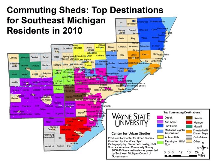
The above map shows the top commuting destination for each community. For example, all of the Downriver area and most of the inner-ring suburbs have a majority of their residents commuting to Detroit for work. However, in Washtenaw County, a the majority of the residents commute to Ann Arbor, and in St. Clair County, most of the commuters who live within the county travel to Port Huron. These patterns again reflect that county seats tend to be a common destination for those commuting to work.


Washtenaw, St. Clair counties have highest percentage of roads in poor condition

On May 5, 2015, the citizens of Michigan are being asked to vote on Proposal 1, which is the State Legislature’s solution to finding more funding to improve Michigan’s roads. In a nutshell, the proposal is asking voters if they support amending the State Constitution to:

  • Eliminate the sales and use tax on gasoline
  • Increase the sales and use tax from 6 percent to 7 percent
  • Increase the portion of the use tax that goes to the School Aid Fund and extend those benefits to higher education and training centers
  • Increase the gas tax and vehicle registration fees
  • Increase the earned income tax credit

(For the exact ballot language please click here.)

Although the proposal, if passed, would affect more than just road funding, much of the discussion revolving around it has been centered on the roads, as can be seen by information offered by the Southeastern Michigan Council of Governments, the Citizens Research Council, state and local road departments and even school representatives.

For the purpose of this post, we show what percentage of pavement segments throughout the Southeastern Michigan region were deemed by the Michigan Department of Transportation to be in “good,” “fair,” and “poor” conditions in 2013. Additionally, we look at the condition of bridges in the region during 2014.

The Pavement Surface Evaluation and Rating (PASER) system was used to determine the conditions of the roads in 2013. According to this system, a road in “fair” condition needs preventative maintenance while a road in “poor” condition needs a structural fix.

Not one of the seven counties in the Southeastern Michigan region had above 25 percent of its pavement segments deemed to be in “good” condition in 2013 by the Michigan Department of Transportation. St. Clair County had the highest percentage of “good” pavement segments at 24.65 percent and Monroe County had the lowest at 14.08 percent. In comparison to the state average (19.09%), Washtenaw, Macomb and St. Clair counties were the only counties in the region with a higher percentage of pavement segments deemed to be in “good” condition.

When looking at the percentage of pavement segments deemed to be in “good” condition by city, we see that Brighton had 0 percent of its pavement classified with this distinction. Brighton is located in Livingston County and only 14.57 percent of the pavement segments in the county were in “good” condition in 2013. Although only 15.15 percent of Detroit’s road were deemed to be in “good” condition in 2013, there were other cities with a lower percentage of “good” pavements. These cities include: Warren, Grosse Point Park and Livonia.

The percentage of pavement segments in “fair” condition throughout the region is higher than those in “good” condition for all seven counties. Monroe County had the highest percentage of segments in “fair” condition at 58.1 percent, while St. Clair County had the lowest at 35.9 percent. Only St. Clair and Washtenaw counties had a lower percentage of “fair” pavement segments than the state average, which was 47.25 percent.

A look at the cities’ pavement conditions shows that Brighton had the highest percentage of “fair” roads at 73.29 percent. The city of Monroe has the lowest percentage at 17.47 percent; this was lower than the state average. Other cities with the percentage of “fair” pavement conditions below the state average were: Ann Arbor, Detroit, Mount Clemens and Port Huron.

About a third of the region’s pavement segments were deemed to be in “poor” condition (32.3% average for the region), a figure similar to the state average (33.65%). When looking at each individual county in the region, we see that only two-Washtenaw and St. Clair-had a higher percentage of “poor” pavement segments than the state average. St. Clair County had the highest percentage at 39.45 percent and Washtenaw County came in just below that at 38.3 percent.

Port Huron, located in St. Clair County, had the highest percentage of pavement deemed to be in “poor” condition at 57.21 percent. Lincoln Park had the lowest at 7.51 percent. Detroit came in at 32.46 percent.

Wayne County had the highest percentage of structurally deficient bridges in the region in 2014 (15.49 percent), according to the Michigan Department of Transportation. For the city of Detroit, 22.59 percent of its bridges were deemed structurally deficient at that time. In recent weeks, it has been reported by the Detroit News that the I-75 Rouge River Bridge in Detroit is so structurally deficient that holes can be seen through the pavement in some areas. The Fort Street and Jefferson Avenue bridges over the Rouge River in that area are also closed for construction. The West Jefferson Avenue bridge has been closed for repair since 2013 because a bridge operator closed it on a passing boat, according to the News Herald. In addition, the News Herald reports that the Fort Street bridge over the Rouge River has been closed since 2013 because of necessary maintenance projects.

Outside of Wayne County, Livingston and Monroe were the only other counties in the region with a higher percentage of structurally deficient bridges (14.24% and 10.45%, respectively) than the state average (8.82%).

Aside from Detroit, the city of Mount Clemens was the only community shown in this post that had more than 20 percent of its bridges deemed structurally deficient.

The information presented throughout this post highlights the conditions of Southeast Michigan’s roads and bridges. The May 5 ballot proposal, Proposal 15-1, is being presented by Governor Rick Snyder as the solution to ensuring Michigan’s roads receive additional funding so the number of roads in poor conditions doesn’t continue to increase. However, approval of this ballot proposal does mean tax increases. The proposed sales and use tax increase, from 6 to 7 percent, would be used to increase state revenue sharing to cities, townships, villages and counties; it would also increase monies going to the School Aid Fund. These monies would not be used on roads, according to the Citizen’s Research Council.

While gasoline and diesel fuel would be exempt from the sales and use taxes under this proposal, the overall gas taxes would increase to 14.9 percent of the price of each fuel; these initial tax rates would be 41.7 cents for each gallon of gas and a 46.4 cents for each gallon of diesel, according to the House Fiscal Agency. These monies, along with increased vehicle registration revenues, would be solely used for transportation and road funding, according to the Citizens Research Council. However, as reported in the Detroit Free Press and other news outlets, if Proposal 15-1 passes about $13.5 million dollars of the new road money would be spent on Michigan Department of Transportation debt in the fist two years.

What has been touched upon in this post is just scratching the surface on the intricacies of this proposal and the background on Michigan’s road conditions, to learn more about this proposal visit the following sites:

http://www.house.mi.gov/hfa/PDF/Transportation/Legislative_Analysis_Transportation_Funding_Package.pdf

http://www.crcmich.org/PUBLICAT/2010s/2015/transportation_funding_proposal.html

Few Southeast Michigan cities continue to grow

LEGEND:

Green charts indicate increasing population in that decade

Red charts indicate declining population in that decade

Yellow charts indicate the population remained stagnant in that decade

In this post we show through a slideshow how the populations of cities within the Southeastern Michigan region have grown, and in many cases fallen. According to the Michigan Legislature, some cities within the state were formed through the Northwest Ordinance and the authority of territorial government before Michigan was admitted into the union. For example, the city of Detroit was founded in 1701 but it was until 1837 that Michigan became officially recognized as a state. Only after Michigan became a state did the Census start recording data.

In 1840 the city of Detroit and the city of Monroe were recognized as official cities by the Census Bureau. Detroit’s population at that time was 9,102 and Monroe’s was 1,703. Pontiac, Port Huron, Ann Arbor, Ypsilanti and Mount Clemens all appear on the chart a decade later, in 1850.

By the early part of the 20th Century we see growth both within the city of Detroit and the areas surrounding the city. The Home Rule City Act was enacted in 1908, giving the opportunity for new cities to arise, so long as a city charter was created. Fraser, New Baltimore, Grosse Pointe Park, Ecorse, Hamtramck and South Lyon all appear on the 1910 map; they were not incorporated cities to be represented on the 1900 map.

Additionally, in 1910 the Highland Park Plant, located just outside Detroit on Woodward Avenue, opened, as did the Dodge Main Plant, also just outside of Detroit, in Hamtramck; both were automotive facilities. It was the opening of such automotive plants within Detroit and its outskirts that helped propel the city to a population of 1.5 million people in 1930. Just like Detroit’s population, Pontiac’s population had significantly grown up until this point, in part because of the Pontiac Assembly Plant.

It was in about 1930 that the region outside of the county seats and the inner-ring Detroit suburbs began to expand. This started to occur, according to Thomas Sugrue in “From Motor City to Metropolis: How the Automobile Industry Reshaped Urban America,” because the growing middle and wealthy classes (much of which was supported by the auto industry), were beginning to choose to build in cities like the Grosse Pointes and Birmingham.

Although many of the suburbs were experiencing rapid growth, when we move forward a decade to 1940, evidence of population loss in the inner-ring suburbs begins to appear. As can be seen in the red colored maps-which indicate population loss in that specific decade-both Highland Park and Hamtramck began to lose residents in 1940 and have yet to regain their 1930 numbers, which are nearly double current population estimates.

Moving forward to 1950 is when Detroit’s population peaked at about 1.8 million. Then, by 1960, the population decline began, and has continued ever since. As much of region was, and still is dependent, on the auto industry, we saw the building of about 25 new auto plants throughout Metro Detroit suburbs during the 1940s and 1950s, according to Sugrue (2004). This, along with the expansion of the federal highway system throughout the 1950s and 1960s, were all contributing factors to the start of suburbanization in the area (Sugrue, 2004).

While Detroit residents began to disperse from the city prior to its population peak, “white flight” also began to increase following the race riots that broke out in 1967. However, policies show that the footing for this type of out-migration began before those race riots. According to Sugrue in his book “The Origins of the Urban Crisis: Race and Inequality in Postwar Detroit”, around the 1940s, as Detroit’s population continued to grow, federal policies around homeownership started to surface that kept African Americans in Detroit and within certain neighborhoods in the city (1996). For example, a majority of the predominantly “black enclaves” in Detroit were redlined on the Home Owners Loan Corporation maps, meaning these areas were not suitable for federal loans or similar aide (Sugrue, 1996). This, along with the combination of access to suburban auto plants because of vehicles and roadways, meant that by 1960 there were more African Americans in Detroit than Caucasians, who had flooded to suburbs (Sugrue, 1996).

As Detroit’s population began to decline, we see that the suburbs began to boom. Warren, Royal Oak, Pontiac and Livonia reached their population peaks in the 1970s. By the 1980s though there were more than two dozen cities in the Metro-Detroit region experiencing population loss, as denoted by the red maps. Everywhere from Farmington to Pontiac to Port Huron to the Grosse Pointes to Detroit to Monroe were all battling with population loss. Additionally, in 1983, the city of Auburn Hills was incorporated (it was formerly Pontiac Township) which is why it first appears on the 1990 chart with a population of 17,000.

Although the city of Ann Arbor was founded long before the last half of the 20th Century, it was one of the few that continued to grow, as did other communities such as Woodhaven, Riverview, Sterling Heights, New Baltimore and the area around Novi. In 2010, Sterling Heights, New Baltimore and Woodhaven were some of only a few cities in the region with increasing populations.

One noteworthy population increase in recent years is Dearborn, which recovered from its decades of population loss in 2000. Despite experiencing growth, the Census data shows that Dearborn has yet to bounce back to its population peak, like many of the red colored charts in 2010.

Dropping from a population of about 1.8 million in 1950 to 714,000 in 2010, we see people left the city of Detroit long before the recession of 2008. In fact, as the charts show, the population loss started about 50 years prior, as the suburbs grew more attractive, the highway system continued to expand and access to vehicles became more accessible to a wider range of residents, enabling many to increase their options for choosing where to live.


Sources:

Census Bureau

Michigan Legislature

Sugrue, Thomas. (1996). The Origins of the Urban Crisis: Race and Inequality in Postwar Detroit. Princeton University Press.

Sugrue, Thomas. (2004). From Motor City to Metropolis: How the Automobile Industry Reshaped Urban America. Automobile in American Life and Society. http://www.autolife.umd.umich.edu/Race/R_Overview/R_Overview1.htm


Southeastern Michigan region’s population grows while Wayne County’s falls

  • Within the last year Wayne County, which is still the largest county in the region, lost the largest number of residents in the nation (annual)
  • From December 2014 to January 2015, the unemployment rate across the state and in the City of Detroit’s increased (monthly);
  • The Purchasing Manager’s Index for Southeast Michigan increased from February 2015 to March 2015 (monthly);
  • Commodity Price Index decreased from February 2015 to March 2015 for Southeast Michigan (monthly);
  • Standard and Poor’s Case-Shiller Home Price Index for the Detroit Metropolitan Statistical Area shows home prices have been increasing since September.

The above three charts show the population estimates for the seven counties that make up Southeastern Michigan. As shown, Wayne County lost about 50,000 residents from 2010 to 2014 while both Oakland and Macomb counties each gained about 20,000 residents. According to WDET, Wayne County had the largest population loss between 2013 and 2014 in the nation; a net deficit of 11,000 residents. On the other hand, Macomb County gained 5,000 residents between 2013 and 2014 and Oakland County gained about 6,000 residents. We do know historically that at least a portion of those leaving Wayne County are from Detroit and are moving elsewhere within the region, to areas such as southern Macomb County.

The overall region experienced a population increase of about 24,000 people between 2010 and 2014, according to Census data. From just 2013 to 2014 the region gained more than half of the four-year increase-about 12,500 residents.

According to the most recent data provided by the Michigan Department of Technology, Management, and Budget, the unemployment rate for the state of Michigan increased from 6.3 percent in December to 6.6 percent in January. During this same period, unemployment in the city of Detroit also increased from 12.2 in December percent to 14.3 percent in January.

From December of 2014 to January of 2015, the number of people employed in the city of Detroit decreased by 2,178, leading to a total of 210,741 people employed in January.

The above chart shows the number of people employed in the auto manufacturing industry in the Detroit Metropolitan Statistical Area (MSA) (Detroit-Warren-Livonia) from January 2014 to January 2015. From July 2014 to January 2015 employment in this industry has increased by 13,300 from 91,600 to 104,900. From just December to January the number of people employed in this industry grew by 3,300.

The Commodity Price Index, which is a weighted average of selected commodity prices, was recorded at 50 points in March 2015, which was 2.5 points lower than the previous month and 11.4 points lower than March 2014.

The above charts show the Standard and Poor’s Case-Shiller Home Price Index for the Detroit Metropolitan Statistical Area. The index includes the price for homes that have sold but does not include the price of new home construction, condos, or homes that have been remodeled.

According to the index, the average price of single-family dwellings sold in Metro Detroit was $97,900 in January 2015. This was an increase of approximately $3,100 from the average price in January 2014. Since September, prices have decreased by $2,830.

US Postal Service: Address vacancies increase in Detroit

As an ongoing project, David Martin, Ph.D. of Wayne State University’s Center for Urban Studies, has tracking the number of address vacancies in the city of Detroit. As you will see in this particular post, there has been a gradual increase in vacancies, a trend that has not been all that uncommon over the years.


The most recent (December 2014) quarterly statistics from the U.S. Postal Service show an increase in the total number of vacant addresses in the city of Detroit. The total number of vacant addresses (both residential and commercial) increased by 1,288 from 89,480 to 90,768 for the period Sep 2014 to Dec 2014. The total number of residential addresses declined by 372 from 361,887 to 361,515 likely reflecting ongoing demolition activity during the quarter. The total vacancy rate increased from 22.0% to 22.4%.

Source: United State Postal Service via HUD, March 2014.

Tracking Neighborhood Vacancy Change in Detroit:

Percentage Point Change in Address Vacancy over the Past Year (12/2013-12/2014)

Best Performing Neighborhoods in Detroit 12/2013-12/2014 (Green)

Wayne State, West Canfield, Art/Cultural Center, Atkinson/Euclid. Lafayette Park, East Riverfront,, Cody, Rouge Park, Palmer Park, Indian Village, Castle Rouge, Springwells, Woodmere, Islandview, Von Steuben.

Worst Performing Neighborhoods in Detroit 12/2013-12/2014 (Red)

Tireman, NW Goldberg, Newberry, Lasalle Gardens, Brightmoor, Grandmont, Schoolcraft, State-Fair/Nolan, The Eye, Stewart, East Warren, Southeastern, Regent Park, Denby, Pulaski, Outer Dr/Van Dyke, Medical Center, Masonic, Temple/Cass