Where’s population up and down? Part II

Continuing from last week’s post, this week’s post will examine the percentage change in population  in the outlying counties of Southeastern Michigan from April 2010 to December 2012. These counties are Washtenaw, Livingston, St. Clair, and Monroe counties. St. Clair County had the largest number of communities with a high population loss (four communities with a population loss over 3 percent) and Washtenaw County had the highest number of communities with the largest population increase (two communities with a population increase over 7.5 percent).

The lightest shade of yellow represents the communities with highest percent of population loss while the darkest shade of brown represents the largest percent increase.

Slide3

Slide4

Slide5

Slide6

Slide7

According to the above maps, of all the municipalities listed, Dexter Township in Washtenaw County had the highest percent of population growth (9.2%) from 2010 to 2012. This 9.2 percent represents a population increase from 4,067 to 4,443. Lima Township in Washtenaw County was the only other municipality to have a similar growth rate; this community experienced a 7 percent population increase. While Estral Beach in Monroe County had the largest percent of population decline of the four counties represented in this post, the 7.2 percent decline only represented a 30 person loss. In St. Clair County there were four municipalities with losses ranging from 3.2 percent to 3.7 percent.

•Municipality with highest overall growth in numbers: Oceaola

•Municipality with highest overall decline in numbers: Clay Township

Below, the municipalities represented in the highest and lowest percent change categories in the maps are shown.

Washtenaw County:

There were no municipalities with  a population decline between 2.7 and 8.6 percent in Washtenaw County.

Municipalities with highest percent increase

•Dexter Township: 9.2 (376)
•Lima: 7.7 (253)

Livingston County:

There were no municipalities with  a population decline between 2.7 and 8.6 percent in Livingston County.

Municipality with highest percent increase

•Oceaola: 5.4 (684)

St. Clair County:

Municipalities with highest percent decline

•East China: -3.7 (142)
•Ira Township: -3.5 (183)
•Clay Township: -3.3 (303)
•Columbus: -3.2 (129)

There are no municipalities with a  population increase between 4.4 and 11.5 percent in St. Clair County.

Monroe County:

Municipalities with highest percent decline:

•Estral Beach: -7.2 (30)
•Maybee: -3.7 (21)
• South Rockwood: -3.8 (63)

There are no municipalities with a  population increase between 4.4 and 11.5 percent in Monroe County.

NYT: Upward mobility not easy for Detroiters

According to an article recently released by the New York Times, climbing the income ladder in the Detroit area is not as realistic as it is for someone from the Seattle, Washington or San Jose, California area. For example, a child whose parents earn in the 10th percentile in the Detroit area on average ends up in the 32nd percentile. Someone from Seattle whose parents earn in the 10th percentile on average ends up in the 40th percentile.

Where’s population up and down? Census and SEMCOG estimates

Over the next two posts, we will examine the percent change in population from 2010 to 2012 for Southeastern Michigan. This week we present  the municipalities that make up Wayne, Oakland and Macomb counties. Next week we will consider the same information for Washtenaw, Livingston, St. Clair and Monroe counties.


The data used for these maps comes from two sources, the U.S. Census for the 2010 figures and the Southeast Michigan Council of Governments for the 2012 estimates. We use the SEMCOG estimates for 2012 because they are the most recent available.  Census estimates based on the American Community Survey (ACS) are only available for 2011. We will be revisiting this post once the ACS numbers are available for 2012. Also we will present a comparison of the SEMCOG and ACS numbers, accessing patterns of variation between the two.

The individual county maps are presented from largest to smallest overall population.

During this period, Oakland and Washtenaw counties experienced the highest percentage increase in population while Wayne County had the largest population decline.

Of all the municipalities in the tri-county region, Highland Park experienced the largest percentage loss in population (-8.6%) from 2010 to 2012, which was about 1,000 people. However, Detroit, which has a much higher population than its neighbor, lost about 32,000 people, but had a lower percent of population loss. Such population losses contributed to Wayne County have the largest percent of population loss of the tri-county and seven-county regions.

The ranges of percent change vary in each map but the color-coding remains the same. The lightest shade of yellow represents the communities with highest percent of population loss while the darkest shade of brown represents the largest percent increase.

Slide3


Slide4


Slide5


Slide6


According to the information provided by SEMCOG, Highland Park in Wayne County experienced the largest percent in population decline from 2010 to December of 2012 at 8.6 percent. Its population dropped from 11,776 in 2010 to 10,762 in 2012.  Detroit, which has long been in the public eye for its loss of population, experienced a 4.1 percent population decline: in 2010 the population was recorded at 713,862 , and in 2012 it was estimated at 684,799.

In Wayne County, Northville Township had the highest percentage population increase at 3.2 percent, based on a 926 resident increase.

In the tri-county area, Macomb County had the most municipalities with a population increase over 3 percent. In Macomb County, Macomb Township experienced the highest percent of population growth at 5.2 percent; this represents a 4,114 person increase from 79,580.

It was Lyon Township in Oakland County that had the highest overall percent increase in population change out of the three counties at 11.4 percent. The township’s population increased from 14,545 to 16,212, or 1,667 residents.  Below the municipalities represented in the highest and lowest percent change categories in the maps are shown.

•Municipality with highest overall growth in numbers: Macomb Township

•Municipality with highest overall decline in numbers: Detroit
•Wayne County: 
•There were no municipalities in the highest percent increase bracket for Wayne County ( Northville Township had the highest percent increase at 3.2% (926)
•Municipalities with highest percent decline
•Highland Park: -8.6% (-1,014)
•Detroit -4.1% (-29,063)
•Inkster: -3.8% (958)
•Woodhaven: -3.3% (419)
• Oakland County:
•Municipalities with highest percent increase
• Lyon Charter Township: 11.4% (1,667)
•Novi: 5.3% (2,969)
•Wixom: 6 % (818)
•Lake Orion: 5.6% (167)
•There are no municipalities with in the highest percent of decline bracket for Oakland County (Oak Park: and Pontiac each had the highest percent of decline for Oakland County though at -1.2 percent.)
•Macomb County:
• Municipality with highest  percent increase
•Macomb Township: 5.2% (4,113)
Municipalities with highest percent decline
•Utica: -3% (-144)
•Armada: -2.7% (-98)

**The number of municipalities listed in each  category vary because they come from the highest percent of increase and decrease category in each map. 


Detroit’s unemployment increases

•For the month of May 2013, Detroit’s unemployment rate slightly increased while the number of people employed in the Detroit Metropolitan area increased.  This is because Detroit’s unemployment rates are based on city residents while the number of people employed includes workers who live outside city limits; (monthly)
•When looking at the auto- and auto part-manufacturing field in the Detroit Metropolitan Statistical Area, there was a decrease in employment from April 2013 to May 2013–the first decrease since December 2012; (monthly)
•The Purchasing Manager’s Index for Southeast Michigan decreased from May 2013 to June 2013 (monthly);
•The Commodity Price Index increased from May 2013 to June 2013 for Southeast Michigan (monthly);
•Standard and Poor’s Case-Shiller Index showed the prices of homes in the Detroit area have increased over the last year-and-a-half (monthly);
•Building permits obtained increased for Macomb County from April 2013 to May 2013; they decreased for Oakland and Macomb counties during the same time period (monthly).
econ1

According to the most recent data provided by the Michigan Department of Technology, Management and Budget, there was no change in the unemployment rate for the State of Michigan between April 2013 and May 2013; it was 8.4 per 100 people. However, for the City of Detroit, the unemployment rate rose from 16.0 in April to 16.3 in May. Despite this slight increase in Detroit’s unemployment rate for May 2013, the rate was 1.3 points below where it was in May 2012.

econ2

In May 2013 there were 283,508 people employed in the City of Detroit, an increase of about 3,000 people from April 2013. There were also about 7,000 more people employed in May 2013 than in May 2012.

econ3

The above chart shows the number of people employed in the auto and auto part manufacturing industries in the Detroit Metropolitan Statistical Area (MSA) from May 2012 to May 2013. There was an increase in the number employed in these industries from December 2012 to April 2013, but there was a slight decline between April 2013 and May 2013. In April 2013, there were 92,800 people employed in the auto and auto part manufacturing sector in the Detroit MSA, and, in May 2013, there were 89,800 people employed.

econ4

The Purchasing Manger’s Index (PMI) is a composite index derived from five indicators of economic activity: new orders, production, employment, supplier deliveries, and inventories; a PMI above 50 means the economy is expanding. According to the most recent data released on Southeast Michigan’s Purchasing Manager’s Index, there was a decline of 12 points from May 2013 to June 2013; in June, it was recorded at 49.2 . The PMI of 49.2 is reflective of the drop in the New Orders Index, Employment Index, and Finished Goods Index. The June index was the first time Southeast Michigan’s PMI had dropped below 50 since August 2012.

econ5

The Commodity Price Index, which is a weighted average of selected commodity prices, was recorded at a higher level in June 2013 compared to June 2012 for Southeast Michigan; there was a 16 point difference. In June 2013, the Commodity Price Index was reported at 59.5; this was a 7.5 point increase from May 2013.

econ6

econ7

The above charts show the Standard and Poor Case Shiller Home Price Index for the Detroit Metropolitan Statistical Area. According to the index, in Detroit, the average price of homes (single-family dwellings) sold increased by about $16,000 from June 2011 to April 2013. The index includes the price for homes that have sold but does not include the price of new home construction, condos, or homes that have been remodeled.

Like the Home Price Index, the annual percent change in the Home Price Index also showed a relatively steady increase since June 2011. Between April 2012 and April 2013, there was a 19.9 percent increase in home prices for the Detroit MSA.

econ8econ9

econ9

The above charts show the number of residential building permits obtained each month in Oakland, Macomb, and Wayne counties from January 2012 until May 2013. These numbers are reported by local municipalities to the Southeastern Michigan Council of Governments and include single family, two family, attached condo, and multi-family units.

Of the three counties examined, Macomb County was the only county that experienced an increase in the number of permits obtained from April to May in 2013 (an increase of 95 permits). The number obtained in Wayne County decreased by 32 from April to May and the number for Oakland County decreased by 9.

When comparing the number of permits obtained in May 2012 versus May 2013 for these three counties, Macomb County was the only county to show an increase, 47 permits. There was a decrease of 2 permits for Oakland County, and, in Wayne County, the number of permits obtained remained the same.

New policy would mean more responsibility for abandoned buildings

According to a recent column in the Detroit Free Press, two writers believe a new policy would be private industry more responsible for ridding their vacant properties. The suggested policy would require such industry executives to secure sound funding that would allow enough monies to be available at the end of the buildings life to properly deconstruct it. To read more click here. Also, to learn more about Detroit’s vacant properties read our recent post, here.

Detroit’s home prices rising

According to Standard and Poor’s Case-Shiller Home Index, the Detroit area has some of the lowest home values in the U.S. However, over the last two years, the Detroit area has also experienced relatively consistent growth in home values.  This index is a monthly report that measures the change in prices in a group of homes in 20 of the country’s major metropolitan cities. The index includes homes that have sold but doesn’t include the prices of new construction, condos or homes that have been remodeled.

This post examines the Case-Shiller Home Price Index and the percent of annual change in that index for the following Metropolitan Statistical Areas (MSAs):

•Chicago (Chicago-Naperville-Joliet)
•Cleveland (Cleveland-Elyria-Mentor)
•Detroit (Detroit-Warren-Livonia)
•Los Angeles (Los Angeles-Long Beach-Santa Ana)
•New York (New York-Northern New Jersey-Long Island)
•Minneapolis (Minneapolis-St. Paul-Bloomington)
•Miami (Miami-Fort Lauderdale-Pompano Beach)
•Detroit, Chicago, Cleveland and Minneapolis were chosen because of their Midwest location while the other three major cities were chosen as a reference to home sales on the three major U.S. coasts.

In the below charts the index is reported in thousands of dollars.

case1

The chart above shows the Standard and Poor Case-Shiller Home Price Index for four major Midwest MSAs and the entire United States for June 2011 through March 2013. Since June 2012, the Detroit and Minneapolis areas have both experienced steady increases in home index prices (about $15,000). Detroit’s home index price, however, has remained consistently lower than Minneapolis’ and the other areas examined.
case2

The above chart shows the annual percent change in the Standard and Poor Case- Shiller Index for the U.S. and four Midwestern MSAs. With the exception of September 2012, the Detroit area has consistently had the highest percent change in its home prices. In March 2013, for the Detroit MSA, the percent change in the Case-Shiller Index from the year before was reported at 18.59 points.

Information for Cleveland for percent change in home pricing was only available from June 2012 and forward.

case3

Of the four MSAs examined above, the Los Angeles MSA has the home index price closest to Detroit’s. While Detroit’s ranged from $69,690 to $84,510 over approximately the past two years, L.A.’s ranged from $95,980 to $109,290. The home index prices for the New York area are the highest of the MSAs examined, but they are also the only ones to have lost value compared to June 2011.

case4

Similar to the Detroit area, the home prices for the Los Angeles MSA have experienced the highest percent of annual change in the time frame examined. In March 2013, L.A. experienced a 16.64 percent change compared to March 2012, while New York only experienced a 2.48 percent change during that same time period.

In coming economic indicator posts, the Case-Shiller Home Index Price for the Detroit area will be examined further.

A pocket of Detroit’s downtown exhibits most number of falls

This post examines the number of fall-related calls placed to Detroit EMS from January 1, 2010 to August 26, 2012 . Both the frequency and distribution of these calls are examined, along with the type and number of injuries suffered from the falls. All information obtained was from Detroit EMS. Overall, the post shows that the city’s downtown, predominantly in the area between M-10 and I-375, is where the highest number of falls occurred. The most frequent type of fall was one where the victim fell from less than six feet and suffered no injuries. The most common reported reason for falls was an altered state of consciousness, which could range from an inability to focus to a concussion. In addition to examining fall-related calls for the entire City of Detroit, three neighborhood areas are also highlighted at the end of this post. These three areas (North End and Crossman, Osborn, and Southwest) are highlighted because they are CLEARCorps target areas for the Green and Healthy Homes-Detroit Initiative, which aims to reduce housing related health-risks through “comprehensive home-based assessments and interventions, public outreach and education, and local partnerships.”

falls1

falls2

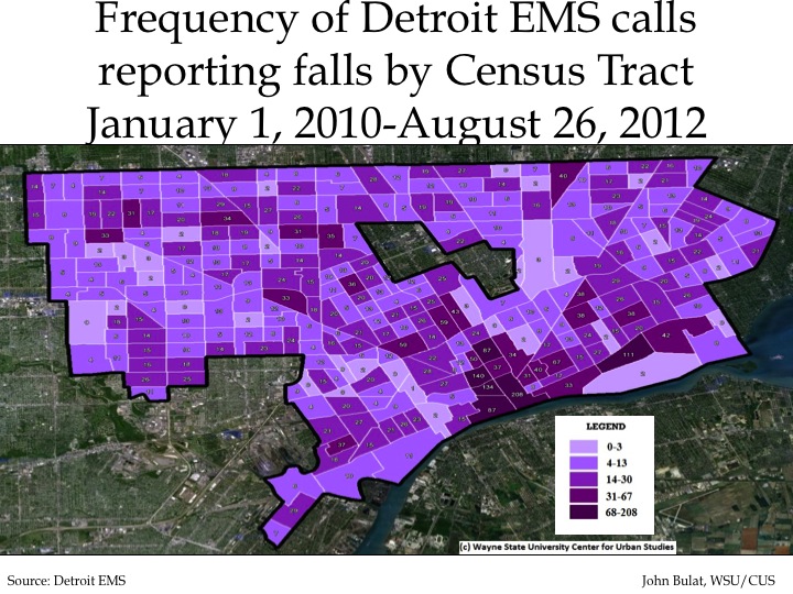
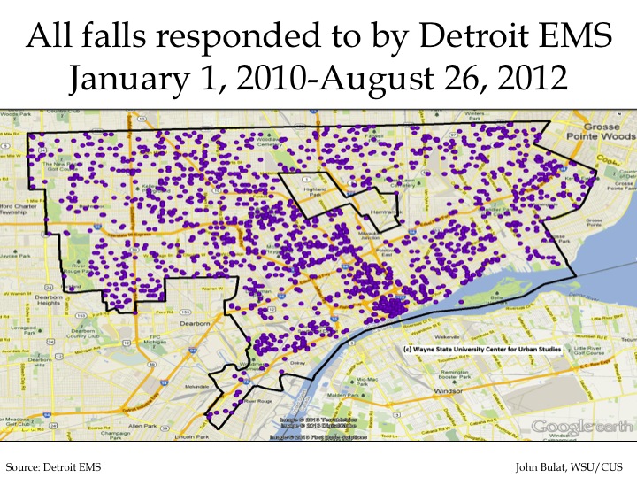
The above maps show the frequency and distribution of fall-related calls Detroit EMS personnel responded to from January 1, 2010 to August 26, 2012. In total, EMS responded to 4,853 calls in that time frame, most of which were concentrated along the city’s downtown near the Detroit River between M-10 and I-375. In that area there are six Census tracts with the highest range of calls (over 67 calls); no other Census tract in the city received more than 67 calls during that time period. For the Census tracts in dark purple there were a total of 767 fall related calls.  There was also a concentration of falls around Woodward Avenue.

In the second map, which shows the distribution of falls in the city, one dot is equal to one fall related call. This remains true in all other distribution maps in this post.

falls3

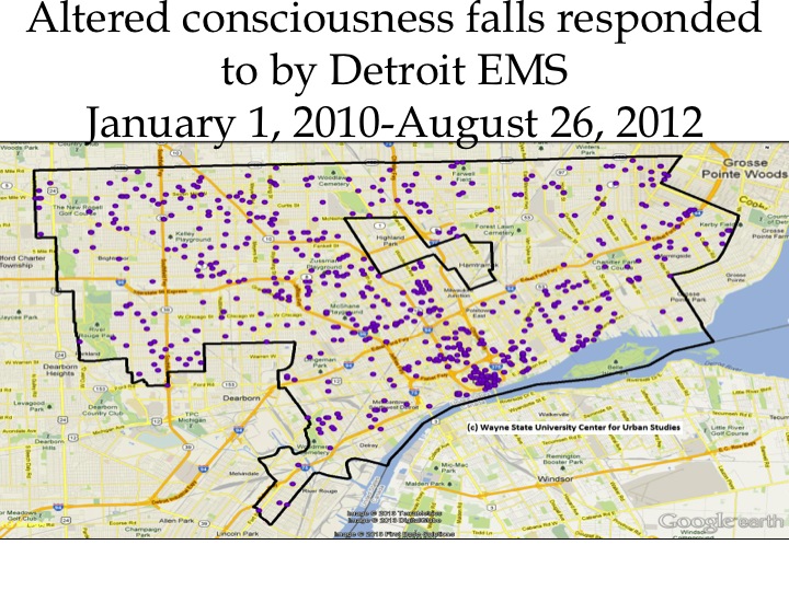
The above map shows the distribution of EMS calls reporting falls associated with the victim having altered consciousness following the incident. In total there were 750 such calls. Similar to the first frequency map of all falls, this map shows the highest concentration of such falls was located downtown, along the Detroit River and down Woodward Avenue.

falls4

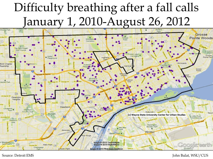
In the time frame examined in this post, there were 350 calls where the victim of a fall had difficulty breathing following the incident. As can been seen, these type of fall-related EMS calls did not occur as often as other types of fall-related calls and were less concentrated in the downtown area of the City of Detroit.

falls5

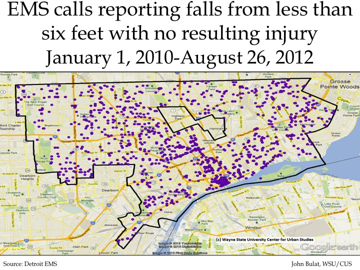
Of the type of fall calls to EMS examined in this post, there were 1,653 instances where a person fell less than six feet and suffered no injuries. These made up 34 percent of the fall calls received by Detroit EMS during the time period examined. There was a heavy concentration of these calls received in the city’s downtown, between M-10 and 375. There was also a string of such incidents just west of I-94, between I-75 and I-96.

falls6

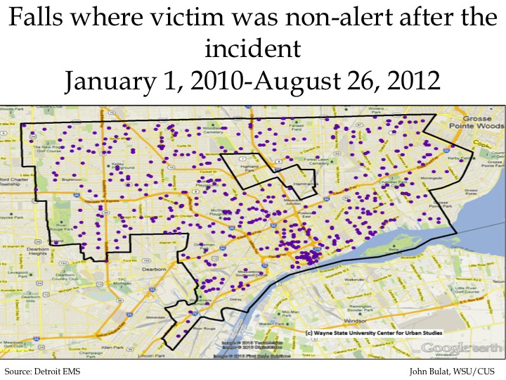
There were 612 calls to the Detroit EMS from January 1, 2010 to August 26, 2012 related to a person falling and being non-alert following the incident. Aside from the concentration of such falls in the city’s downtown between M-10 and I-375, these calls are fairly evenly distributed throughout the city.

falls7

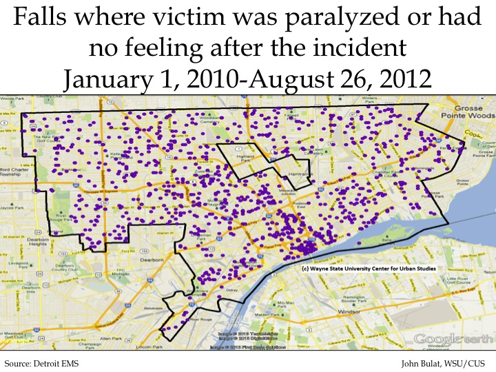
Between January 1, 2010 and August 26, 2012 Detroit EMS responded to 1,488 calls where the injured person was paralyzed or had no sense of feeling following the incident.

falls8

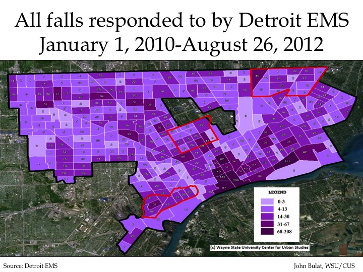
The Green and Healthy Homes-Detroit Initiative aims to reduce housing related health-risks through “comprehensive home-based assessments and interventions, public outreach and education, and local partnerships.” Through this initiative, ClearCorps is targeting three neighborhoods for housing hazard identification and remediation.  These neighborhoods are the North End and Crossman area (the center target area), the Osborn area (the north target area) and the Southwest area. The map above shows that none of these target areas had Census tracts were Detroit EMS responded to more than 67 falls. All three areas did have at least one Census tract with the second highest range (31-67) of fall-related calls.

falls9

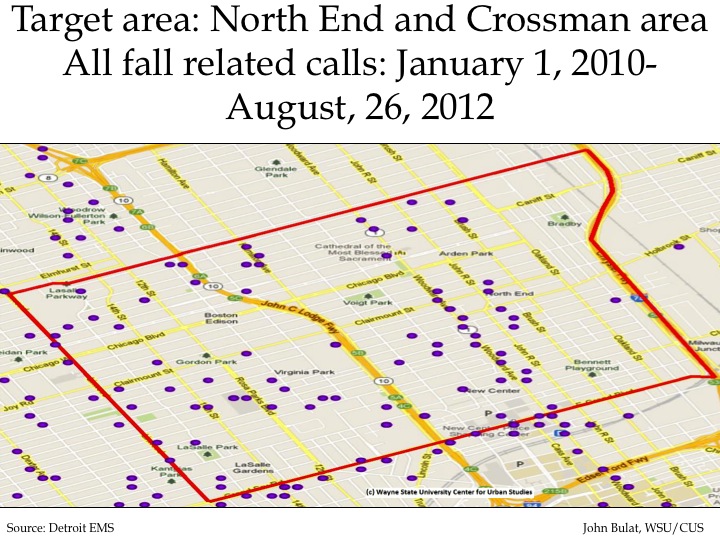
In the North End and Crossman area there were about 70 total fall-related calls made to Detroit EMS from January 1, 2010 to August 26, 2012. Of those calls, the following types of fall-related calls were responded to:

(The categories below are not mutually exclusive.)

•Altered consciousness: 27
•Difficulty breathing: 9
•A fall from less than 6 feet with no injury: 45
•No alert: 18
•Paralyzed/loss of feeling: 41
falls10

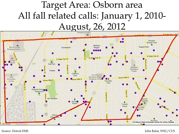
In the Osborn area there were about 80 total fall-related calls made to Detroit EMS from January 1, 2010 to August 26, 2012. Of those calls, the following types of fall-related calls were responded to:

(The above categories are not mutually exclusive)

•Altered consciousness: 25
•Difficulty breathing: 13
•A fall from less than 6 feet with no injury: 60
•No alert: 30
•Paralyzed/loss of feeling: 48

falls11

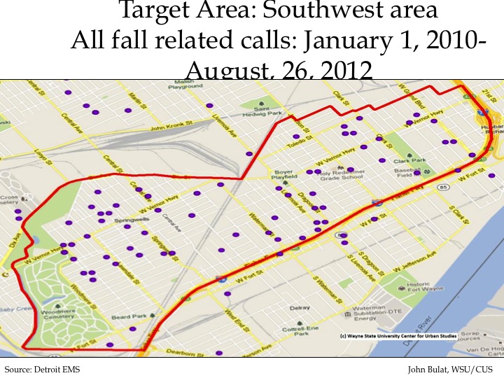
In the Southwest area there were about 60 total fall-related calls made to Detroit EMS from January 1, 2010 to August 26, 2012. Of those calls, the following types of fall-related calls were responded to:

(The categories are not mutually exclusive)

•Altered consciousness: 19
•Difficulty breathing: 20
•A fall from less than 6 feet with no injury: 40
•No alert: 21
•Paralyzed/loss of feeling: 40