Mortality related to Disease:Region below average for Alzheimer’s mortality

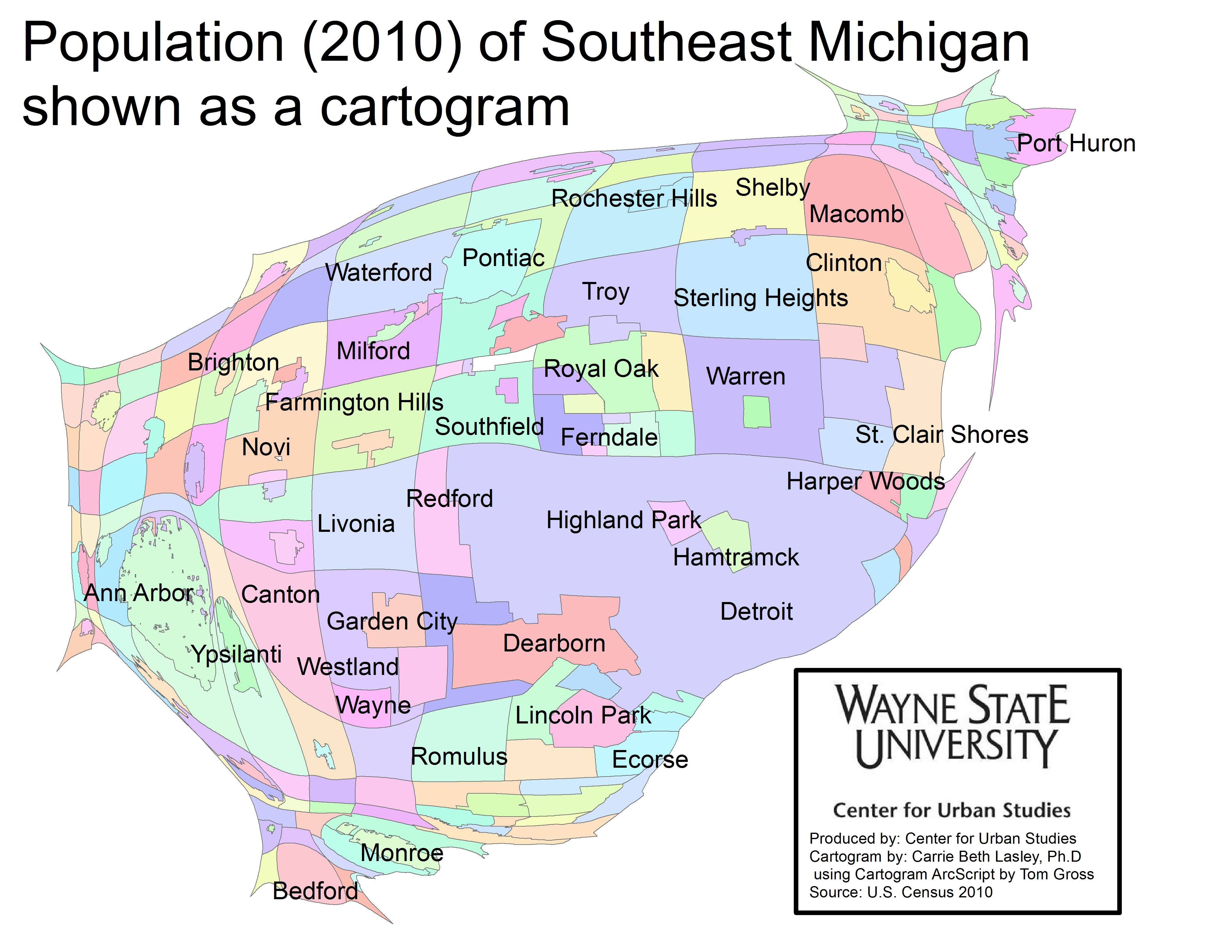
This post portrays regional mortality rates related to disease, in particular, cancer, heart disease and Alzheimer’s disease.

The cancer mortality rate for those above the age 75 was the highest of the three diseases presented below. Alzheimer’s disease was the only illness presented below where none of the counties in Southeastern Michigan has a mortality rate above the state average. From 2006-2010, the rolling average mortality rate related to Alzheimer’s disease for the State of Michigan was  recorded at 22.7 deaths per 100,000 residents. Macomb was highest in the region at 20.9.

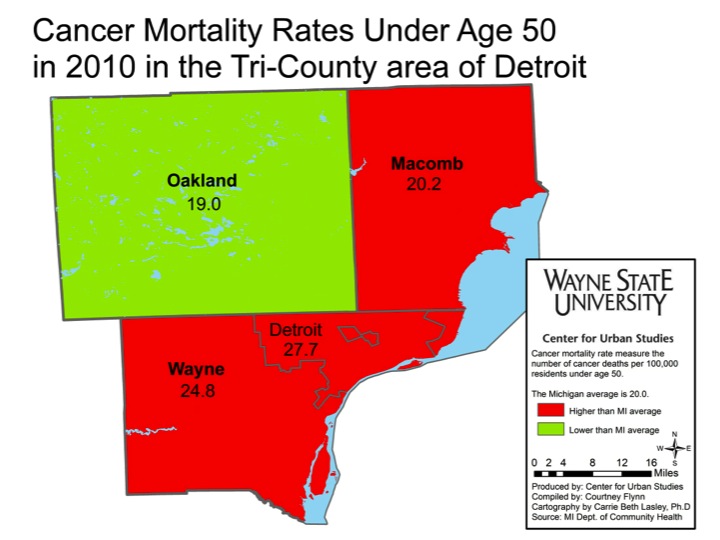
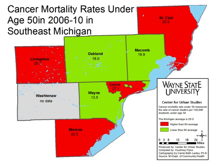
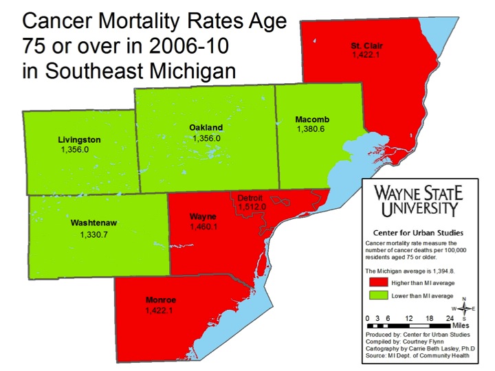
The mortality rate for those 75 or older with cancer is about 150 times higher than those below the age of 50. For example, in the City of Detroit the mortality rate for those above the age of 75 with cancer was 1,512 per 100,000 residents from 2006 to 2010. For those below the age of 50 the mortality rate was 27.1 per 100,000 residents for the City of Detroit during the same time frame.

On all three maps, Oakland County was below the state average for the mortality rate related to cancer. Mortality rates related to cancer for the City of Detroit, however, were consistently above the state average, across age group and time.

The Michigan Department of Community Health did not document cancer mortality rates for those between the age of 51 and 74.

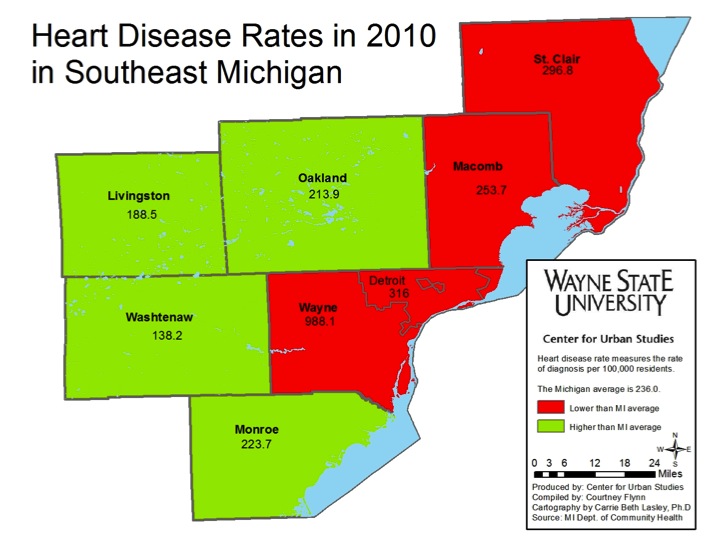
Heart disease is another illness where Detroit was again above the state average, but in this case lower than Wayne County as a whole. In 2010, according to the Michigan Department of Community Health (MDCH), there were 236 deaths related to heart disease in the State of Michigan. In comparison, MDCH reported 316 deaths in Detroit and 988 deaths per 100,000 residents in Wayne County related to heart disease in 2010.  Washtenaw County was on the opposite end of the spectrum with a mortality rate related to heart disease recorded at 138.2 per 100,000 residents.

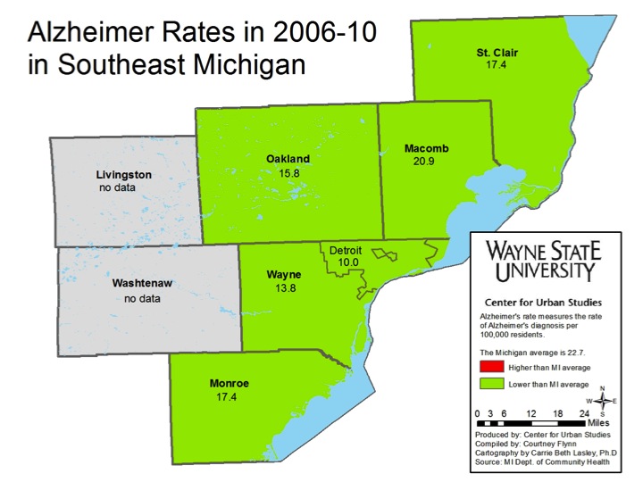
Of the three types of diseases presented, Alzheimer’s disease had the lowest mortality rates. According to MDCH, the state average was 22.7 Alzheimer’s related deaths per 100,000 residents from 2006-10. None of the areas presented on the map were at or above the state average. Macomb County had the highest rate at 20.9 while Detroit had the lowest at 10 deaths per 100,000 residents.

Information for Livingston and Washtenaw counties was not available because the state reported it had not collected enough data to determine an accurate rate.

Metro-Detroit mortality rates mapped

In a previous report, Drawing Detroit discussed mortality rates in the Southeast Michigan area. In this post, we would like to visualize some of that data through maps, specifically the average infant mortality rates, adult mortality rates, and adult mortality rates related to homicide, unintentional injury, and suicide.

According to the Michigan Department of Community Health, Detroit had above average mortality rates for all the categories presented below, with the exception unintentional injury death for those 75 and older and those who committed suicide.

According to the Center for Disease Control and Prevention, the mortality rate is defined as “a measure of the frequency of occurrence of death among a defined population during a specified time interval.”  For this map it is measured by deaths per 100,000 residents. The above map shows the mortality rates from 2010 for each of the seven counties that make up Southeastern Michigan. Of these counties, St. Clair County had the highest mortality rate in 2010 at 1,007.1 per 100,000 residents; Wayne County had the second highest rate at 985.2. Washtenaw County had the lowest rate at 581.2. Detroit’s mortality rate in 2010 was recorded at 1,050 per 100,000 residents.

Infant mortality measures the deaths occurring in the first year of life per 1,000 births. For 2010, the Michigan Department of Community Health reported that the average infant mortality rate for the state was 7.1 per 1,000 live births. Wayne County had the highest infant mortality rate of the seven counties in the region at 9.7 per 1,000 live births; the City of Detroit had a rate of 13.5. Washtenaw County had the lowest infant mortality rate at 5.2 per 1,000 births.

According to the Center for Disease Control, unintentional injuries are unplanned injuries that occur suddenly; they are typically associated with crashes, falls, fires, burns, drowning, poisoning, and aspirations. The death rate associated with unintentional injuries was highest for those 75 and older, although rates for the seven-county region have fluctuated across time.

With the exception of unintentional injury related deaths for those 75 and older, Detroit’s mortality rate for this category was higher than the state average and all the counties in the region. In the six maps above, Washtenaw County was the only county to remain under the state average for unintentional injury related deaths for the various age groups and averages presented.

To learn more how these numbers have changed over time please view our previous post here.

In Southeastern Michigan, St. Clair County had the highest suicide rate per 100,000 residents for those between 25-74 years old, peaking at 21.5 for the 2006-10 time-frame. For those under 25, it was recorded at 6.3 for the 2006-2010 time-frame.

In the Metro-Detroit region (Wayne, Oakland, and Macomb counties), Macomb County had the highest suicide rate in 2010 for those under 25 and those 25-74; these rates, 6.8 and 17.4 respectively, were also above the state averages.

Information for Washtenaw and Livingston counties was not available for the 25-74 age group.

For all categories presented, Detroit had the highest homicide rates, according to the Michigan Department of Community Health. When looking at the 2006-2010 rolling averages, it was the highest for the 25-74 age group, per 1,000 residents. This rate was recorded at 48.3, and the Michigan average was recorded at 7.1. For just 2010 data, again, the 25-74 age group for Detroit had the highest homicide rate at 41.7; the state average was 6.1 per 1,000 residents.

To learn more about how homicide rates in the region have changed over time click here.

In a future post we will display maps showing the mortality rates related to specific health related deaths, such as cancer and Alzheimer’s disease.


A different look: Southeastern Michigan’s population

In the population cartograms below Wayne, Macomb, Oakland, Livingston, Monroe, St. Clair, and Washtenaw counties, along with the municipalities, are displayed according to their population size. A cartogram is a geographic representation method that alters the area and shape to demonstrate the relative relationship of a data feature while preserving the spatial relationship. This method allows you to visually apply weight to data, changing the way we visually experience the map, while maintaining geographic boundaries.

As can be seen, Wayne County had the highest population in 2011 of the seven counties, at about 1.8 million, and Detroit had the highest population of the all the municipalities in the region in 2010 at about 714,000.While Detroit is the most eye-catching municipality on the map because of its size, the surrounding suburbs, such as Warren, Sterling Heights, and Dearborn, also have higher populations than places in St. Clair and Washtenaw counties, with exceptions like Ann Arbor and Port Huron.

The population information was provided by the U.S. Census and the American Community Survey.

Historical museums, theaters prominent throughout seven-county region

In this post, we examine the location of art, history, military, science, theater, and other types of cultural institutions in the area. So far, we have identified about 220 cultural institutions located in Southeast Michigan, the majority of which are either related to art, history, or theater. In addition to displaying their locations, we have also included an overlay of the mean household income for the Metro-Detroit area (Wayne, Macomb and Oakland counties). The income related overlay is to display what correlation, if any, there is to the location of cultural institutions and income.

For the “Art Assets” map the art museums, for profit and non-profit, are displayed on the map, as are art galleries in the region. The “Historical Museums and Institutions” shows where community historical museums are located, in addition to larger scale museums like Charles H. Wright Museum of African American History. “The Private and Non-Profit Theaters” map also shows where community based institutions are along with larger theaters, like the Fox Theater and the Detroit Opera House. The “Science Museum” map mainly displays scientific based museums funded through universities, with a few exceptions, while the “Cultural Institutions” maps shows where assets such as auto museums and the Cranbrook gardens are located.


Based on our findings to date, theaters and historical organizations are the most widely distributed in the seven-county region and make up the majority of the cultural institutions in the area. Altogether, we have identified 64 theaters and 80 historical organizations in the region, which accounts for 65 percent of the overall number.

For these types of cultural institutions, it is not uncommon for local communities to house non-profit, and sometimes private, entities that display their historical and theatrical attributes. With these organizations being so widespread, it is difficult to link their locations to income distribution.

Many arts organizations, however, are located in areas where the mean income is above $60,001. The Danielle Peleg and Art Leaders galleries in West Bloomfield and the Paint Creek Art Center and Oakland University art galleries in Rochester Hills are such examples. While the mean income of census tracts in Detroit is typically between $20,001 and $40,000, there are still several art museums and cultural institutions located in the city, particularly in Midtown and downtown.

Military and science organizations were the least prevalent in the seven-county region.

Also, if interested in learning more about income distribution click here.

Michigan ranks 20th in per pupil education funding

According to a New York Times article there are large disparities between states and the amount of resources they can put toward education. This is because most school districts are funded through local property taxes. For example, the state of New York had the largest per pupil funding in 2011 at about $18,000 while Utah’s spending was at about $7,000 per pupil; Utah had the lowest funding. The State of Michigan ranked 20th; about $11,000 was brought in per pupil in 2011. To learn where your state sits in the ranking read “In Public Education, Edge Still Goes to Rich.”

Livingston, Oakland, Washtenaw counties have highest median household income

Livingston, Oakland, Washtenaw counties have the highest median household income in the Southeast Michigan region. In this post, we examine the median household income by census tract for the City of Detroit, and Wayne, Macomb, and Oakland counties. In addition, the median household incomes for all the communities in Southeast Michigan are presented.  These numbers were based on information obtained from both the American Community Survey and city-data.com, a website which aggregates community data.


The three maps above show the median household income by census tract for 2011 for the City of Detroit, Wayne County and the tri-county region. The data was provided by the American Community Survey. As can be seen, Detroit and many other inner-ring suburbs had multiple tracts with household median incomes below $60,001.

While the census tracts with lower median household incomes were mainly centralized around Detroit, there were also tracts in southern Macomb County and central and southeast Oakland County whose median household incomes were between $20,000 and $60,001.

With the exception of the Grosse Pointes and a few other tracts in and around the city, many of the communities/tracts that had median household income values over $60,000 did not border the City of Detroit.


The maps above show information from 2009 aggregated by city-data.com; this is a website that collects information form various sources to provide profiles on U.S. cities. According to the data, in 2009, Redford and Garden City both had median household incomes of $16,751, the lowest in Wayne County. Hazel Park had a median family income of $21,469 and Hamtramck had a median family income of $30,346; Detroit’s was reported at $33,754.

Oakland County only had three communities with median household incomes below $35,000; they were Royal Oak, Commerce, and Lyon townships. In contrast, there were 10 communities with a median family income over $100,000. Bingham Farms, at $148,295, had the highest median household income in the county.

Like Oakland County, a majority of the communities in Livingston and Washtenaw counties had median household incomes above $60,000. Barton Hills in Washtenaw County had the highest median household income in the region at $197,830. Handy Township in Livingston County, at $8,237, had the lowest median household income.

A majority of the communities in Wayne, Macomb, Monroe, and St. Clair counties had median household incomes of $60,000 or below.

Next week we will look at the locations of various cultural institutions in Southeast Michigan in comparison to the mean household income of the communities they are located in.