Detroit’s unemployment remains steady

•Detroit’s unemployment rate remained constant at 16.3 percent between May 2013 and June 2013; (monthly)
•The overall number of people who work within the Detroit Metropolitan borders (both residents and non-residents) decreased in June 2013 in comparison to May. This is because Detroit’s unemployment rates are based on city residents while the number of people employed includes workers who live outside city limits; (monthly)
•When looking at the auto and auto part manufacturing industries in the Detroit Metropolitan Statistical Area, there was a small increase in employment from May 2013 to June 2013.; (monthly)
•The Purchasing Manager’s Index for Southeast Michigan increased from June 2013 to July 2013. (monthly);
•The Commodity Price Index decreased from June 2013 to July 2013 for Southeast Michigan. (monthly);
•Standard and Poor’s Case-Shiller Index showed the prices of homes in the Detroit area continue to increase. (monthly);
•The number of building permits obtained in Wayne County increased from May 2013 to June 2013; they decreased for Oakland and Macomb counties during the same time period (monthly).
econ1

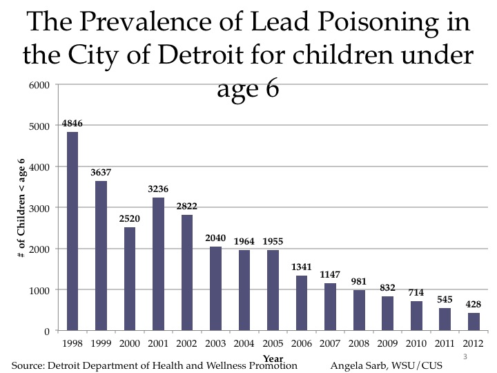
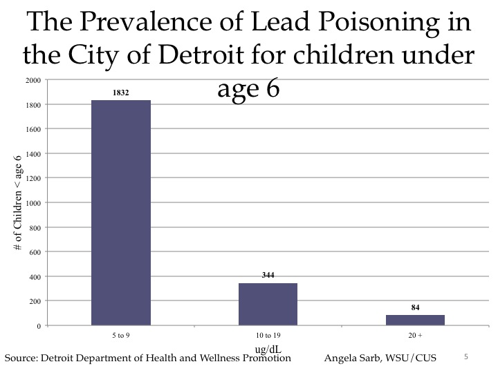
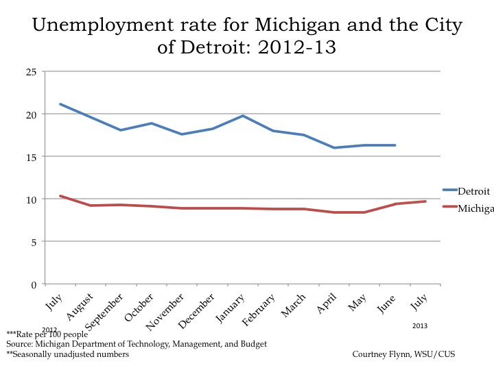
According to the most recent data provided by the Michigan Department of Technology, Management and Budget, there was a 0.3 percent increase in the unemployment rate for the State of Michigan between June 2013 and July 2013; in July 2013, the rate was 9.7 per 100 people. For the City of Detroit, the unemployment rate remained constant from May 2013 to June 2013 at 16.3 percent.

Slide04


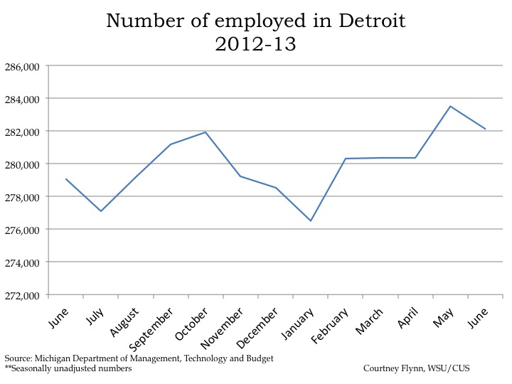
In June 2013, there were 282,129 people (both residents and non-residents) employed in the City of Detroit, which was a decrease of 1,379 people from May 2013.

Slide06


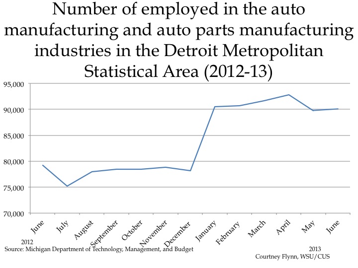
The above chart shows the number of people employed in the auto and auto part manufacturing industries in the Detroit Metropolitan Statistical Area (MSA) from June 2012 to June 2013. There was only a small increase in the number workers employed in these industries from May 2013 to June 2013. However, between July 2012 and June 2013, there was an increase of 14,900 persons.

Slide08


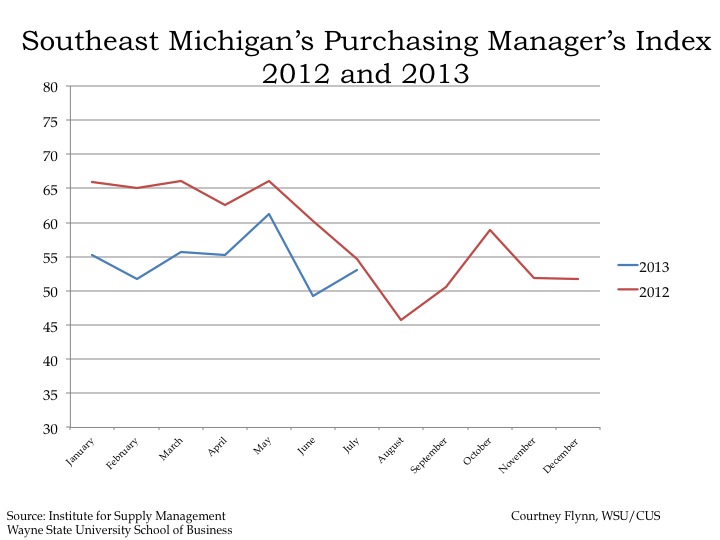
The Purchasing Manger’s Index (PMI) is a composite index derived from five indicators of economic activity: new orders, production, employment, supplier deliveries, and inventories; a PMI above 50 means the economy is expanding.

According to the most recent data released on Southeast Michigan’s Purchasing Manager’s Index, there was an increase of 2.9 points from June 2013 to July 2013; in July 2013, it was recorded at 53.1. The PMI of 53.1 is reflective of an increase in production activity and new orders.

Since the beginning of 2012 the PMI has indicated an expanding economy, aside from August 2012 and June 2013.

Slide10

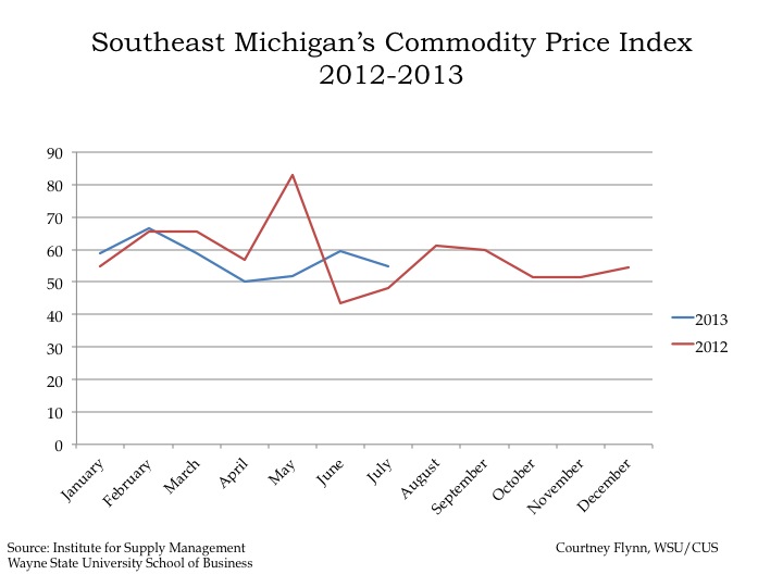
The Commodity Price Index, which is a weighted average of selected commodity prices, was recorded at 54.8 in July 2013, which was 4.7 lower than the previous month. The July 2013 value (54.8), however, was 5.7 points higher than the July 2012 value (49.1).

Slide12

Slide13

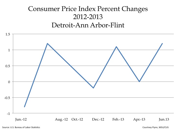
The Consumer Price Index measures the change in prices in a fixed market. The index is based on prices of “food, clothing, shelter, fuels, transportation fares, charges for doctors’ and dentists’ services, drugs, and the other goods and services that people buy for day-to-day living,” according to the Bureau of Labor Statistics.

The above graphs show the percent change in the price index measurements. The first graph shows there was a 1.2 percent increase in the overall Consumer Price Index from April to June 2013 in the Detroit-Ann Arbor-Flint area. According to the Bureau of Labor Statistics, this is mainly based on the fact that energy costs increased by 6.6 percent over the three month time period.

For the Consumer Price Index Less Food and Energy, there was a 0.6 percent increase in the index from April to June 2013. This change was smaller than the overall Consumer Price Index percent increase.

Slide15

Slide16

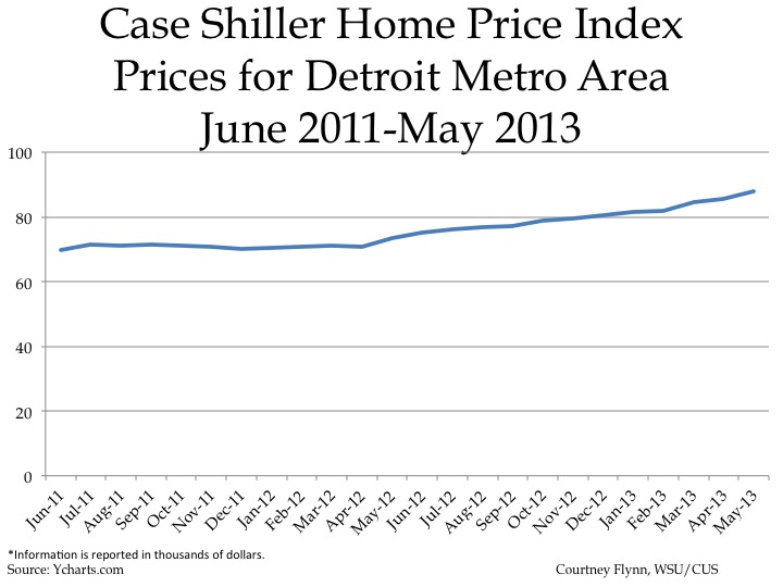
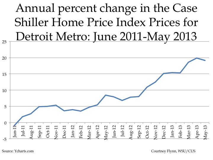
The above charts show the Standard and Poor’s Case Shiller Home Price Index for the Detroit Metropolitan Statistical Area. The index includes the price for homes that have sold but does not include the price of new home construction, condos, or homes that have been remodeled.

According to the index, the average price of single-family dwellings sold in Metro Detroit was $87,990 in May 2013. This was an increase of approximately $18,300 from the average price in June 2011.

Like the Home Price Index, the annual percent change in the Home Price Index also showed an overall increase since June 2011. Between May 2012 and May 2013, there was a 19.16 percent increase in home prices for the Detroit MSA.

Slide18

Slide19

Slide20

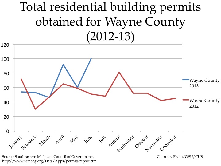
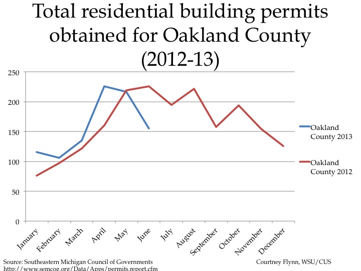
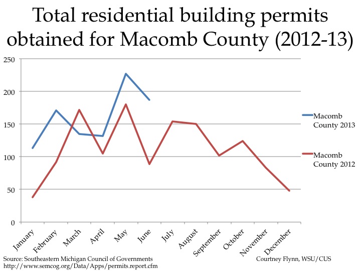
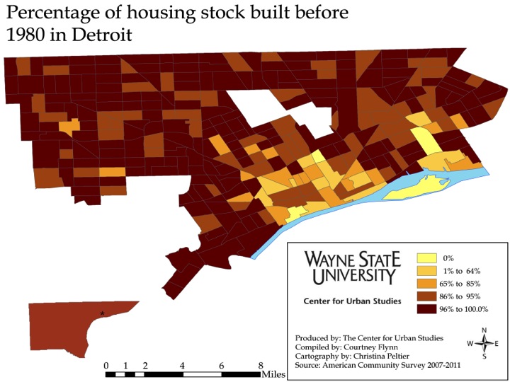
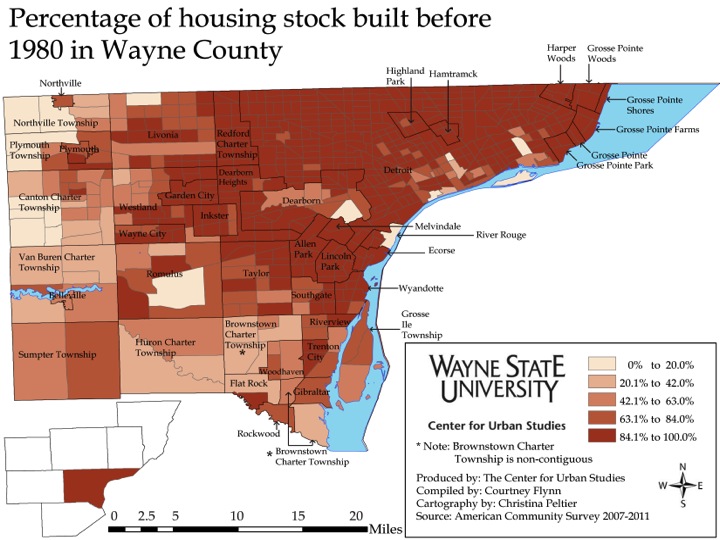
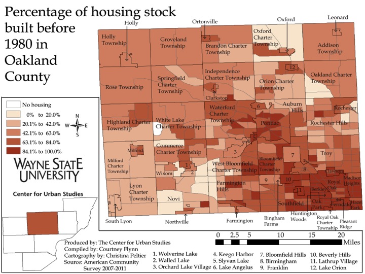
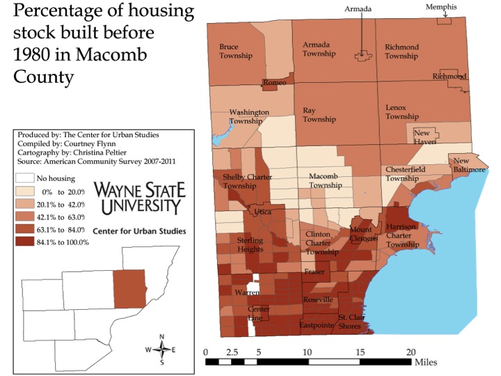
The above charts show the number of residential building permits obtained each month in Wayne, Oakland, and Macomb counties from January 2012 until June 2013. These numbers are reported by local municipalities to the Southeastern Michigan Council of Governments and include single family, two family, attached condo, and multi-family units.

Of the three counties examined, Wayne County was the only county that experienced an increase in the number of permits obtained from May to June in 2013 (an increase of 40 permits). The number obtained in Oakland County decreased by 64 from May to June and the number for Macomb County decreased by 30.

When comparing the number of permits obtained in June 2012 versus June 2013 for these three counties, Macomb and Wayne counties showed increases, 98 and 49 respectively. There was a decrease of 71 permits for Oakland County.

In June of 2013 there were 100 building permits pulled in Wayne County, 155 pulled in Oakland County and 187 pulled in Macomb County.


Childhood lead poisoning: Progress and accelerating risks based on budget cutbacks

Reduction of childhood lead poisoning is one of the great successes in Detroit in recent years, a product of strong collaboration by non-profit agencies, funders and the City of Detroit. In this update on lead poisoning we show the progress that has been made, explain the risks and then demonstrate how the cutbacks in funding are putting Detroit’s and the region’s children at risk.

Lead is a heavy metal that accumulates in the body when ingested, and has toxic effects on the nervous system, cognitive development, and blood production. It can be ingested through dust or paint (pica, usually in small children) can also be ingested through drinking water that has been contaminated  as a result of lead pipework or lead-based solder. Within dwellings, the main sources of lead come from paint and water pipes, though paint is almost exclusively the source of poisoning in the Detroit area.  Outside the home it can also come from soil, especially around older buildings or near thoroughfares where lead is still residual in dust from the era in which lead was used as an anti-knock agent in gasoline. Other sources include flaking external paintwork or former smelters.

The most prevalent effect from lead exposure is reduction in cognitive capacity in children – even with relatively low lead levels in blood, it negatively affects children’s IQ. The most vulnerable age group is children under 3 years old because of potential effects on neurological development, and because young children’s bodies more readily take up lead. Other risk groups include pregnant women and fetuses.

As shown below lead poisoning cases have been declining.

lead1


The chart above shows the number of children under age 6 who had a blood lead level greater than or equal to 10 μg/dL from declined tremendously from 1998-2012 . The decline was from 4,846 to 428 children. This occurred as a result of direct intervention by the City of Detroit Department of Health and Wellness Promotion to work with families, by the City Department of Planning and Development to abate lead paint in existing housing, by the Wayne County Prosecutor’s office to charge rental owners who rent lead poisoned property to families with young children and because of the massive numbers of demolitions of lead poisoned properties over the last decade. In addition, many families have taken the opportunity of lower prices on properties to move into better housing, abandoning many of the worst properties in the city.

Slide05


The second chart shows the number of children under six who had a blood lead level of 5-9 μg/dL, 10-19 μg/dL and greater than 20 μg/dL in 2012. The two higher categories sum to the total of 428 in the previous chart. Recently the Centers for Disease Control has begun counting children in the 5 to 9 ug/dl category as lead poisoned, based upon accumulating research that lead poisoning at these levels has substantial effects in reducing cognitive capacity.

The next several maps show the distribution of lead poisoned children in Detroit.

lead3


lead4


lead5


These first three maps show the locations of cases of the higher levels of lead poisonings—those greater than 20 ug/dl first, followed by those greater than 10-19 and 20 ug/dl and finally all those above 10 ug/dl.  There is clear concentration of these cases in the areas where older  housing still remains in the city, particularly in the closer in areas of the east side, southwest Detroit and the area between the Lodge and I-96.

lead6


lead7


These first of these two above maps show where the lower levels of lead poisoning exist among Detroit’s children.  The ssecond map shows all the lead poisoning cases. While the highest concentrations are similar to the previous maps, the important point is that lead poisoning cases are occurring in every part of the city, consistent with the fact that  older housing—homes built before 1978 when lead was banned from house paint—exist all over Detroit.

This is demonstrated by the next two maps.

Slide14


Slide15


As can be seen in the first of the two maps above, much younger housing is located in the inner core where housing demolition and replacement has been intense since the 1940s and 1950s. However, the majority of the city is covered in dark brown, which represents Census tracts where between 96 and 100 percent of the homes were built before 1980. In Detroit, 62.2 percent of housing was built before 1950, a substantially higher percentage than any other county in Michigan.

Importantly, the same risks exist in the inner suburbs of Wayne County as demonstrated by the second map above.

One crucial way of intervening early with lead poisoning is by testing of young children. The next three charts speak to this.

Slide17

Slide18


Slide19

The two line charts above show lead testing in Detroit and Wayne County, respectively, over 2012 and 2013 (to date). The data for 2013 are substantially below those for 2012, reflecting drastic cuts in the public provision of testing since the closure of these service by the Detroit Department of Health and Wellness Promotion as part of cuts implement in 2012. We may expect some recovery in testing as children head back to school, but the bar chart above shows that testing in Detroit has consistently declined in volume over the last several years. (The 2013 numbers are just for the year to date.) Part of this decline may be because of a decline in Detroit’s population.

In addition to cuts in testing there have been cuts in case management, elevated blood level investigations, prosecution and abatement.

Given all these cuts in services and interventions, one might reasonably expect an increase in lead poisoning cases among young children. It is likely, however, that because fewer children are tested, fewer of those with lead poisoning will be identified. Social and health problems may appear to diminish if they are not measured properly.


Lead and Housing: Homes built before 1980

Here we complete our examination of  the percent of housing built before 1980 in the 7-county SEMCOG region. The intent is again to shed light on the potential for lead poisoning as lead was banned from house paint after 1978.

The overall percentages across the seven counties include:


•Livingston 42.2%
•Macomb: 62.1% 
•Monroe: 61.8%
•Oakland: 64.0% 
•St. Clair: 61.8% 
•Washtenaw: 59.3%
•Wayne 84.4%
•Livingston County had the lowest percent of homes built before 1980 of the seven-county region with 42.2 percent, according to the American Community Survey. The overall percentage of homes built before 1980 in Monroe, St. Clair and Washtenaw counties was more in line with the overall Macomb and Oakland county percentages.

 Overall, there is about a 42.2 percent difference between the percent of homes built before 1980 in Livingston (42.2%) and Wayne (84.4%) counties. 

Image

Image

Image

Image

In both Washtenaw and St. Clair counties nearly all the municipalities had between 42.1 and 63 percent of the homes built before 1980 up through 2011.  In Washtenaw County only Ann Arbor had a percentage of homes built before 1980 that put it in the highest bracket ( 84.1-100 percent). The only municipality in the same bracket in St. Clair County is Port Huron. In Monroe County, where majority of the municipalities are in the 63.1 to 84 percent bracket, only the City of Monroe has a percentage of homes built before 1980 in the highest bracket. Livingston County has no municipalities where between 84.1 and 100 percent of the homes were built before 1980.

In general the percentage of housing built before 1980 is rather substantial, indicating a fairly high risk for lead poisoning from lead-based paint even in the out-counties of the region. The significance of this is that it implies there will be a long term necessity for careful surveillance of young children’s blood lead levels and an equally strong need to maintain code enforcement relative to older dwellings lest lead based paint deteriorates and triggers more childhood lead poisoning cases. 

Image

Finally, here is a comparison of housing age in the region compared to the state and the nation. In the above chart the percent of homes built before 1980 is shown for each of the seven counties in Southeastern Michigan region, along with the state and national percentages. As can be seen, Wayne County has the highest percentage at 88.4 and the state of Michigan comes in second at 67.2 percent. The percent of homes built before 1980 in the U.S. is 57.5%; Livingston County has the lowest percent of homes built before 1980 at 42.2.   By this measure Wayne County’s and Detroit’s housing is very old compared to the state or nation, which would not mean as much if the housing were well maintained. However, because job losses and wage cuts have reduced incomes, the amount of disposable income for housing maintenance is much reduced. Therefore there are likely increasing health and safety risks not only from lead paint, but from other housing repair issues as well.   


Lead and Housing Age: Homes Built Before 1980

In the following post we will examine the percent of homes built before 1980 for the city of Detroit and Wayne, Oakland and Macomb Counties to examine the risk of lead poisoning among children. Prior to 1978 there was no ban on the use of lead based paint, and 1980 is the closest available Census data on housing age. The older the homes and the higher percentage of older homes, the higher the risk that lead based paint was used in the homes.

Detroit has the highest percent of homes built before 1980 of all the areas examined. Since Detroit has such a high percentage of older homes (a majority of the Census tracts in Detroit have 86 percent or higher of the homes built before 1980), the Detroit map uses different breakpoints in the legend than the County maps presented below.

Age1


There are only three Census tracts in Detroit where none of the homes in the city were built before 1980. These are locations such as Belle Isle and the Coleman A. Young International Airport, which generally do not have housing stock, though some people were found to have taken up residence in these areas.

One of the especially interesting features of this map is that much of the younger housing is located in the inner core where housing demolition and replacement has been intense since the 1940s and 1950s.

Much of the city is covered in dark brown, which represents Census tracts where between 96 and 100 percent of the homes were built before 1980.

Age2


Age3


Age4


According the maps presented above, Wayne County has the highest number of Census tracts with homes built before 1980; in total 84.4 percent of the county is made up of homes built before 1980.

A closer look shows that majority of these Census tracts fall within the Detroit City limits and the inner suburbs, such as Redford and Lincoln Park. According to the legend, between 84.1 and 100 percent of the homes in the darkest shade of brown, in areas like Detroit and Lincoln Park, were built before 1980. Inner suburbs of Oakland and Macomb such as Ferndale and Eastpointe, respectively, follow this same pattern. This means these inner suburbs are at substantial risk of lead poisoning of children, particularly when older housing stock is not fully maintained.

In Oakland and Macomb counties though there are far fewer Census tracts where over 84 percent of the homes were built before 1980. For example, Macomb Township, which has seen the highest population growth in the last two years, is mainly made up of Census tracts where 0-20 percent of the homes were built before 1980. In total, 62.1 percent of Macomb County is made up of homes built before 1980 and 64 percent of Oakland County is made up of homes built before 1980.