Metro-Detroit Sees Lower Unemployment Rates

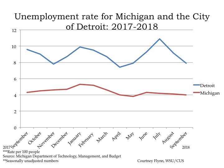
  • The State and City of Detroit’s unemployment rates decreased at the monthly levels;
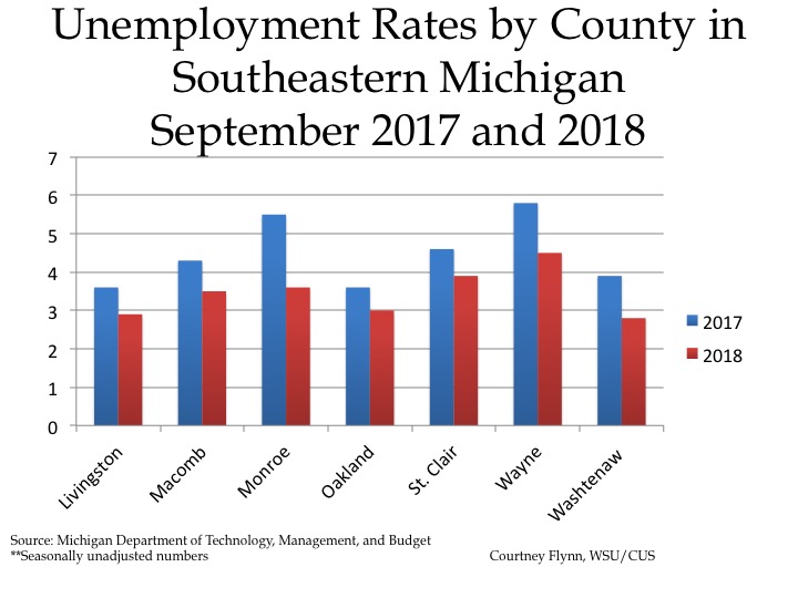
  • Regionally, September 2018 unemployment rates are lower than the prior year;
  • Housing prices continue to rise in Metro-Detroit.

The chart above displays the unemployment rates for each of the seven counties in Southeastern Michigan for September of 2017 and 2018. In September of 2018 Wayne County had the highest unemployment rate at 4.5, with St. Clair County having the second highest regional unemployment rate 3.9. Livingston and Washtenaw counties were the only two in the region with unemployment rates below 3 in September of 2018. The unemployment rate for Livingston County was 2.9, and the unemployment rate for Washtenaw County was 2.8.

When comparing 2017 and 2018, every county in the region experienced a decline in the unemployment rate. Monroe County experienced the largest decline, with the September 2017 unemployment rate being 5.5 and the September 2018 unemployment rate being 3.6.

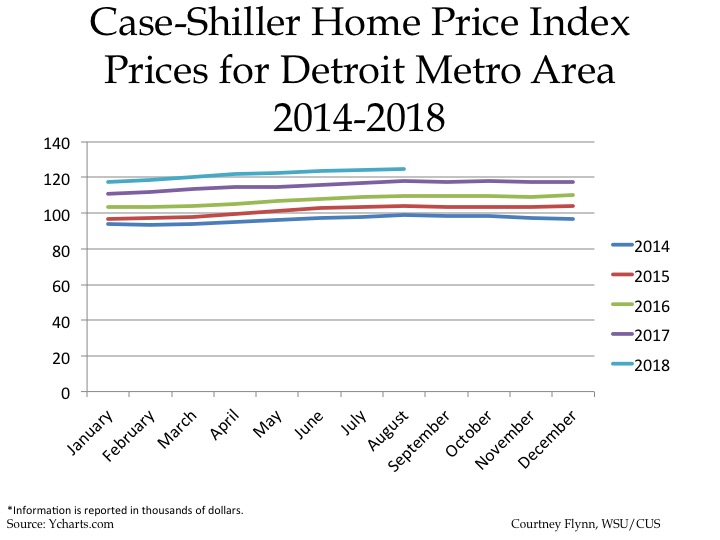
The above chart shows the Standard and Poor’s Case-Shiller Home Price Index for the Detroit Metropolitan Statistical Area. The index includes the price for homes that have sold but does not include the price of new home construction, condos, or homes that have been remodeled.

According to the index, the average price of single-family dwellings sold in Metro Detroit was $124,770 in August 2018; this was $530 higher than the average family dwelling price in July. The August 2018 price was an increase of $7,010 from August of 2017 and an increase of $15,110 from August of 2016, an increase of $21,020 from August of 2016 and increase of $26,050 from August of 2014.

Turkeys, Chickens and Ducks

As Thanksgiving approaches it is worth noting that our state has had a great success in expanding wild turkey populations across the state from near extinction in 1900 to over 200,000 birds across the state nowadays. All but the most densely populated areas of Southeastern Michigan have wild turkeys. And now they will find many cities are allowing their domesticated cousins—chickens. And at least one has added ducks.

Across Southeastern Michigan there are 30 communities that allow for residents to house chickens on their property, according to recent research conducted by the Detroit Free Press. These communities have various ways of allowing residents to have the chickens on their property. For example, in the City of Warren residents are allowed to have three hens and pay a $10 registration fee to have the chickens. In the City of Berkley though restrictions are bit tighter, with only five permits available for residents to have backyard chickens.

It is within the purview of each community as to whether or not they want to allow backyard chickens and to what extent they will be allowed. This local control comes from a rule the Michigan Agriculture Commission adopted in 2014 that essentially states not everyone can claim rights under the Right to Farm Act. The rule is intended to protect the overall goal of the Right to Farm Act, which is to protect industrial sized farmers in rural communities. The local control aspect of backyard livestock and poultry allows more suburban and urban communities to decide what is best for their community and residents. As noted above some communities only allow a certain number of permits to be distributed, while others require a fee to be paid, and only a certain number of hens to be owned by an individual. While there are 30 communities in Southeastern Michigan that allow residents to own chickens, there are 21 that have banned them. Ann Arbor recently added ducks to the list of animals backyard farmers can cultivate.

Reasons individuals want to house chickens in their backyard typically links back to wanting the chicken’s eggs. Hens can lay up to five eggs per week. Reasons communities cite for wanting to ban them include the allegation that the chickens, and their feed, may attract rats and that the hens themselves may be a noise nuisance.

Population Shifts Reflect Aftermath of Economic Distress, Change

Last week we examined the density of the various racial, ethnic and ancestral backgrounds in Southeastern Michigan and this week we further explore how those populations have grown or declined, regionally between 2010 and 2016. One of the fascinating results of this analysis is that it demonstrates a clear reversal in the long term trend for Caucasian population to exit Detroit. This has reversed with substantial increases in the percentage of whites in some inner city areas of Detroit. We see a similar trend in Pontiac in Oakland County. As the first map below shows, population growth above 51 percent or more occurred in the Downtown Detroit, Midtown, West Village, New Center, Boston Edison, Corktown and Palmer Park areas of Detroit. These areas have been popular areas of redevelopment in recent years. Another possible reason for this growth is that homes in Detroit, for example, cost far less than other areas of the metropolitan area, and this makes renting or home ownership feasible when it might not be, after losses of income due to the decline of industry and the job market. One note of caution—the big increases for whites occur with respect to very small base populations. So, big increases might not mean that many people.

As the second map shows, most of Detroit experienced a loss of the African American population between 2010 and 2016. While Detroit experienced a loss of the African American population, there were increases of this population in areas such as Warren, Eastpointe, Dearborn and several outer-ring suburbs. This represents a continuation of a decades long migration outward from Detroit. As job markets integrate, it may be rational for African Americans to seek to be closer to job locations in the suburbs, where, after all, job growth has been higher than in Detroit.

The same forces are in play for the Latinx population. There were also population increases above 51 percent for those of Hispanic or Latinx descent in the region’s outer-ring suburbs, as the third map below shows.

For the Arab ancestry map (the fourth map), we see that there are several areas in the region, including in much of Detroit, where this population is minimal or not present. Where it was present in Detroit, it has been rapidly declining. Conversely, the Arab ancestral population’s growth is expanding in areas of western Macomb and both the eastern and western portion of the southern half of Oakland County.

Overall these maps remind us that population changes that have been steady for decades can change in unexpected ways in just a very few years, especially after a decade of economic distress and change.

Detroit’s Ex-Urban Areas Lack Diversity, Density

The purpose of this post is to show the population density of race, ethnicity and ancestry throughout Macomb, Oakland and Wayne counties. Each dot in the maps represents 500 people and the race, ethnicity or ancestry of that concentration. The groups represented on the maps are those of Arab ancestry, Hispanic or Latino ethnicity, non-Hispanic black or African American and non-Hispanic white or Caucasian. As shown in the first map, there are various concentrations of each throughout Southeastern Michigan, with those of non-Hispanic black or African American and non-Hispanic white or Caucasian being the most prominent across the region.

A deeper look at the map, and the individual maps, shows that the Caucasian population has the broadest distribution across in the region, with the highest concentrations in Detroit’s northern suburbs (See Below). The only truly notable absence of the Caucasian population in the map below is in Highland Park and in some areas of Detroit.

The group with the next highest population distribution is the African American population, with the largest concentration being in the City of Detroit. Other areas with high-density African American populations are the southern areas of the inner-ring suburbs of Detroit, Southfield, and Inkster, with increasing density in some down river communities and southern Macomb County, especially Warren. Additionally, as can be seen in the map below, Pontiac also is one of the higher density areas with an African American population.

When looking at the first map above, attention is also drawn to the Southwest portion of Detroit, where there is the highest density of the Hispanic or Latino ethnicity in the region. Allen Park, Lincoln Park and Melvindale also have a higher density of the Hispanic or Latino ethnicity in the region. The individual map also shows that there is also some concentration of the Hispanic or Latino population in Pontiac.


The final group examined in this post is those of Arab ancestry, and the highest density of this group is in eastern area of Dearborn and in Hamtramck. Dearborn Heights also has among the highest density of those of Arab ancestry. As the Arab ancestry map shows though, western Macomb County, eastern Oakland County and some western Oakland County communities are also the areas of the Southeastern Michigan where those of Arab ancestry live.

As noted, the above maps highlight the population density of various racial, ethnic and ancestral groups in the region. The outlying suburban and ex-urban areas of the region have much lower population density, along with far lower diversity.

Next week we will examine the how the percentage of each of these populations changed between 2010 and 2016.


NYT: Support for Climate Change Solutions More Popular than Expected

According to a recent New York Times article, there is broader consensus on solutions to climate change than one may automatically think. For example, support for renewable energy is above 60 percent, nationally, and in theory about 70 percent of Americans support the idea of a carbon tax. To read more on these solutions and how the support varies across the country click here.