St. Clair County had highest percentage off of opposite sex unmarried partner households in 2013

In this post we see that in 2013 the percentage of households comprised of opposite-sex unmarried partners ranged from 4.3 percent to 6.2 percent, with St. Clair County having the highest percentage. Additionally, there were more opposite-sex unmarried partner households in Southeast Michigan, than same-sex unmarried households in 2013. As shown in a previous post, no county had more than 0.8 percent of its households comprised of same-sex unmarried households was above 0.8 percent and no municipality’s percentage was above 3.7 percent.

Within the seven county region, Milan City in Monroe County had the highest percentage of opposite-sex unmarried partner households at 16.8 percent. The only other municipality within the region where more than 10 percent of the households were made up of an opposite-sex unmarried partners was Mussey Township in St. Clair County; 10.9 percent of the population lived in such a household.

As already noted, St. Clair County had the highest percentage of opposite-sex unmarried partner households at 6.2 percent; Oakland County had the lowest at 4.3 percentage. Within Oakland County, Hazel Park had the highest percentage of opposite-sex unmarried partner households at 7.8 percent. Oakland and Macomb counties were the only counties that did not have a municipality where 9 percent or more of households contained opposite-sex unmarried partners. In Wayne County, Gibraltar was the only municipality where more than 9 percent of the households were made up of opposite-sex unmarried partners (9.1 percent).Conway Township in Livingston County also had 9.1 percent of its households made up of opposite-sex unmarried partners; this was the only municipality in Livingston County where more than 9 percent of the households being made up of opposite-sex unmarried partners. In Washtenaw County, Ypsilanti had the highest percentage of opposite-sex unmarried partner households at 9.6 percent.

Although at the municipal level there were few communities where more than 9 percent of the households were made up of opposite-sex unmarried partners, at the census tract level we see that there were in fact areas throughout Oakland and Macomb counties where more than 9 percent of households were comprised of opposite-sex unmarried partners. In Oakland County, these areas were located in and around Pontiac, Rochester, White Lake and Ferndale/Hazel Park. In Macomb County, these tracts were in the areas of Chesterfield Township, Sterling Heights, Mount Clemens, Fraser, Harrison Township, Clinton Township, and Eastpointe.

Detroit, which had a percentage of 5.2 of opposite-sex unmarried partner households, had a large number of census tract with a high percentage of opposite-sex unmarried partner households.

Pleasant Ridge had highest percentage of same-sex unmarried households

According to Equality Michigan there were about 287,000 lesbian, gay, bi-sexual and transgender (LGBT) adults in Michigan in 2010, accounting for about 3 percent of the state’s population. Currently, Michigan is one of 13 states that does not legally recognize same-sex marriage. Despite the ban, there are thousands of same sex couples living together throughout the state. In Southeastern Michigan, Washtenaw County had the highest percentage of same-sex unmarried households. It was a small city in Oakland County that had the highest percentage of same-sex unmarried households at the municipal level.

In this post we will further examine the percentage of same-sex unmarried households at the municipal level throughout the region, along with at the census tract level. The data for this post is from the 2013 American Community Survey.

In both the seven county and tri-county regions, the city of Pleasant Ridge had the highest percentage of same-sex unmarried partner households at 3.7 percent. Pleasant Ridge is a small city located in the southern part of Oakland County off of Woodward Avenue, with the the city of Royal Oak to the north and the city of Ferndale to the south. Ferndale, which is home to the region’s largest LGBT advocacy center, Affirmations, had 1.6 percent of its population made up of unmarried same-sex partner households. Grove Township, in the northwestern part of Oakland County, also had 1.6 percent of its population made up of unmarried same-sex partner households.

While the Ferndale area is well-known for being a LGBT-friendly community, Casco Township in rural St. Clair County had the second highest percentage of unmarried same-sex partner households in the region at 2.2 percent. However, while Casco Township had the second highest representation in the region there were eight communities in St. Clair County where 0 percent of the population lived in an unmarried same-sex partner household. This statistic was similarly represented in other rural parts of the region, such as in Monroe County, parts of northern Macomb and Oakland counties, and throughout Livingston and Washtenaw counties.

Although Washtenaw County had several communities where 0 percent of the population lived in an unmarried same-sex partner household, it was still the county with the highest percentage of such households. Ann Arbor, which is the county’s largest city and the home of the University of Michigan, had 1.1 percent of its population residing in an unmarried same-sex partner household. Sylvan Township had the highest percentage of unmarried same-sex partner households in Washtenaw County a 1.6 percent.

In Wayne County, the cities of Flat Rock, Grosse Pointe Park and Plymouth were the only three communities where more than 1 percent of the population resided in an unmarried same-sex partner household.

When looking at the tri-county region and the Wayne County at the census tract level we see that there are many census tracts and/or neighborhoods where upwards of 3 percent of the population resides in an unmarried same-sex partner household. For example, in the city of Detroit, where .3 percent of the total population lived in an unmarried same-sex partner household, there are areas near Grosse Pointe Farms, Woodward Avenue and 7 Mile Road and Dearborn where more than 3 percent of the population lived in an unmarried same-sex partner household. Or, in Bruce Township, where less than 1 percent of the population lived in an unmarried same-sex partner household, there was about a third of the city where between 2.1 and 3 percent of the census tracts are made up of unmarried same-sex partner households.

Next week, we will examine the percentage of opposite sex unmarried households.

Hamtramck had largest family size in region in 2012

According to the American Community Survey, a family is defined as a “group of two people or more (one of whom is the householder) related by birth, marriage, or adoption and residing together; all such people (including related subfamily members) are considered as members of one family.” For this post we are examining the average family size throughout Southeastern Michigan.

In the U.S., the average family size is 3.21 while in Michigan and the Southeast Michigan region that average is 3.13.

Wayne and Macomb counties were the only two in the region where the average family size in 2012 was above the average for the state and the region. The average family size in Wayne County in 2012 was 3.45, making it the largest in the region, and Macomb County’s was 3.14.

Wayne County’s large average family size can be attributed to the average family sizes of the cities of Detroit and Hamtramck. Hamtramck was the municipality with the largest average family size in the region at 4.26. The city of Detroit had an average family size of 3.71. These family sizes can be linked to the high birth rates in both communities. According to the Michigan Department of Community Healthy, Hamtramck’s birth rate in 2012 was 20 per 1,000 residents and Detroit’s was 14; the state’s was 11.4.

While the city of Hamtramck was the only municipality in the region to have an average family size above 4, there were several Census tracts at or above this threshold. For example, the east side of the city of Dearborn, along with several pockets in the city of Detroit. For example, the Campau Area District in Detroit had an average family size of 5.91.

On the opposite end of the spectrum, St. Clair County had the lowest average family size in the region at 3.04. While the city of Port Huron has a growing population (as we noted in this previous post), St. Clair County is much more rural that the inner tri-county area. Monroe County is also rural and had the second lowest family size in the region at 3.06.

In the tri-county region Lake Angelus, which is located in Oakland County, had the lowest average family size of 2.39. Lake Angelus is the state’s smallest incorporated city. Lake Angelus was one of nine municipalities in the Oakland County where the average family size was less than 2.5. Macomb County had five municipalities where the average family size was less than 2.5 and Wayne County had none.

Population pyramids highlight distinctions between Southeast Michigan communities

In this post we examine the age distributions of the 2012 population by displaying the data in population pyramids for the following cities: Ann Arbor (Washtenaw County), Brighton (Livingston County), Detroit (Wayne County), Livonia (Wayne County), Monroe (Monroe County), Port Huron (St. Clair County), Sterling Heights (Macomb County),and Troy (Oakland County). For each city the percent of the population in the age groups listed on the y-axis are displayed for both males and females. The age groups with the wider arm in the pyramid represent age groups that make up a larger percent of the city’s overall population. These cities were chosen because they are the largest cities in each of the seven counties of Southeast Michigan; Livonia was included in addition to Detroit to highlight what differences may exist between the county’s two largest cities. All population data was taken from the American Community Survey, 2012-5 year estimates. They are listed in alphabetical order. Note that the scale for the City of Ann Arbor pyramid is different in order to accommodate local patterns, so readers should attend closely to the scales.

In addition to a population pyramid showing age distribution of the population, it also sheds light on the birth rate, death rate and life expectancy of the population. There are general shapes to a population pyramid: a pyramid, a box or barrel, and an inverted pyramid. These type of pyramids represent the following:

  • Pyramid: a developing nation, or in this case city, with a slow growth rate, high birth rate, and often a short life expectancy.
  • Barrel: a nation or city that is already well established with a low infant mortality rate, slow population growth, and high life expectancy.
  • Inverted pyramid: a nation or city with negative growth, which is associated with a low birth rate, a shrinking population and low life expectancy.

In this post, one sees substantially diverse pyramids across the cities. One visual pattern, consistent with all other data, is the far higher share of women living to greater ages than men.

Slide03

Note: Ann Arbor’s scales are substantially different than the other charts to accommodate the large college age population.

In 2012, the majority of the population in Ann Arbor, which is home to the University of Michigan, was ages 15 -19 and 20 -24: for females 31.5 percent of the population was represented in these two age groups and for males and 38.5 percent of the population was represented. Of all the age groups, the 20-24 one was the most represented for males and females: for females, 19.3 percent of the population was aged 20-24 and for males 20.7 percent of the population was aged 20-24 in 2012. Aside from the population bulges for the college-age students, population growth was fairly stable, as can be seen by the similar age-group representations throughout the pyramid. However, population among children is much lower than some other cities in this post.

Slide05

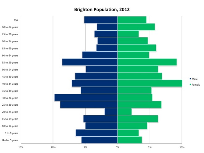
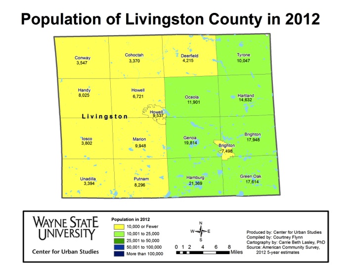
In 2012 in Brighton, 51.6 percent of the male population was between the ages 25 and 59 in 2012 and 70.7 percent of the female population was in that age range. The age group of 40-44 had the highest percentage of females in 2012, with 10.6 percent of the female residents being in that age range. For males, the most common age group was between the ages of 30 and 34; 9.8 percent of the male population was in that age range. In Brighton, the 20-24 age group was the least numerous, with 2 percent of males in Brighton being in that age group and 2.2 percent of females. Brighton is the only city in this post where there were more older men than women. This can be seen by the fact that the percent of males aged 85 and above was 5.2 percent while only 4.5 percent of females were aged 85 and above.

Slide07

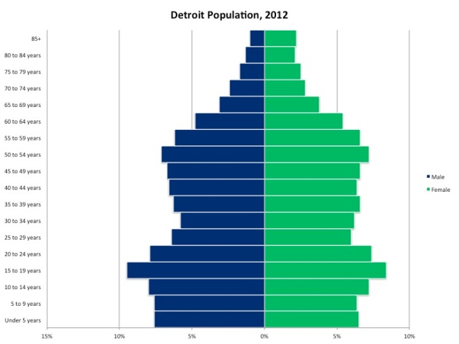
The city of Detroit compared to the other cities in this post, with the exceptions of Port Huron and Monroe (for females) had a relatively high birth rate, as can be seen by the fact 32.7 percent of the males in the city were aged 19 or below and 28.5 percent of the females in Detroit were below the age of 19 in 2012. According to the Michigan Department of Community Healthy, the city’s birth rate in 2012 was 14 per 1,000 residents; the state’s was 11.4. Detroit’s population bulge occurred in the 15-19 age group for both males and females. Also, in 2012, according the Michigan Department of Community Health the infant mortality rate in Detroit was 15 while the state of Michigan’s was 6.9.

As the population ages, the chart shows a more traditional male-to-female ratio in the older years, unlike in Brighton. Starting with the 60 to 64 age grouping, there began to be a larger difference between the percent of males represented versus the percent of females represented in the population. In total, 14.3 percent of the males in Detroit were aged 60 and above in 2012 compared to 18.8 percent of females who were aged 60 and above.

Slide09

For the city of Livonia, the population bulge in 2012 was between the ages of 45 and 59 for both males and females (25.2% of both males and females where in this age range), highlighting the baby boomers, who would have been between the ages of 47 and 66 in 2012. Overall, the population pyramid for Livonia’s population in 2012 shows that the population was middle aged. For males, the age group with the highest representation was the 50-54 percent age group with 8.9 percent. For females, the 50-54 age group had the highest representation at 9.2 percent.

Slide11

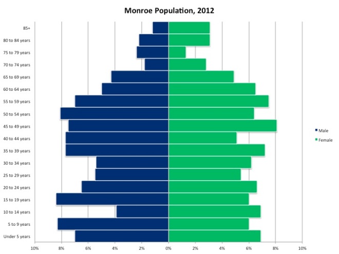
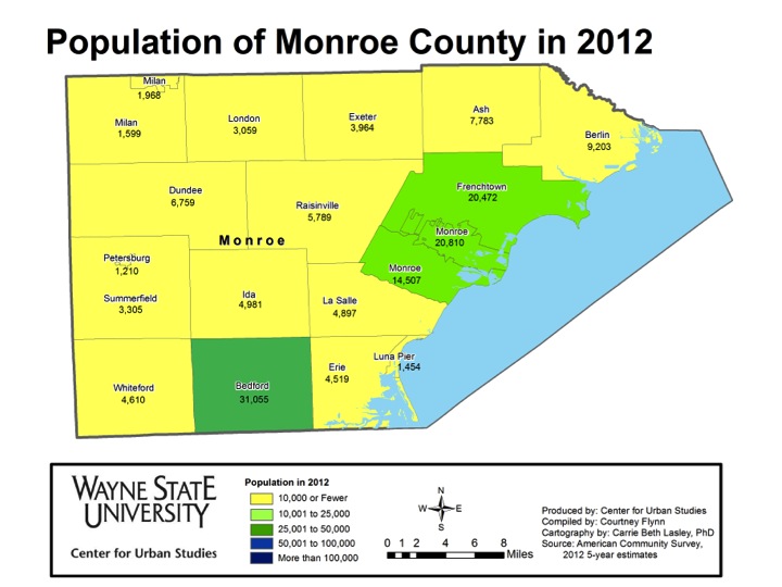
The population pyramid shows Monroe’s population was fairly stable, with a fewer percentage of both males and females in the 25-34 age range. Also, aside from those five-year ranges aged 70 and above, males between the age of 10 and 24 years of age were the smallest group at 3.9 percent, indicating an aging population.

Slide13

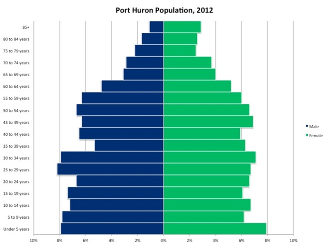
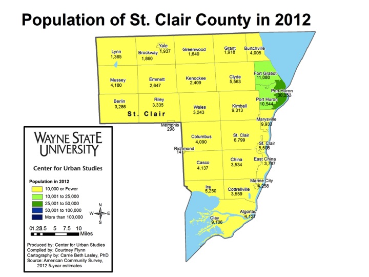
In 2012, Port Huron’s population pyramid showed that the population was slightly growing, because of the high dependent population, which is those age 9 and under, and overall pyramid shape to the population distribution, with a wide base and narrow top, closely resembling a pyramid. At that time, 26.9 percent of females in Port Huron were 19 or under and 30.3 percent of males were 19 or under. In Port Huron in 2012 the birth rate was 14 per 1,000 residents, compared to the state’s rate of 11.9.

Slide15

The population pyramid above, which represents Sterling Heights, is more stable, seeing as how a majority of the age groups represented in the chart made up similar percentages of the population in 2012. For males, the 45-49 age group was the most represented at 7.9 percent and for females the 50-54 age group had the highest representation at 7.8 percent. Sterling Heights, like Livonia, shows a bulge in the population just beyond child-bearing years, but still of working age.

Slide17

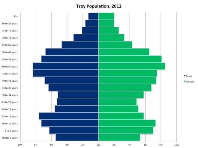
For the city of Troy, those between the ages of 35-69 and 5-19 for both males and females were part of the population bulges. For males, the age groups of 45-49 and 50-54 each had the highest representation of the population at 8.9 percent. For females, the 50-54 age group had the highest representation at 8.4 percent. In addition to the middle-age population bulge, this chart shows that in recent years birth rates started to decline, as can be seen from the transition from the under 5 years of age group up through the 15-19 years of age group. For example, in 2012 the birth rate per 1,000 in the city of Troy, according to the Michigan Department of Community Health, was 9.8 per thousand residents (this is less than the state’s and far less than Detroit’s 14). Those under 5 years of age for males made up 5.5 percent of the male population, and females under the age of 5 made up 5.3 percent of the female population.

Overall region experiences slight population loss from 2012 to 2013

One important aspect of understanding a region is to understand its population distribution and demographics. To keep our readers updated on this we regularly update our maps to reflect the most current population statistics.

In this post, 2012 population statistics from the American Community Survey are presented.

Slide05


Overall, this post will examine the 2012 population numbers for the municipalities located in Southeastern Michigan; this is because 2013 population statistics are not yet available at the local level. However, above we provide a comparison of the counties’ populations from 2012 to 2013. Wayne County experienced the largest decrease from 2012 to 2013, about 47,196 residents left, about 32,000 of those residents left from within the city of Detroit. According to the American Community Survey, every other county lost residents as well, with the exception of Monroe and St. Clair counties. These losses were minute next to the loss experienced in Wayne County. The county that lost the second highest number of residents from 2012 to 2013 was Oakland County; about 4,700 residents left from 2012 to 2013. Monroe County gained 77 residents and St. Clair County gained 62.

Although Detroit’s population has been declining since the early 1960s, it still remains the largest city in both the region, and the state. In 2012, the population was reported to be 721,459, about a 1 percent increase from the population of 713,000 in 2010.


In Wayne County, the City of Detroit was the only municipality in which the population exceeds 100,000. In the seven-county region there were only four municipalities with a population exceeding 100,000– Detroit (721,459), Warren (134,550), Sterling Heights (129,887) and Ann Arbor (114,725). Warren and Sterling Heights are located in Macomb County and Ann Arbor is in Washtenaw County. In Oakland County, where the total population was 1,207,297 in 2012, the municipality with the highest population was the city of Troy (81,307).

The Tri-County Region (Wayne-Oakland-Macomb) contained the largest portion of the population in Southeastern Michigan in 2012, about 84 percent. Livingston, Monroe St. Clair and Washtenaw counties did not have one municipality with a population above 35,000. Washtenaw had just Ann Arbor and Ypsilanti exceeding this figure. In Livingston County, Hamburg Township had the highest population at 21,396. In Monroe County, Bedford Township had the highest population at 31,055. Port Huron had the highest population in St. Clair County at 30,253. As already noted, Ann Arbor had the highest population in Washtenaw County at 114,725.

Since 2010 the overall population in Southeastern Michigan has experienced a population increase, despite decades of population decline, with the city of Detroit falling from the fourth-largest American city in the mid-twentieth century to barely cracking the top 20 today. However, the region is still home to around four million people, and it is second only to Chicago among other Midwestern metropolitan areas.

Females make up majority of Southeastern Michigan’s population

In this post, we use American Community Survey data from 2012 to examine the male/female, or sex, ratios across Southeastern Michigan. A population’s male/female ratio is reported as the number of males per 100 females. In each of the seven counties in the region, and in a majority of the region’s municipalities, there were more females than males. There were, however, about three dozen rural municipalities where males outnumbered females.

SEMCOGGender (2)

In 2012, Wayne County had the highest percentage of females in the seven county region. The county’s population was comprised of 52 percent females and 48 percent males. This is the same as a male/female ratio of of 92.44, where there were 92.44 males for every 100 females. The city of Detroit, located in Wayne County, had an even lower male/female ratio; there were 89.2 males for every 100 females.

In the region, Livingston County was the closest to having the population equally divided between males and females. The 2012 male/female ratio was 99.83 males per 100 females. For this county that meant the population was almost exactly 50 percent male and 50 percent female.

Gender - SEMCOG City SUBs (only calledout)

There were several municipalities throughout the region with a male/female ratio that was either much higher or lower than that county’s average. For example, the small rural community of York Township in Washtenaw County had the highest male percentage in the region. York’s population was 59.2 percent male and 40.8 percent female. Lyndon Township, also located in Washtenaw County, had the second highest male population at 56.8 percent; 43.2 percent of the population was female. A majority of the municipalities with more males than females are located in the rural areas. One might speculate that these communities have many farmers who may be either widowers or single males.

Royal Oak Charter Township in Oakland County was the municipality with the lowest percentage of males in the region. The township’s population was 59.9 percent female and 40.1 percent male. Overall, Oakland County was 51.5 percent female and 48.5 percent male.

Genderdetroitcensus (only3callouts)

In the city of Detroit in 2012, there were 89.2 males for every 100 females. In the same year, there were also census tracts with disproportionate ratios of either males or females. For example, census tract 9851, which borders the city of Hamtramck, had 233.3 males per 100 females. This meant that 70 percent of the population was male and 30 percent was female. In tract 5064, north of Hamtramck, the ratio was even higher; there were 363.8 males for every 100 females. This meant that 78.4 percent of the population was male and 21.6 was female. The lowest ratio was in census tract 5337, where there 44.5 males per every 100 females; this also meant 69.2 percent of the population was female.

African Americans most likely to leave Wayne County

This post breaks down the top locations of out-migrants and in-migrants by race, age, educational attainment and income from years 2006-2010 and 2007-2011 (depending on the data). As you will see, there are certain groups that are much more likely to leave Wayne County.Slide03Wayne County has lost a large share of its residents to out-migration. The high out-migration is reinforced by the chart above, which shows the ratios per category for those coming into Wayne County, compared to those leaving. African Americans had the largest disparity; for every one African American who moved into Wayne County, 27 left. The age group of 60-69 had the smallest disparity; for every one person that age who moved in, two left.

Slide05

Slide06  Of the top 10 destination counties for out-migrants, seven of them were in Michigan. In total, 13,417 residents left Wayne County to move elsewhere. For White in-migrants to Wayne County, only four of the top sources were other Michigan counties. In total, 897 White in-migrants moved to Wayne County between 2006 and 2010.Slide09Slide08  Five of the top 10 destinations for Latino out-migrants were other Michigan counties, with Kent County ranking first with a total of 273 people; in total there were 682 Latinos that left Wayne County between 2006 and 2010. Only three of the top 10 sources of in-migrants were in Michigan. The county that provided the most in-migrants (238) was Cook County, Illinois. Cook County is the home of Chicago, which is a major entry point for Latinos into the Midwest. The Cook County numbers were 41.5 percent of the Latino population that entered Wayne County between 2006 and 2010.Slide11Slide12  A large number of African Americans left Wayne County for areas immediately around it—Oakland, Macomb and Washtenaw Counties. Far fewer African Americans moved into Wayne County. This is consistent with the substantial increases in African Americans throughout the inner suburbs of Detroit, which commentators suggest is driven by the search for better schools and safer communities. Of the top 10 locations African American in-migrants left to move to Wayne County from, only three counties were in Michigan (St. Clair, Alger, and Ottawa counties) from 2006 to 2010. In total there were seven counties in Michigan in which African Americans migrated to Wayne County from. There was a total of 197 African American residents who moved from Dakota County, Minnesota, to Wayne County; this location had the most African American in-migrants come from one place during this period. This location represented 22 percent of the total African American population that moved into Wayne County between 2006 and 2010.Slide14Slide15
  For the three charts above and the three below, only certain age groups were examined to show the movement of families, young people and the elderly. We wanted to see if the assumption that the elderly would have a higher rate of out-migration, as they typically move to retirement communities, was true. It was not. For all age groups represented above, Oakland and Macomb counties had the highest number of Wayne County residents move within their boundaries. Of the three groups, children were the largest (5,375), followed by young adults (1,309). Only a total of 258 Wayne County residents from the 60-69 year old age group moved to those two counties.Slide18

Slide15

Slide19Slide20  Few children between the ages of 5 and 17 moved to Wayne County from elsewhere in the state. There were 32 in-migrants from Ottawa County and 30 children from Ingham County. Those between the ages of 25 and 30 from within the state of Michigan represented larger in-migration numbers. For example, 326 residents moved from Washtenaw County to Wayne County, 91 from Genesee County, 82 from Ingham County and 53 from Kent County.Slide22Slide23Slide24  Wayne County is losing many residents of all education levels to the out counties and beyond. Of those with bachelor’s degrees, from 2007 to 2011, 1,566 went to Oakland County and 256 went to Macomb County; in total 3,417 residents with bachelor’s degrees left Wayne County. Oakland and Macomb counties also received the highest number of Wayne County residents with less than a high school degree and a graduate or professional degree.Slide26Slide27Slide28  At each educational level, immigrants represented just a fraction of out-migrants. There were 424 residents with a bachelor’s degree from outside Wayne County that moved in. There was a net total of 272 people with a graduate or a professional degree who moved to Wayne County and 499 people without a high school diploma who moved in. A Michigan county ranked number one for each education level represented here, in terms of residents leaving to move to Wayne County.Slide30Slide31  Three times as many residents who made $150,000 a year moved out of Wayne County than moved to it. Of those who left between 2007 and 2011, 253 residents went to Oakland County and another 209 went to Wake County, North Carolina. In total there were 1,869 residents who earned $150,000 or more and left Wayne County between 2007 and 2011. When examining the in-migrants, more (228) moved from Washtenaw County than any other county. Clark County, Nevada ranked second on that list with a total of 105 residents leaving there for Wayne County. Overall, 644 people who earned $150,000 a year or more moved to Wayne County.

Wayne County loses more residents than gains

From 2007 to 2011, Wayne County consistently decreased in population, according to the U.S. Census Bureau’s American Community Survey 5-year estimates for the period. The results indicate a net total of more than 45,000 people left the county, with 53,000 residents leaving and 8,000 new residents moving into Wayne County during that period.

This week, we will explore the overall domestic migration patterns. In a later post, we will examine the data behind Wayne County migration to better understand who is coming into and departing.

First, we will examine the net numbers. From 2007 to 2011, Wayne County had a net loss of residents to the rest of Michigan and to 41 other states.   There was also a net gain of residents from 8 states. Across all states, a total of 813 counties gained residents from or lost residents to Wayne County. The majority (566 counties) gained residents from Wayne County. The map below shows the rate of loss or gain in the counties that had residents relocate to or from Wayne County during that period.

Slide03

From 2007 to 2011, a total of 28,252 Wayne County residents chose to relocate within their home state of Michigan. No other state gained more than 2,000 Wayne County residents. The most popular relocation states for Wayne County residents are listed below with their total of out-migrants from Wayne County. Neighboring Ohio gained the second highest number of out-migrants from Wayne County, followed by eight southern states. Except for California, Arizona and Texas, these states are largely those Southern states from which the Great Migration came into Michigan came in the early part of the 20th Century.

Slide05

Out-migration also had three distinct patterns, as listed in the chart below. Neighboring counties received the largest numbers of Wayne County out-migrants. Just under half of all departing residents chose Oakland, Macomb or Washtenaw for their destination. Noted retirement centers in the West and South also drew a fair amount of Wayne residents, as did smaller municipalities in other parts of Michigan.

Slide07

From 2007 to 2011, there were eight states that were sources of in-migration of residents to Wayne County. These states, listed in the table below, were more rural with predominantly cooler weather conditions. Sparsely-populated Alaska was the largest source of in-migration to Wayne County from 2007-2011, relocating 680 residents to the Detroit area.

Slide09

When considering the counties that were the source of the most in-migrants to Wayne County, as shown in the chart below, three patterns emerged. First, other large cities contributed many residents to the area – including Anchorage, the Bronx, Chicago and Minneapolis. Wayne County also had in-migrants from some of the most rural areas in Michigan, including Berrien County, Eaton County and Newaygo County. Military outposts such as Annapolis and Fort Payne are also contributors to the Wayne County population, possibly representing residents returning to the area after service.

Slide11


The next map takes a closer look at the regional patterns. Wayne County had a net gain of residents from counties that border the Great Lakes and other larger cities, including Chicago, St. Louis, Buffalo and the New York metro area. It is still a net-loser of residents to most of the region’s small cities and interior rural areas.

Slide12

Next week we will continue to look at migration as relates to Wayne County. The upcoming post will drill down on the sex, age and income levels of residents leaving and moving to the region.


Catholics represent largest religious population in Southeastern Michigan

In the seven-county region there are several different religious denominations represented. We examine the rate of religious membership to some of the most prevalent denominations in the region. In the following maps,  the percentage of residents who claim active membership with these groups will be shown using data from the Association of Religious Data (ARD) and the 2010 American Religious Census; the  definitions for these groups are provided below by the ARD.

Catholicism: A form of Christianity where there is a hierarchy of bishops, priests and the pope. In the Catholic Church priests must also be celibate.

Mainline Protestantism :Typically moderate and liberal theological denominations that include the United Church of Christ, Methodist Church and the Episcopal Church.

Evangelical Protestantism: A more conservative movement in the Protestant Church that emphasizes the importance of sharing ones’ faith with non-believers, which is focused on a strong personal relationship with Christ. Examples include Baptists, Anabaptists, Church of God and Pentecostals among others

Black Protestantism: A branch of Protestantism that is similar to Evangelical Protestant denominations. African American protestants focus on the importance of justice and freedom. Such denominations include  the National Convention Baptist of America and the African Methodist Episcopal Zion; there are seven major denominations.

Islam: Muslims follow the text of the Koran and focus on the “oneness of God”. There are five pillars practiced in Islam: praying, fasting, almsgiving, pilgrimage and testimony of faith. The two divisions of Islam are Sunni and Shi’a.

Judaism: This is based on texts in the Hebrew Bible

Orthodox Christianity: This includes both Eastern Orthodox Christians and Oriental Christians. In these forms of Christianity there is no central form of leadership.

Latter Day Saints: Also known as Mormonism, this religion is guided by the Book of Mormon and aspects of the Bible. They seek to restore the New Testament.

Those who identify themselves as Catholics in the region represent the largest religious based population. The state percentage of Catholics was 17.4 percent. Two counties in the region (Wayne and Washtenaw) where the Catholic population was below that percent. Macomb County had the largest population of Catholics in the region at  29.7 percent.

Macomb County had the lowest percent of residents (2.5%) who identified themselves as Mainline Protestants. With the state average being 6.6 percent, Washtenaw (7.5%), Monroe (6.6%) and St. Clair (6.7%)counties were the only ones in the region that were above the state average.

Wayne County had the largest percent of Black Protestant practitioners in the region at 6.6 percent. The county with the second highest population of Black Protestant practitioners was Washtenaw County and that percentage (1.6) was 5 percentage points below Wayne County and .6 percentage points below the state average (2.2%). The City of Detroit is in Wayne County, where the largest African American population resides.

Overall, Evangelical Protestants represent more of the state’s and region’s population than do Mainline or Black Protestants. According to the data, state average for Evangelical Protestants is 12.9 percent. In Monroe County, 17.5 percent of the population is comprised of residents who identify themselves as Evangelical Protestant practitioners; this is the only county in the region above the state average. Washtenaw County had the lowest representation at 7.3 percent.

The state average for Judaism practitioners was 0.4 percent and five the seven counties in the region were below this average with 0.0 percent of their population being affiliated with this religious group. Oakland County had the highest population at 3.0 percent. The Holocaust Memorial Museum of Michigan is located in Oakland County, as is the Jewish Federation of Metropolitan Detroit.

Those who are members of the Muslim religious group in Southeast Michigan were most heavily represented in Wayne County at 3.6 percent, above the state average of 1.2 percent; the City of Dearborn is located in Wayne County. The only other county above the state average was Washtenaw County where 1.3 percent of the population identified as being a practitioner of Islam.

The state average for those who practice Orthodox Christianity was 0.5 percent; Wayne (0.9%), Oakland (1.1%) and Macomb (1.1%) were the only counties in the region above the average. Livingston County was the only one in the region where 0.0 percent of the population stated that they did not affiliate with this religious group.

The Church of Latter Day Saints is one of the religious groups in the region that has a lower representation. Washtenaw County was the only county in the region above the state average of 0.6 percent; with practitioners representing 0.9 percent of the population.

This map shows the percentage of people in the region who either don’t affiliate with a religion or who aren’t associated with the most common religions discussed in this post. The percentages represented in the map above are not directly correlated with irreligion or atheism. According to the data, in the state of Michigan, 57.9 percent of the population did not identify with one of the common religious groups or with one at all. St. Clair, Washtenaw, Livingston and Monroe Counties were above  the state average with Washtenaw County having the largest population at 67.2 percent.

Detroit vacancies increase from September 2013 to March 2014

According to data provided by the US Postal Service, residential vacancies have increased by 1,502 from January 2014 to March 2014. From September 2013 to March 2014 vacancies increased by over 2,000. According to USPS, they determine that a residency is vacant if an occupant has not collected their mail for 90 days are more.

The Center for Urban Studies creates a data base with this information and it provides a more in-depth look at the vacancies. The USPS publicly releases the vacancy data on a quarterly basis; this is possible through an agreement with the U.S. Department of Housing and Urban Development.