Poverty in Metro-Detroit spreading through the suburbs

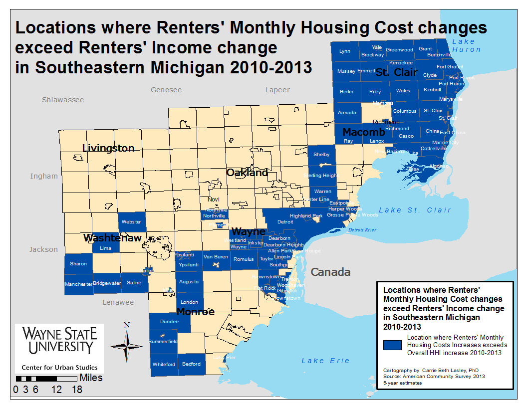
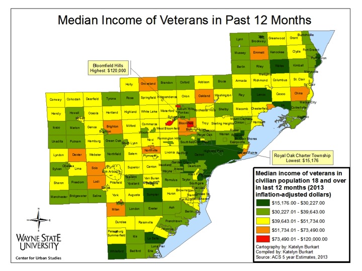
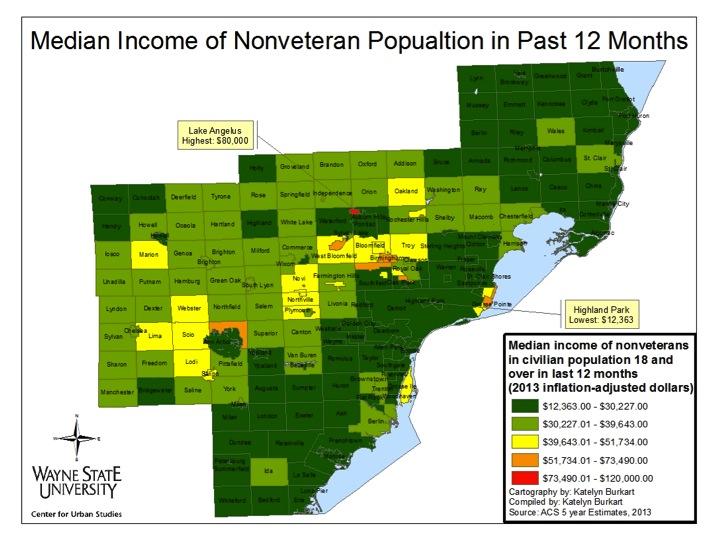
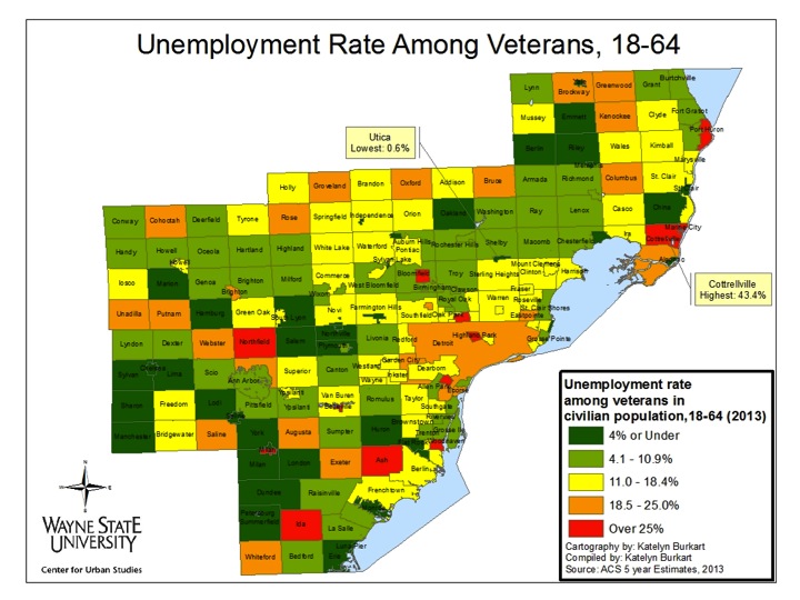
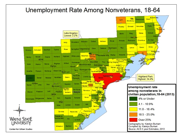
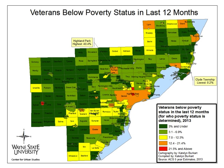
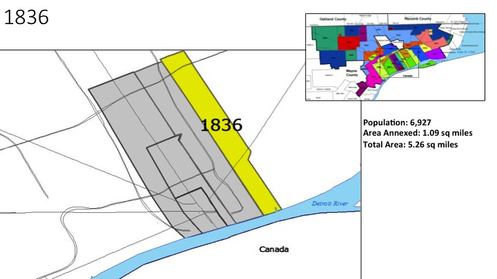
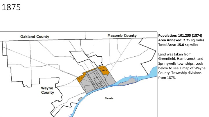
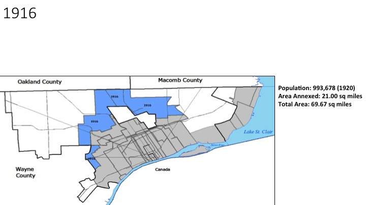
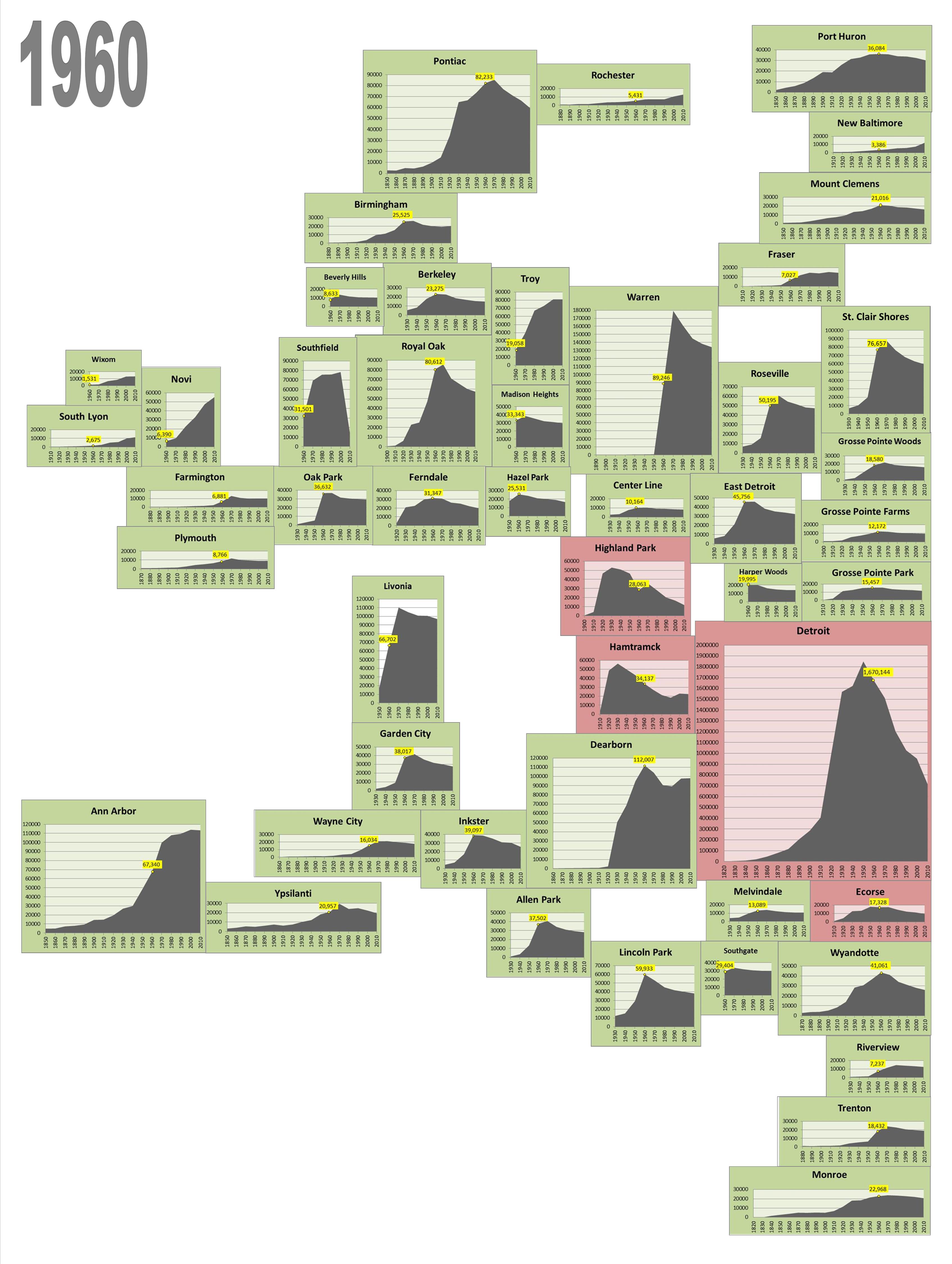
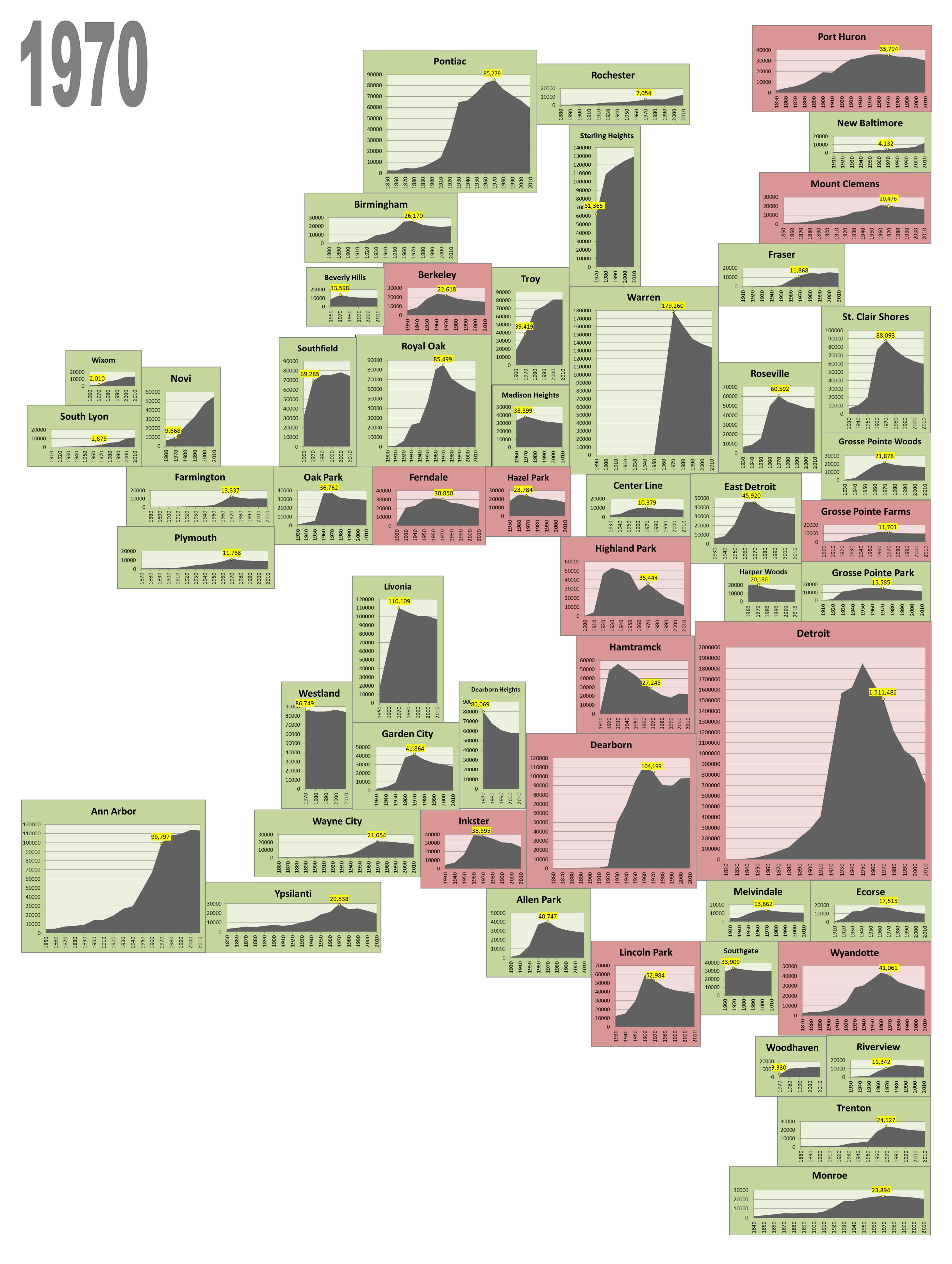
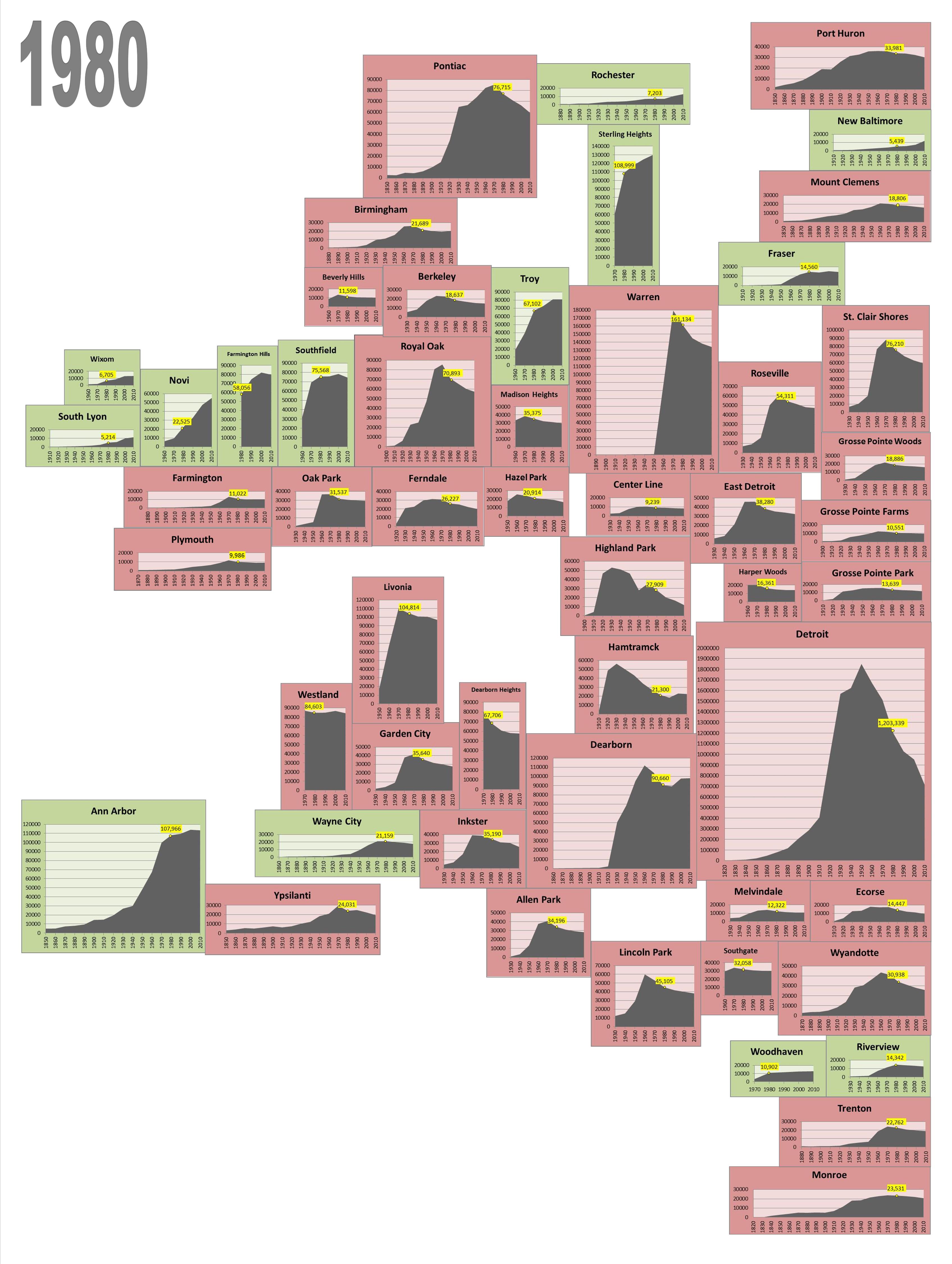
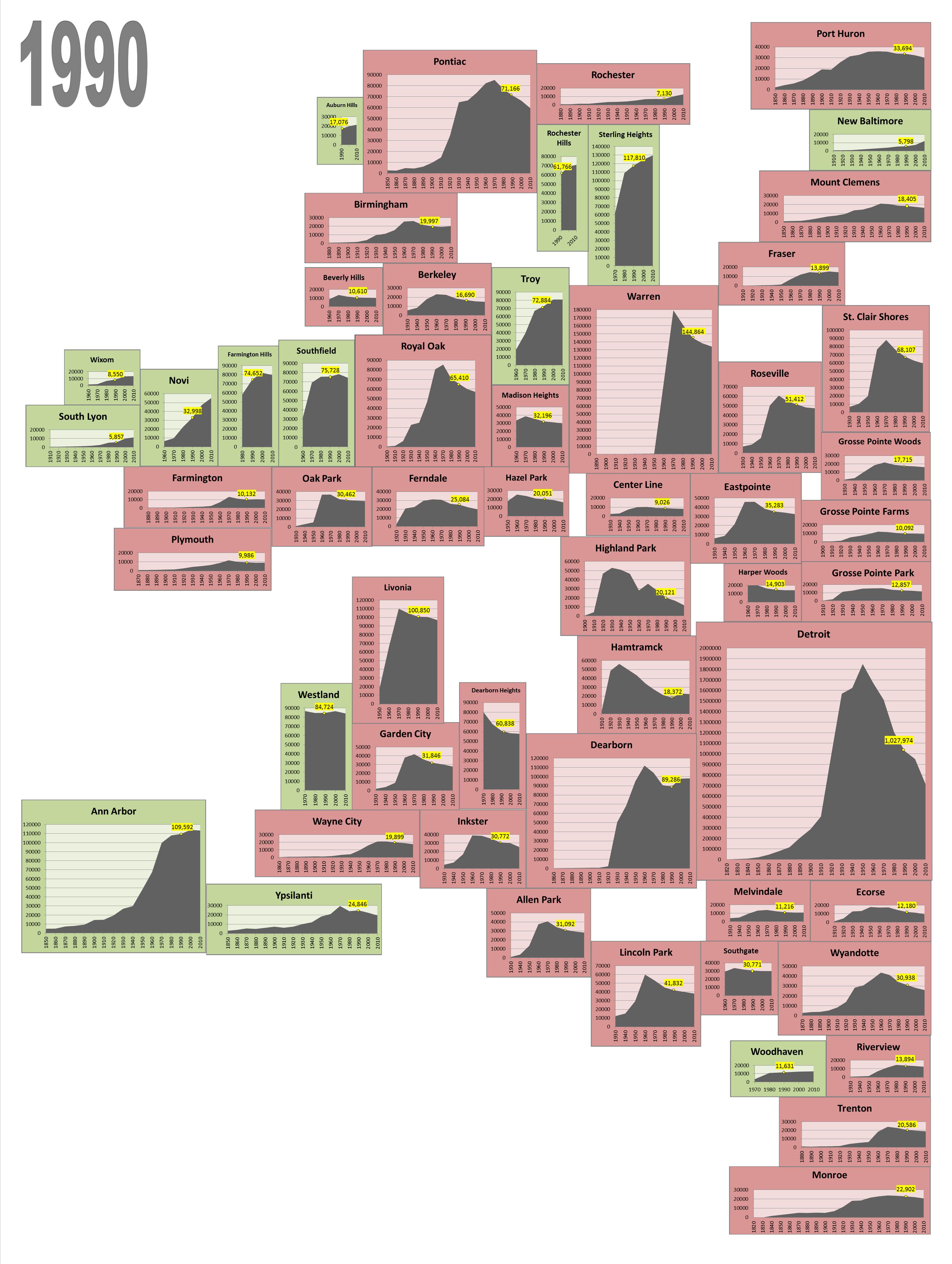
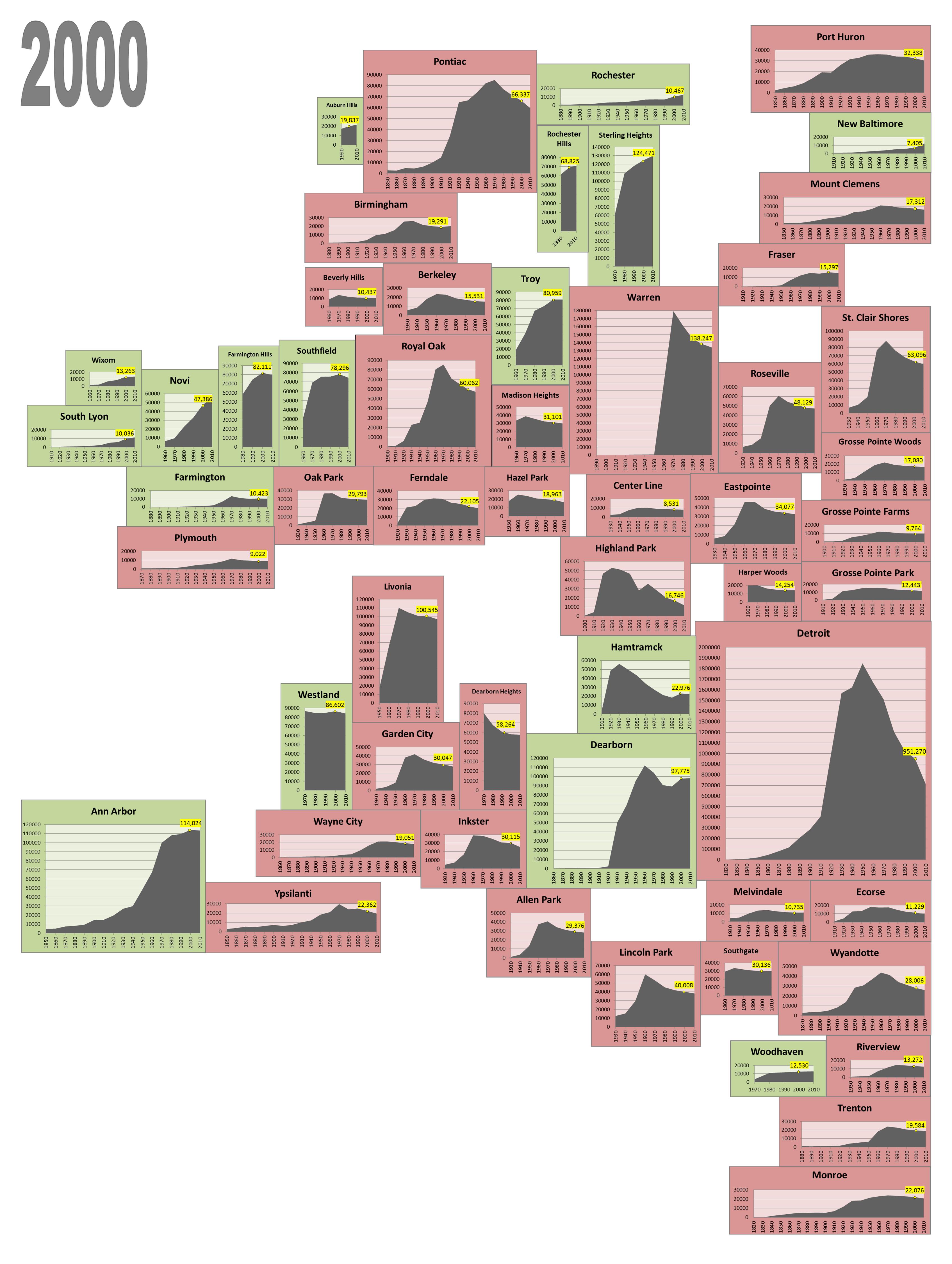
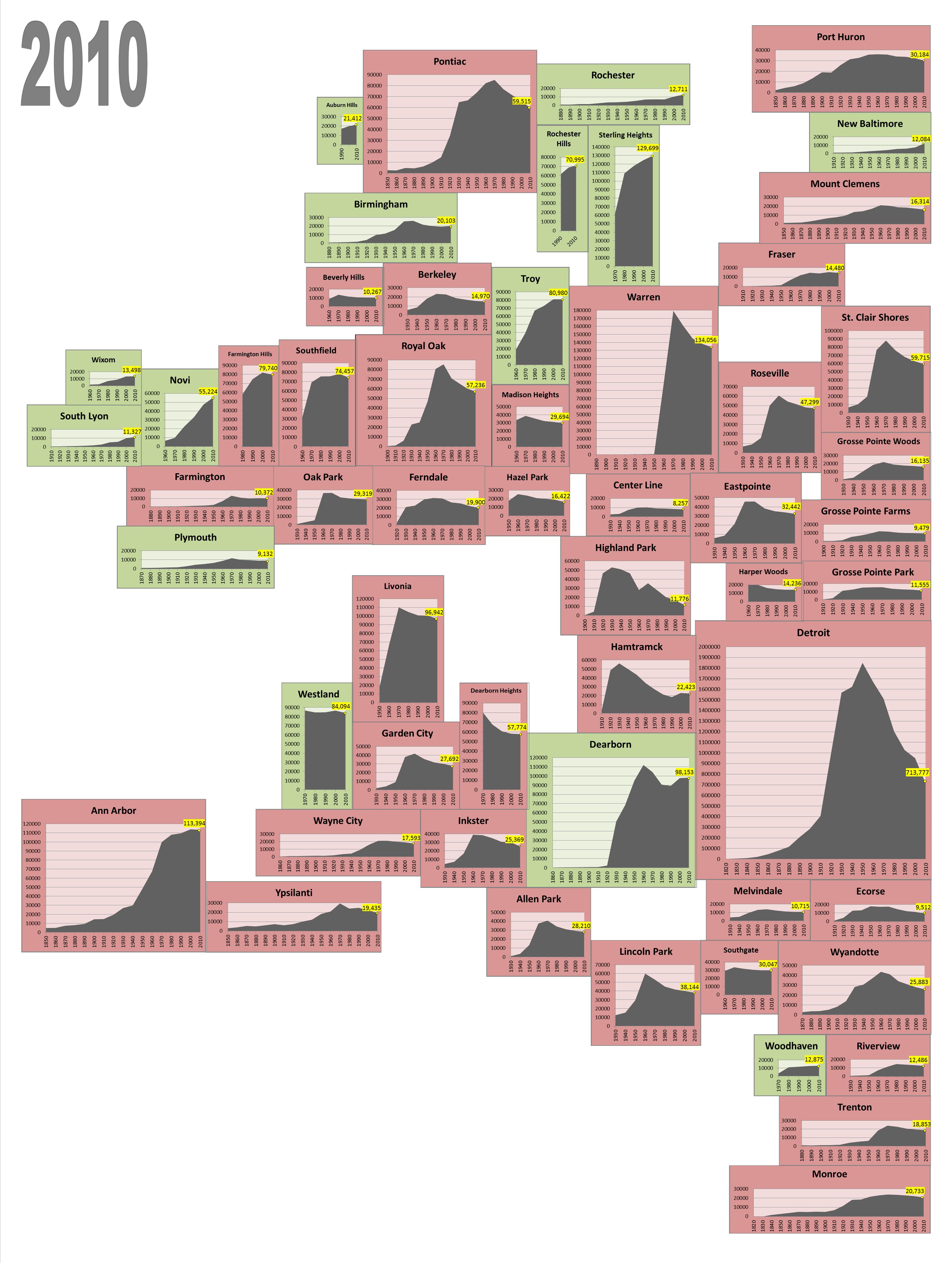
Between 2009 and 2014, poverty levels in the region’s urban communities, such as Detroit, Pontiac and Highland Park, increased, just as they did for some of their suburban neighbors. One might assume that the city of Detroit had the region’s highest percentage of residents living below the poverty level in 2014 due to the amount of press coverage it receives regarding poverty, crime, and various economic indicators. However, the city of Hamtramck, an immediate neighbor to Detroit, actually had the highest percentage of residents living below the federal poverty level in 2014.

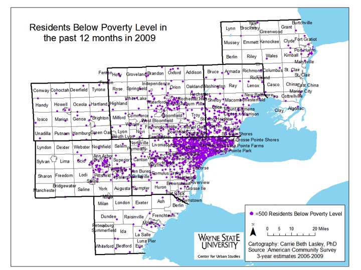
This post will examine the percent of residents throughout the region below the poverty level in 2009 and 2014. Both the change in percent and concentration will be shown with various maps. For reference, according to the U.S. government, the Federal Poverty Level (FPL) in 2014 for a family of four was $23,850; in 2009 the FPL was $22,050 for a family of four.

DetroitPoverty2009


DetroitPoverty2014

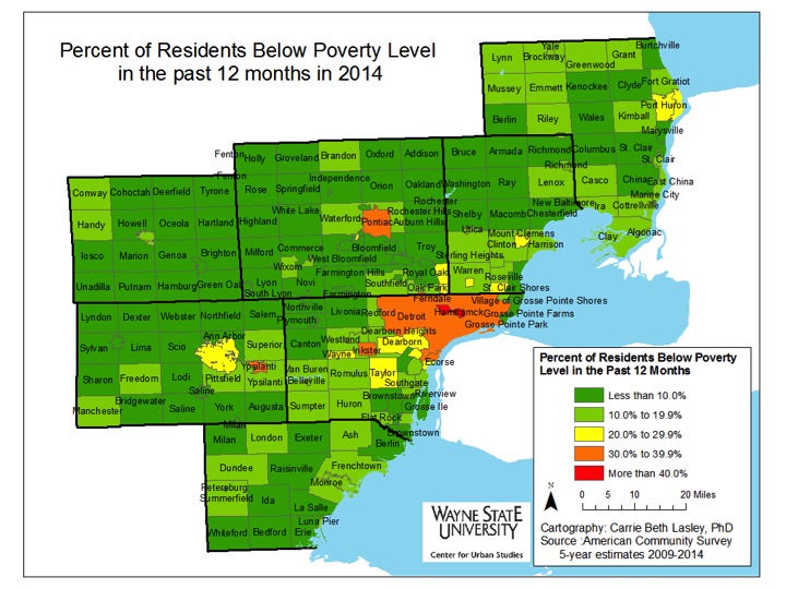
In 2014, the cities with 30 percent or more of residents living below the poverty line were:

  • Ypsilanti: 30.6%
  • Inkster: 37 %
  • Pontiac: 37.8%
  • Detroit: 39.4%
  • Highland Park: 47.6%
  • Hamtramck: 48.5%


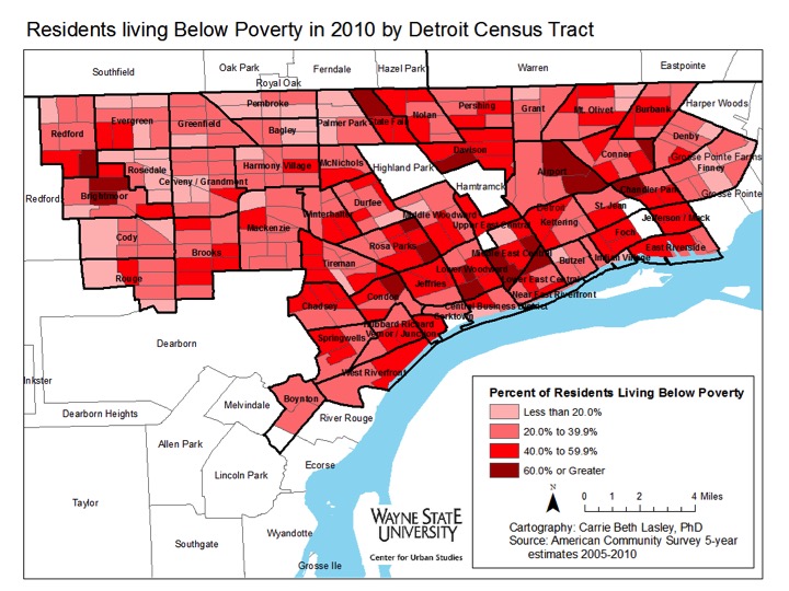
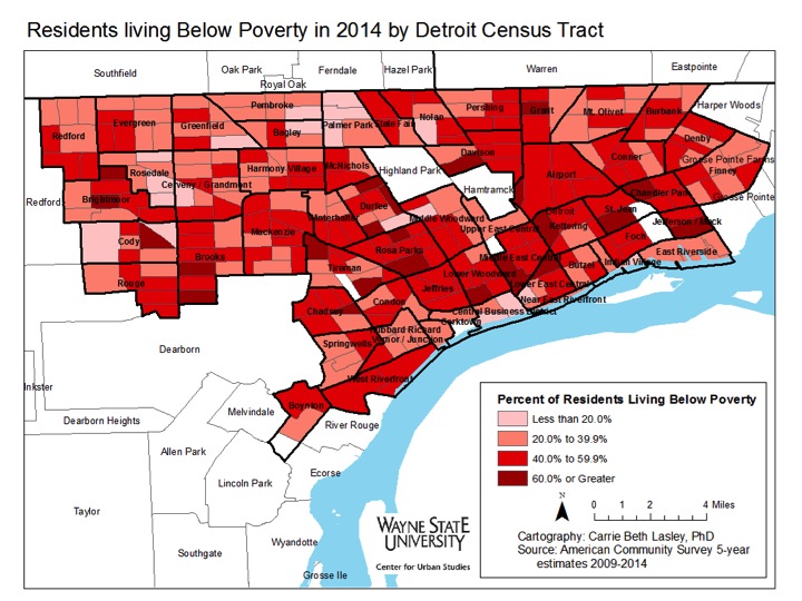
As mentioned above, in 2014, the city of Hamtramck had the highest percentage of individuals living below the poverty line at 48.5 percent; in 2009, that number was 38.4 percent. In the city of Detroit, the percentage of individuals living below the poverty line increased from 33.2 percent in 2009 to 39.4 percent in 2014.


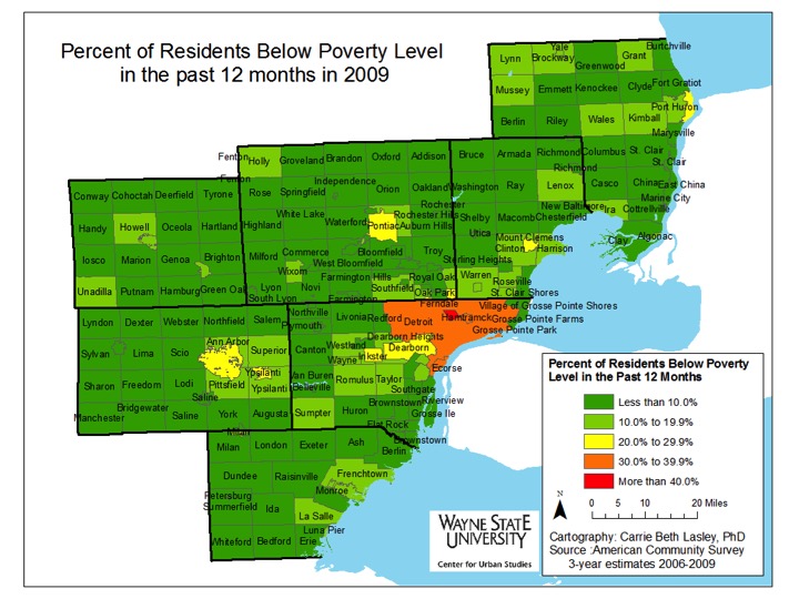
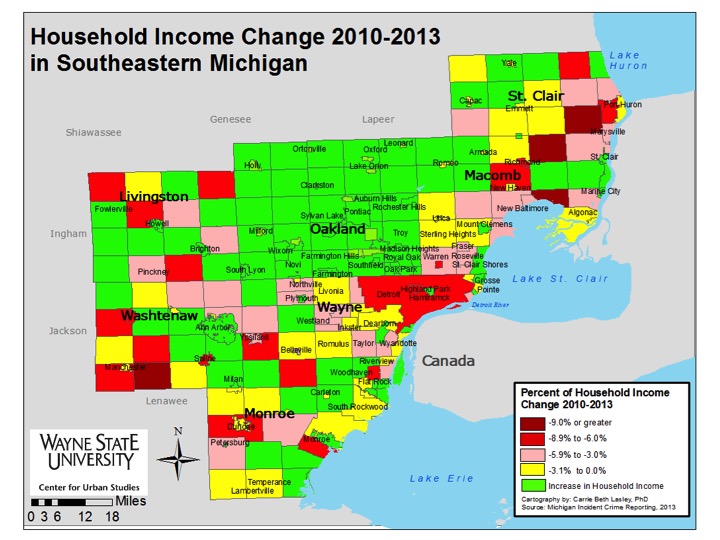
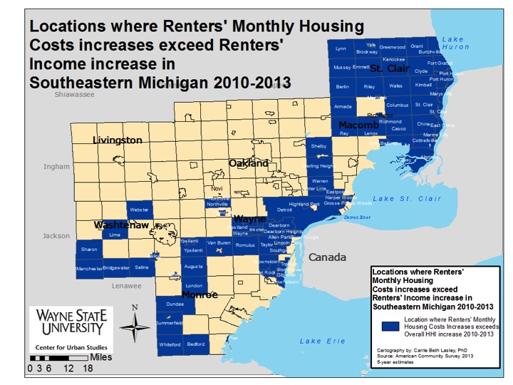
Each county within the Southeastern Michigan region, with the exception of Livingston County, experienced an increase in the number of communities with a higher percentage of residents living below the poverty line between 2009 and 2014. For example, in 2009, a majority of St. Clair County had less than 10 percent of its residents living below the poverty level, but by 2014 that shifted to between 10-19 percent of residents. There were some communities within that county, though, such as Fort Gratiot and Port Huron Township, which experienced a decrease in the percentage of people living below the poverty level. The higher poverty levels in St. Clair County shifted to the more rural area (the northern part of the county) and to the waterfront communities. Overall, the percentage of individuals living below the poverty line in St. Clair County in 2014 was 15.2 percent.


Another visible increase in the percentage of residents living below the poverty level was in the southern portion of Macomb County. Here, cities such as Eastpointe, Sterling Heights, Center Line and Utica all went from having less than 10 percent of their populations living below the poverty level to between 10 to 19 percent of the populations living below the poverty level. For Eastpointe, just under 10 percent of the population lived below the poverty level in 2009 and in 2014 that percentage increased to 23.5 percent. In Sterling Heights, 7.9 percent of the population lived below the poverty level in 2009, and in 2014 that number increased to 13 percent. Macomb County’s overall poverty rate was 12.2 percent in 2014.

The increase in the percentage of individuals living below the poverty line took place in Wayne County as well, with Redford, Flat Rock, Inkster, Wayne, and the southwest portion of the county all experiencing visible changes. Overall, Wayne County had a poverty rate of 24 percent in 2014.

While several communities throughout the region did experience an increase in the percentage of residents living below the poverty line there were, as noted above, some that experienced a decrease. For example, in 2009, 10.5 percent of the population in Howell Township in Livingston County lived below the poverty line and in 2014 that number was 4.6 percent.

Among the counties in Southeastern Michigan, Livingston County had the lowest percentage of individuals living below the poverty level in 2014 at 5.4 percent. The percentage of individuals living below the poverty level in Oakland County in 2014 was 9.9 percent and in Monroe County it was 11.8 percent.

SEMichiganPoverty2009

SEMichiganPoverty2014

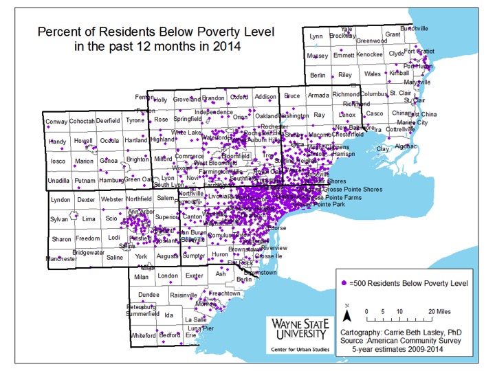
Poverty, while being largely concentrated in the city of Detroit, has shifted outward toward the suburbs between 2009 and 2014, as illustrated above. In Wayne County, areas of Detroit, such as downtown, have experienced decreases in the percentage of individuals living below the poverty line while places such as Westland, Romulus and the western portion of the county have experienced an increase. To the north of Detroit, communities in southern Macomb County, such as Eastpointe, and in southeastern Oakland County, such as Hazel Park and Oak Park, have also experienced an increased percentage in the number of residents living below the poverty line.


Ann Arbor, while not experiencing a shift the magnitude of Detroit’s, has also seen its populations living below the poverty levels shift to nearby areas like Pittsfield and Scio. Additionally, in Ann Arbor, poverty concentration has decreased in the northeastern portion of the city and dispersed throughout the entire city.


While the region has experienced a slight shift and a clear growth in concentrated poverty, this isn’t an uncommon trend for other metropolitan areas throughout the Midwest region. According to “Architecture of Segregation: Civil Unrest, the Concentration of Poverty, and Public Policy,” a new study by the Century Foundation, concentrated poverty has spread from within the boundaries of metropolitan cities and into the inner ring suburbs. This has been attributed, in part, to the gentrification and increased taxes of urban communities, which has resulted in the movement of residents who are living below the poverty level to inner ring suburbs with aging infrastructure.

DetroitPovertyChange

DetroitPoverty2009

DetroitPoverty2014


DetroitPovertyConcentration2010

PovertyDetroitDD2014


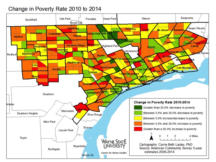
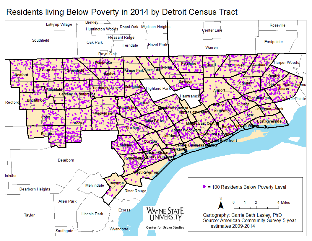
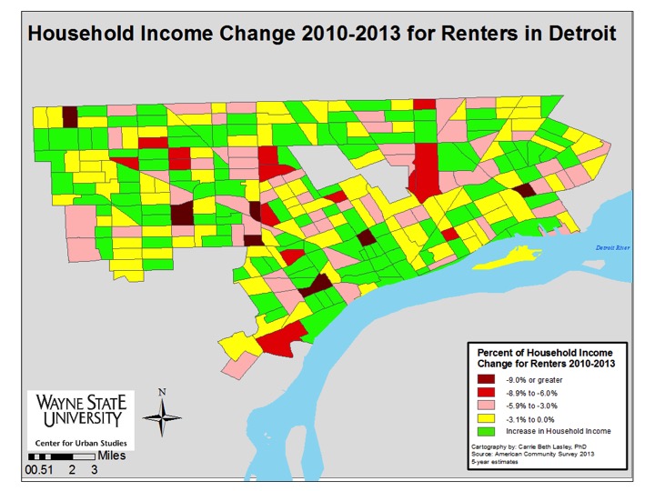
Between 2010 and 2014, pockets of Detroit neighborhoods experienced a decline in the percentage of individuals living below the poverty line while others experienced increases upwards of 20 percent. Concentrations of poverty in Detroit increased in areas such as Cody/Rouge, the neighborhoods bordering Grosse Pointe Farms, along the borders of Hamtramck, and the Southwest neighborhoods of the city.

Only about a dozen census tracts had less than 20 percent of individuals living below the poverty line in 2010. A majority of these census tracts were located on the city’s west side, west of Palmer Park and near Rosedale Park, along with about four bordering the Grosse Pointes on the east side. By 2014, a majority of those census tracts experienced at least a 5 percent increase in the percentage of residents living below the poverty level.


The neighborhoods along Woodward Avenue north of Highland Park, such as Palmer Park and Green Acres, experienced some of the largest decreases in the percentage of individuals living below the poverty level in the city of Detroit between 2010 and 2014. The Midtown, East Riverside, and Corktown areas also experienced decreases in the percentage of residents living below the poverty level.


In spite of the positive trends in these neighborhoods, however, high poverty census tracts have dramatically increased in the city of Detroit since 2000, according to the Century Foundation study cited earlier. By 2014, the majority of the census tracts in the city of Detroit had between 40 and 59.9 percent of residents living below the poverty level. As such, even with the improvements made, poverty concentration continues to be a challenge in the city of Detroit.

It is policies, both new and recent, that have helped contribute to the increase in concentrated poverty. From the investment into new infrastructure, rather than fixing what already stands, to urban sprawl and the disproportionate building of homes for the middle class and wealthy to the income increases being felt by the rich, but maintaining stagnant for the poor, there are policies in place that allow the growth of poverty and concentrated poverty to occur.


Detroit’s housing costs increasing faster than incomes

Throughout Southeastern Michigan monthly housing costs for renters are increasing generally faster than their monthly household incomes, which in many cases are actually declining, according to data from the American Community Survey. Even in areas where the renters’ incomes improvements exceeded the change in overall regional housing costs between 2010 and 2013, monthly housing costs continued to increase at a rapid pace. There were areas in the region though, particularly Oakland County, where monthly housing cost increases stayed below the monthly household income increases. However, Detroit’s overall housing costs generally increased at a faster pace than the monthly income changes (largely declines) of residents.

Slide03


Slide04

Between 2010 and 2013 all Oakland County communities experienced an increase in household income while many communities throughout the rest of Southeastern Michigan continued to experience a decrease in their household income. St. Clair County had the most communities where the household income decreased more than 9 percent (three-Columbus, Ira and Kimball townships) between 2010 and 2013; the only other county where a community had such an income decrease was Washtenaw with Bridgewater Township.

When just looking at renter’s income change between 2010 and 2013 we see that there were fewer households that experienced an income decrease and more that saw their incomes increase.

According to Governing.com, Michigan is one of three states that suffers from housing affordability burdens, particularly in the rental realm. Incomes may be increasing throughout the state, but for renters earning minimum wage, those small increases often equate to the increases in monthly housing costs, especially as demand for rental units remains high.

Slide06

RentMoreHHI (1)
Slide08

Despite renters throughout the region experiencing income increases, these increases were not equal to or more than their housing costs in several communities. In St. Clair County all of the communities experienced housing cost changes above those of the renters’ monthly income. This was not unique to just St. Clair County though. Rather every county in the region, with the exception of Livingston and Oakland, had renters whose income changes weren’t keeping up with their housing cost increases. With increases in Oakland County’s renters’ income outpacing their monthly housing cost increases this could mean a number of things, including: rental prices are not increasing as quickly as places such as Detroit or Warren because demand is lower; these renters’ incomes are growing as the economy stabilizes (for places like Ferndale, Royal Oak and Rochester we see their income increases are above that of non-renters) while in areas like Detroit the median household income is lower, income growth can’t keep up with cost of housing increases.

A series of five maps drilling down into the City of Detroit (presented below) shows that pockets of the city experienced household income growth between 2010 and 2013. While there was some overlap between overall income growth and renters’ income growth, this wasn’t true for every Census Tract. One area where there was such a difference was just east of Hamtramck. Here we see that Census Tract experienced overall income growth between 2010 and 2013 but the renters there did not see their incomes increase. Renters in that area also experienced monthly housing cost increases that exceeded their income changes. In this area of the city, homeownership also appears to be more prevalent than in other areas of the city.

Throughout other parts of the city we see that the majority of Census Tracts experienced an increase in renters’ household income between 2010 and 2013. But, the increases in monthly housing cost offset most income increases. This could indicate a shift toward gentrification in some areas as long-term, lower-income renters cannot afford increasing monthly housing costs as demand for rental units in Detroit continues to grow. With a current vacancy rate of 5 percent and a desire for many suburbanites to live in areas such as Downtown, Midtown and Corktown, housing costs in the city continue to grow, according to the MetroTimes (link). It is these areas where renters experienced income growth well above the overall changes in the City of Detroit. Not every Census Tract in these neighborhoods though had renters with income changes above the overall change experienced by the city as whole.

Slide11

Slide12

Slide13

Slide14

Slide15

Detroit rental units

Suicide, Substance Use Causing Increased Mortality Rates Among White, Middle-aged Men

Suicide rates are increasing and locally the number of suicides were either highest among those 20-44 or 45-74, as detailed in a recent Drawing Detroit blog post. According to a recent New York Times article, suicide is a cause of death that is not only growing in Southeastern Michigan, but nationally. Throughout the state of Michigan, according to the Michigan Department of Health and Human Services, suicide was the fourth leading cause of death for white males between the ages of 35 and 49 (244 suicides total).

The article details recent research conducted by Princeton Economists Angus Deaton and Anne Case, which concludes that the rising death rates among middle-aged white men are being caused by suicides and issues related to substance use. According to the article, the mortality rate for white Americans between the ages of 45 and 54 with no more than a high school education increased by 134 deaths per 100,000 people. While the Michigan Department of Health and Human Services does not detail mortality rates by race, age and education level explicitly on its website, it does show that the mortality rate from white males between the ages of 45 and 54 increased from 469.7 to 494.4 between 2000 and 2013. Just as the death rate for white American males is increasing nationally, Michigan is also experiencing the plight.

While suicide rates have contributed to the growing mortality rate for this segment of the population, Deaton and Case found that suicide coupled with deaths caused by drug use and alcohol poisoning are what explained the increased mortality rate.

No direct explanations were discovered for the increase in suicide deaths and deaths caused by drug and alcohol use, however, Deaton found that increases in mortality rates for middle aged white men were parallel with the same population’s reports on distress, pain and poor health. This correlation, he said, could be used a rationale for the increase in the type of deaths.


For more on this article click here.

To learn more about suicide rates in Southeastern Michigan click here.

Veterans in SE Michigan tend to fare better with income and employment

Last week we examined where veterans live throughout the seven-county region of Southeastern Michigan and this week we take a deeper look into the socioeconomic picture for the region’s veterans. Overall, we see that veterans in the region in 2013 tended to have a higher median income level than non-veterans. Also we see that a lower percentage of veterans in the area fell under the poverty line in 2013 than non-veterans. Unemployment status for veterans throughout the region, however, varied.

This data presented in the maps below is from the 2013 American Community Survey.

When looking at median income in Southeastern Michigan at the municipal level, we see that it tended to be higher for veterans than it was for non-veterans. Municipalities such as Bloomfield Hills, Orchard Lake, and Lake Angelus – all of which have higher median income levels than the region as a whole (link to post) – also had higher veteran median income levels than a city such as Highland Park, for example, which has low median income levels.

It should be noted, however, that veterans make up a smaller portion of the population than non-veterans, and as a result, sample size may have had an influence on these numbers.

The unemployment rate among veterans varied much more than it does among non-veterans. The rate among veterans varied from 0.6 percent to 43.4 percent For non-veterans, it ranges from 2.2 percent to in 34.4 percent The locations with high unemployment also varied significantly between veterans and non-veterans, with 12 locations across five counties having over 25 percent unemployment among veterans – rates that were only seen in Detroit and Highland Park among non-veterans.

A lower percentage of veterans were below poverty status, compared to non-veterans throughout Southeastern Michigan. For both veterans and non-veterans, Highland Park had the highest percentage of residents below the poverty line: 46.2 percent of non-veterans and 25.2 percent of veterans. Only two other municipalities had more than 21.5 percent of veterans living below the poverty line: Chelsea (37.9%) and Hazel Park (27.7%). Clyde Township (0.2%) had the lowest percentage of veterans living below the poverty line.

While there were only three municipalities with 21.5 percent or more of veterans living below the poverty line, there were nine municipalities throughout the region where 21.5 percent or more of the non-veteran population was living below the poverty line. Such municipalities included Ecorse, Detroit, Pontiac, Ypsilanti and Port Huron.

Overall we see that while veterans appeared to fare better than non-veterans in terms of income and poverty status, and in some cases employment.

St. Clair County home to largest percentage of veterans in SE Michigan

Next weekend is the Fourth of July, so it’s a good to seek understanding of the veterans in Southeastern Michigan. The map below shows veterans as a percentage of the civilian population in the seven-county region in 2013. According to American Community Survey (ACS) five-year estimates, at the county level, St. Clair County had the highest percentage of veterans in 2013 (10.2%) while Washtenaw County had the lowest (6.1%). Broken down by municipality, the highest percentage of veterans were found in Lake Angelus in Oakland County (16.6%) and the lowest in Hamtramck in Wayne County (2.9%).

Nationally, veterans make up about 9.0 percent of the civilian population over 18. Michigan is average in this regard – veterans make up about 8.9 percent of the civilian population over 18 in the state.

In addition to recording whether or not a respondent served in the armed forces, the ACS further notes what era they served, with data available for five specific time periods: Gulf War II (defined as September 2001 and later), Gulf War I (August 1990 to August 2001), Vietnam War (August 1964 through April 1975), Korean War (September 1950 through January 1955), and World War II (December 1941 to December 1946).

For the state of Michigan as a whole, those who served during Gulf War II make up 7.1 percent of the total veteran population, those who served during Gulf War I make up 12.5 percent, Vietnam veterans make up 36.5 percent, Korean War veterans make up 12.1 percent, and those who served during WWII comprise 9.7 percent of veterans. (This does not add up to 100%, since there are many others who served outside of these specific time periods.) The maps below show the percentage of the veteran population by municipality who served in these various conflicts.

FOOTNOTES

According to National ACS 5-year estimates (2013), there was an adult civilian population of 236.5 million (adult meaning 18 years and over, civilian excluding active-duty service members et al.), and of that, 21.2 million were veterans = ~8.96%.

According to ACS 5-year estimates for the state of Michigan (2013), there was an adult civilian population of 7,577,743, of which 672,213 were veterans = ~8.87%.

Below is a chart listing the municipality in each county from which the highest percentage of the veterans served during each conflict. The percentages are of the total veteran population in that municipality for the period of conflict it is listed in.

One item of note is that although Hamtramck had the lowest percentage of veterans in their population, it had the highest percentage of Gulf War I veterans in Wayne County. This may be a product of refugees from Gulf countries that participated in that war. Similarly, although Washtenaw County as a whole has a low percentage of vets, Chelsea has a high percentage – with nearly half of all Chelsea veterans serving during either World War II or the most recent conflicts in the Middle East. Other clusters with a high percentage of vets across all eras include Memphis (St. Clair/Macomb counties) and the Orchard Lake/Sylvan Lake/Lake Angelus area of Oakland County.

The data presented in this post can be useful when planning specific outreach programs for veterans based on age or time period of service.

Detroit Annexation 1806-1926

Beyond the city proper, most early land annexations involved taking control of land that was undeveloped or farmed. At that time most of Wayne, Oakland, and Macomb counties were covered in swampy areas and drainage of these swamps allowed settlement into the new areas of Southeast Michigan.

Villages vs. City – Cities incorporate in order to  have more power than a village designation. Villages are not autonomous to the townships they reside in and is vulnerable to annexation by neighboring cities that are looking to increase their tax base. Villages benefit from joining larger cities because they can take advantage of their infrastructure and city services. Throughout the development of the City of Detroit and Metro area, many smaller villages were formed. The ability to stand up to annexation came down to a village’s resources and the residents voting to join or form a larger city.

After 1909 –  annexations were made much harder. Home Rules for cities and villages made it easier for the surrounding communities to both incorporate and avoid joining the City of Detroit. These home rules have set up something of a “turf war” with residents/politicians creating a dysfunctional system where they compete over resources, rather than working together as a regional unit.

This post examines how Detroit grew in size from 1806 to 1926. However, there are still questions as to what caused the city to stop annexing. In future posts we will further delve into what caused the city to stop annexing additional lands and what consequences the city of Detroit has experienced because of this.

For a close up of the images in the slideshow please scroll to the bottom of this post.

Detroit Annexation Images

WORKS CITED

1.When Detroit Was Young by Clarence M. Burton

2.Weber, P (2013). The rise and fall of Detroit: A timeline. The Week. Retrieved from: http://theweek.com/articles/461968/rise-fall-detroit-timeline

3.The Detroit Historical Society. (2015). A Timeline of Detroit. Retrieved from: http://detroithistorical.org/learn/timeline-detroit/early-american-detroit-1787-182

4.Kowalski, G. (2002). Hamtramck: The Driven City. Arcadia Publishing. Chicago, IL.

5.Historic Fort Wayne Coalition. (2011). Historic Fort Wayne’s History. Retrieved from: http://www.historicfortwaynecoalition.com/fortabout.html

6. Burton, C., Stocking, W., Miller, G ((YYYY). The City of Detroit, Michigan, 1701-1922

7.Checklist of Printed Maps of the Middle West to 1900, 5-2112; Karpinski, 478; Phillips, 1960; Phillips Maps of America, p. 427; Miles, Michigan atlases and plat books, 2; LeGear, Atlases of the United States, L1754

8.The Detroit Historical Society. (2015). A Timeline of Detroit. Retrieved from: http://detroithistorical.org/learn/timeline-detroit/early-american-detroit-1787-1820

9.Belle Isle Conservancy. (2015). History of The Park. Retrieved from: http://belleisleconservancy.org/learn-more/history-of-the-park/

10.http://www.gphistorical.org/timeline.html

11.http://www.modeldmedia.com/features/fairview17008.aspx

12.Sauer, E.A., Perry, C.M. (1917). Perry’s Guide of Detroit and Suburbs: A Complete Reference to the Location of Streets, Steam, and Electric Car lines, Corner House Numbers, Etc. and the Latest Information about the City, It’s Manufactories, Churches, Schools, Parks and Public Buildings. Sauer and Perry: Unknown.

13.https://books.google.com/books?id=yTQdAQAAIAAJ&pg=PA43&lpg=PA43&dq=village+of+st.+clair+heights+detroit+annexation+1918&source=bl&ots=I3LnEWPRbV&sig=srY9tNUN2HxI26GUXCoXo9zmv-M&hl=en&sa=X&ei=7PFAVYzlDIixsAXyjIHgDw&ved=0CC0Q6AEwAw#v=onepage&q=village%20of%20st.%20clair%20heights%20detroit%20annexation%201918&f=false

14.Farley, R., Sheldon, D., Holzer, H. (2000). Detroit Divided. Russell Sage Foundation: New York, NY.

15.Kowalski, G. (2002). Hamtramck: The Driven City. Arcadia Publishing. Chicago, IL.

16.Oliver, Z, (1982). The Changing Face of Inequality: Urbanization, Industial Development and Immigrants in Detroit, 1880-1920. University of Chicago Press. Chicago, IL

17.http://www.detroittransithistory.info/Routes/Tireman-JoyHistory.html

18.Crabgrass Frontier: The Suburbanization of the United States Paperback – April 16, 1987 by Kenneth T. Jackson; http://detroit1701.org/Carver%20Elementary%20School.html

19.Map of the surveyed part of the territory of Michigan.(1825). Made by Orange Risdon. Engraved in Albany, New York by Rawdon, Clark & Co, and published by Orange Risdon.​ Taken from https://www.lib.msu.edu/branches/map/michigan/#OtherLocalMaps

20.Checklist of Printed Maps of the Middle West to 1900, 5-2112; Karpinski, 478; Phillips, 1960; Phillips Maps of America, p. 427; Miles, Michigan atlases and plat books, 2; LeGear, Atlases of the United States, L1754

21.Bureau of the Census. (1910). Thirteenth Census of the United States Taken in the Year 1910: Manufacturers, 1909, General Report.

22.Board of County Auditors, Detroit Michigan (1926). Manual: County of Wayne- Michigan: 1926. DetroitMichigan. Retrieved from: https://archive.org/details/manualcountyofwa00wayn on May 26, 2015.

Few Southeast Michigan cities continue to grow

LEGEND:

Green charts indicate increasing population in that decade

Red charts indicate declining population in that decade

Yellow charts indicate the population remained stagnant in that decade

In this post we show through a slideshow how the populations of cities within the Southeastern Michigan region have grown, and in many cases fallen. According to the Michigan Legislature, some cities within the state were formed through the Northwest Ordinance and the authority of territorial government before Michigan was admitted into the union. For example, the city of Detroit was founded in 1701 but it was until 1837 that Michigan became officially recognized as a state. Only after Michigan became a state did the Census start recording data.

In 1840 the city of Detroit and the city of Monroe were recognized as official cities by the Census Bureau. Detroit’s population at that time was 9,102 and Monroe’s was 1,703. Pontiac, Port Huron, Ann Arbor, Ypsilanti and Mount Clemens all appear on the chart a decade later, in 1850.

By the early part of the 20th Century we see growth both within the city of Detroit and the areas surrounding the city. The Home Rule City Act was enacted in 1908, giving the opportunity for new cities to arise, so long as a city charter was created. Fraser, New Baltimore, Grosse Pointe Park, Ecorse, Hamtramck and South Lyon all appear on the 1910 map; they were not incorporated cities to be represented on the 1900 map.

Additionally, in 1910 the Highland Park Plant, located just outside Detroit on Woodward Avenue, opened, as did the Dodge Main Plant, also just outside of Detroit, in Hamtramck; both were automotive facilities. It was the opening of such automotive plants within Detroit and its outskirts that helped propel the city to a population of 1.5 million people in 1930. Just like Detroit’s population, Pontiac’s population had significantly grown up until this point, in part because of the Pontiac Assembly Plant.

It was in about 1930 that the region outside of the county seats and the inner-ring Detroit suburbs began to expand. This started to occur, according to Thomas Sugrue in “From Motor City to Metropolis: How the Automobile Industry Reshaped Urban America,” because the growing middle and wealthy classes (much of which was supported by the auto industry), were beginning to choose to build in cities like the Grosse Pointes and Birmingham.

Although many of the suburbs were experiencing rapid growth, when we move forward a decade to 1940, evidence of population loss in the inner-ring suburbs begins to appear. As can be seen in the red colored maps-which indicate population loss in that specific decade-both Highland Park and Hamtramck began to lose residents in 1940 and have yet to regain their 1930 numbers, which are nearly double current population estimates.

Moving forward to 1950 is when Detroit’s population peaked at about 1.8 million. Then, by 1960, the population decline began, and has continued ever since. As much of region was, and still is dependent, on the auto industry, we saw the building of about 25 new auto plants throughout Metro Detroit suburbs during the 1940s and 1950s, according to Sugrue (2004). This, along with the expansion of the federal highway system throughout the 1950s and 1960s, were all contributing factors to the start of suburbanization in the area (Sugrue, 2004).

While Detroit residents began to disperse from the city prior to its population peak, “white flight” also began to increase following the race riots that broke out in 1967. However, policies show that the footing for this type of out-migration began before those race riots. According to Sugrue in his book “The Origins of the Urban Crisis: Race and Inequality in Postwar Detroit”, around the 1940s, as Detroit’s population continued to grow, federal policies around homeownership started to surface that kept African Americans in Detroit and within certain neighborhoods in the city (1996). For example, a majority of the predominantly “black enclaves” in Detroit were redlined on the Home Owners Loan Corporation maps, meaning these areas were not suitable for federal loans or similar aide (Sugrue, 1996). This, along with the combination of access to suburban auto plants because of vehicles and roadways, meant that by 1960 there were more African Americans in Detroit than Caucasians, who had flooded to suburbs (Sugrue, 1996).

As Detroit’s population began to decline, we see that the suburbs began to boom. Warren, Royal Oak, Pontiac and Livonia reached their population peaks in the 1970s. By the 1980s though there were more than two dozen cities in the Metro-Detroit region experiencing population loss, as denoted by the red maps. Everywhere from Farmington to Pontiac to Port Huron to the Grosse Pointes to Detroit to Monroe were all battling with population loss. Additionally, in 1983, the city of Auburn Hills was incorporated (it was formerly Pontiac Township) which is why it first appears on the 1990 chart with a population of 17,000.

Although the city of Ann Arbor was founded long before the last half of the 20th Century, it was one of the few that continued to grow, as did other communities such as Woodhaven, Riverview, Sterling Heights, New Baltimore and the area around Novi. In 2010, Sterling Heights, New Baltimore and Woodhaven were some of only a few cities in the region with increasing populations.

One noteworthy population increase in recent years is Dearborn, which recovered from its decades of population loss in 2000. Despite experiencing growth, the Census data shows that Dearborn has yet to bounce back to its population peak, like many of the red colored charts in 2010.

Dropping from a population of about 1.8 million in 1950 to 714,000 in 2010, we see people left the city of Detroit long before the recession of 2008. In fact, as the charts show, the population loss started about 50 years prior, as the suburbs grew more attractive, the highway system continued to expand and access to vehicles became more accessible to a wider range of residents, enabling many to increase their options for choosing where to live.


Sources:

Census Bureau

Michigan Legislature

Sugrue, Thomas. (1996). The Origins of the Urban Crisis: Race and Inequality in Postwar Detroit. Princeton University Press.

Sugrue, Thomas. (2004). From Motor City to Metropolis: How the Automobile Industry Reshaped Urban America. Automobile in American Life and Society. http://www.autolife.umd.umich.edu/Race/R_Overview/R_Overview1.htm


Washtenaw County has highest percentage of foreign-born residents

The U.S. Census Bureau defines a foreign-born person as “anyone who was not a U.S. citizen at birth. This includes respondents who indicated they were a U.S. citizen by naturalization or not a U.S. citizen. Persons born abroad of American parents or born in Puerto Rico or other U.S. Island Areas are not considered foreign born.”

In 2012, 12.9 percent of the U.S. population was foreign-born and 6 percent of Michigan’s population was foreign-born, according to American Community Survey. While no county in Southeast Michigan had a higher percentage of foreign-born residents than the entire United States overall, four of the seven counties in the region did have a higher foreign-born population percentage than Michigan.

We saw in a previous post that Oakland County had the highest percentage of refugee residents in the region in 2012. This post shows that Washtenaw County had the highest percentage of foreign-born residents in that same year.

Slide3

As noted, Washtenaw County had the highest percentage of foreign-born residents in 2012. During that time, 11.4 percent of Washtenaw County’s population was made up of foreign-born residents. Oakland and Macomb counties, which had the largest refugee populations, were the only other counties in the region where more than 10 percent of the population was made of foreign-born residents. In Oakland County, 11.2 percent of the population was foreign-born and in Macomb County 10 percent of the population was foreign-born.

Monroe County had the lowest percentage of foreign-born residents at 2 percent.

WashtFB

We see above that much of the foreign-born population in Washtenaw County resided in and around Ann Arbor.  Within Ann Arbor and portions of Scio, Pittsfield and Ypsilaniti we see that the foreign-born population made up 20 percent or more of the population. Throughout the rest of the county though, particularly the west side, the foreign-born population made up less than 5 percent of the population.

Slide5Slide6

Wayne County, which had a foreign-born population of 7.7 percent, had both the municipality with the highest percentage of foreign-born residents and the lowest. The foreign-born population in Hamtramck made up 43.1 percent of the city’s population. Highland Park’s population was only made up of .4 percent of foreign-born residents.

Other municipalities throughout the tri-county region where more than 4 percent of the population was foreign-born were: Detroit (Wayne), Dearborn (Wayne), West Bloomfield (Oakland), Troy (Oakland) and Sterling Heights (Macomb).

Slide8

In Detroit, where 5.1 percent of the population was foreign-born, the majority of these residents resided in and around Southwest Detroit. In Southwest Detroit, that neighborhood’s population was 47 percent foreign-born. Springwells, West Riverfront, Vernor, Chadsey, Hubbard, and Boynton were other Detroit neighborhoods where 20 percent of more of the population was foreign-born. As we learned in a previous post, much of the foreign-born people living in this area of Detroit are of Hispanic descent.

Opting-Out limits manufacturing employment opportunities for the transit dependent

James Robertson, has been coined Detroit’s “walking man” because of his tenacity in earning a perfect attendance mark at his suburban factory job all while walking nearly 21 miles round trip from Detroit to Rochester Hills. Without a car, Robertson must hobble together a defunct set of bus routes, leaving him no choice but to walk most of the distance into the Detroit suburbs. This story is surely one of many in the Metro-Detroit are, begging the question: Why is the public transit system in the Detroit area far less than mediocre?

Drawing Detroit sets out to illustrate the issue and to discuss how allowing communities to opt out of transit service can limit employment opportunities and create a situation of economic injustice.

Below is a map showing the number of manufacturing employees reported to the 2012 Economic Census of the U.S. Census Bureau in 2012 along with the transit status of communities in Wayne and Oakland counties. Aside from the Detroit Department of Transportation, the only existing transit system that is close being considered somewhat regional is Suburban Mobility Authority for Regional Transit (SMART). SMART has bus lines that run throughout Wayne, Oakland and Macomb counties. In Wayne and Oakland counties municipalities have the option to either opt-in or opt-out supporting SMART, and therefor having it run through their community. In Oakland, the majority of communities-55 percent of 33 of 60- have opted out. In Macomb County, all municipalities support SMART; they do not have the option to opt-out. Because of this, they are irrelevant to the discussion.

Some critics of the Free-Press article on Robertson indicated that there has been little need for low-skill workers in Detroit and other poorer communities to travel into these opt-out communities for employment or otherwise, characterizing these suburbs as bedroom communities with limited job prospects for transit-dependent workers. A quick examination of the map below indicates this is a fallacy. Many manufacturing jobs have moved to the suburbs, following its workforce and also seeking out new facilities and campuses in unsettled areas. Opt-out communities including Oxford Township, Novi and Canton have in excess of 2,000 manufacturing jobs located in their boundaries; Livonia had 9,447 manufacturing jobs in 2012.

In total, 38,461 manufacturing jobs were located in opt-out communities in these two counties, representing 34.1 percent of all manufacturing jobs in the two-county area. Broken down by county, it is 29.6 percent (19,484 manufacturing jobs) of Wayne County’s manufacturing employment and 40.6 percent (18,977 manufacturing jobs) of Oakland’s manufacturing employment.

Majority of Michigan’s refugees resettle in Oakland County

In 2013, Michigan accepted the third highest number of refugees in the country, behind only California and Texas, according to the U.S. Department of the State. That year, 4,608 refugees entered Michigan; this represented 6.5 percent of all U.S. arrivals. The majority of refugees who relocated to the state made their home in Southeastern Michigan.

According to the U.S. Department of State, “a refugee is a person who has been forced from his or her home and crossed an international border for safety. He or she must have a well-founded fear of persecution in his or her native country, on account of race, religion, nationality, membership in a particular social group, or political opinion.”

According to the U.S. Department of Homeland Security the following individuals with the below immigrant statuses are eligible to enter and stay in the U.S. legally:

  • Refugee
  • Asylee
  • Entrant
  • Victim of Human Trafficking
  • Those with a special Immigrant Visa

Slide3Slide4

In 2013, 3,221 refugees relocated to a municipality within the seven counties of Southeastern Michigan. Of these counties, Oakland County received the largest number of refugees at 2,056. Following Oakland County was Macomb County with 871 refugees. Livingston, Monroe, and St. Clair counties did not have any refugees relocate within their boundaries in 2013. In total, 68 percent of all refugees who resettled in Michigan in 2013 came to Oakland, Macomb or Wayne counties. These three counties, along with Kent and Ingham Counties, are where 92 percent of refugees resettled in Michigan in 2013.

The majority of refugees who relocated to Southeastern Michigan in 2013 came from Iraq. Iraqis made up 99.7 percent of the refugees relocating to Oakland County, 99.6 percent of those to Macomb County, and 97.5 percent of those to Wayne County. Washtenaw County had a lower percentage of Iraqi refugee arrivals at 80.5%; Somalians and “other” made up the remaining 20 percent. The refugee populations that relocated to Kent and Ingham counties in 2013 were predominantly made up of people from Burma and Bhutan.

According to the United Nations Refugee Agency, Iraqis are the predominant group seeking refugee status in other countries, such as the United States, because of the armed conflict in their home country. Since 2003, according to the U.S. Committee for Refugee and Immigrants, about 43,000 Iraqi refugees have resettled in Michigan.

Slide6

According to the U.S. Department of State, there was a 61 percent increase from the number of arrivals to Wayne County in 2012 (84) to 2013 (212). During that same time-frame, Macomb County experienced a 35 percent increase and Oakland County experienced a 19 percent increase. Of the four counties in the region where refugees relocated to in 2012 and 2013, Washtenaw County was the only county that experienced a decrease; there were eight fewer refugee arrivals in 2013 compared to 2012.

Additionally, just as experienced in 2013, in 2012 the majority of the refugee arrivals in the region and the state were from Iraq. Complete data was not available for 2014, however, through September 2014, the data shows that Iraq continues to be the country from which the majority of refugees who resettle in Southeast Michigan originate.

For 2015 though the United Nations Refugee Agency has stated that those of Syrian, Palestinian, Iranian and Turkish descent will be the most likely to seek refugee status. In September of 2014 U.S. State Department Spokeswoman Mary Warf said there were thousands of Syrian refugees who were referred to the United State for processing by the United Nations (World Net Daily).

Complete data was not available for 2014, however data through September 2014 again shows that Oakland County received the highest number of refugees and the country in which majority of refugees come from to resettle in Michigan is Iraq.