Childhood lead poisoning: Progress and accelerating risks based on budget cutbacks

Reduction of childhood lead poisoning is one of the great successes in Detroit in recent years, a product of strong collaboration by non-profit agencies, funders and the City of Detroit. In this update on lead poisoning we show the progress that has been made, explain the risks and then demonstrate how the cutbacks in funding are putting Detroit’s and the region’s children at risk.

Lead is a heavy metal that accumulates in the body when ingested, and has toxic effects on the nervous system, cognitive development, and blood production. It can be ingested through dust or paint (pica, usually in small children) can also be ingested through drinking water that has been contaminated  as a result of lead pipework or lead-based solder. Within dwellings, the main sources of lead come from paint and water pipes, though paint is almost exclusively the source of poisoning in the Detroit area.  Outside the home it can also come from soil, especially around older buildings or near thoroughfares where lead is still residual in dust from the era in which lead was used as an anti-knock agent in gasoline. Other sources include flaking external paintwork or former smelters.

The most prevalent effect from lead exposure is reduction in cognitive capacity in children – even with relatively low lead levels in blood, it negatively affects children’s IQ. The most vulnerable age group is children under 3 years old because of potential effects on neurological development, and because young children’s bodies more readily take up lead. Other risk groups include pregnant women and fetuses.

As shown below lead poisoning cases have been declining.

lead1


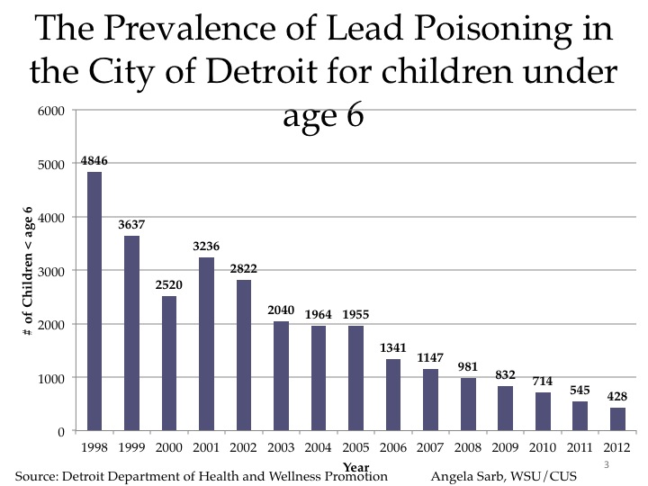
The chart above shows the number of children under age 6 who had a blood lead level greater than or equal to 10 μg/dL from declined tremendously from 1998-2012 . The decline was from 4,846 to 428 children. This occurred as a result of direct intervention by the City of Detroit Department of Health and Wellness Promotion to work with families, by the City Department of Planning and Development to abate lead paint in existing housing, by the Wayne County Prosecutor’s office to charge rental owners who rent lead poisoned property to families with young children and because of the massive numbers of demolitions of lead poisoned properties over the last decade. In addition, many families have taken the opportunity of lower prices on properties to move into better housing, abandoning many of the worst properties in the city.

Slide05


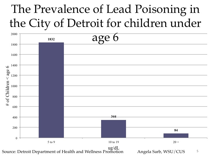
The second chart shows the number of children under six who had a blood lead level of 5-9 μg/dL, 10-19 μg/dL and greater than 20 μg/dL in 2012. The two higher categories sum to the total of 428 in the previous chart. Recently the Centers for Disease Control has begun counting children in the 5 to 9 ug/dl category as lead poisoned, based upon accumulating research that lead poisoning at these levels has substantial effects in reducing cognitive capacity.

The next several maps show the distribution of lead poisoned children in Detroit.

lead3


lead4


lead5


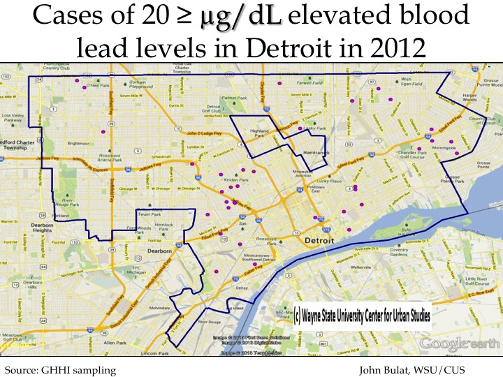
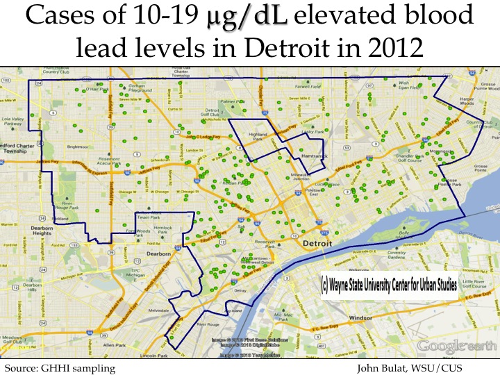
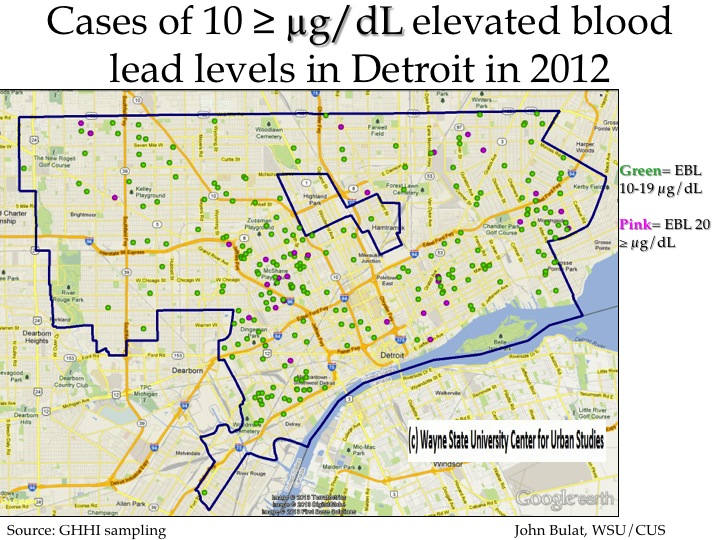
These first three maps show the locations of cases of the higher levels of lead poisonings—those greater than 20 ug/dl first, followed by those greater than 10-19 and 20 ug/dl and finally all those above 10 ug/dl.  There is clear concentration of these cases in the areas where older  housing still remains in the city, particularly in the closer in areas of the east side, southwest Detroit and the area between the Lodge and I-96.

lead6


lead7


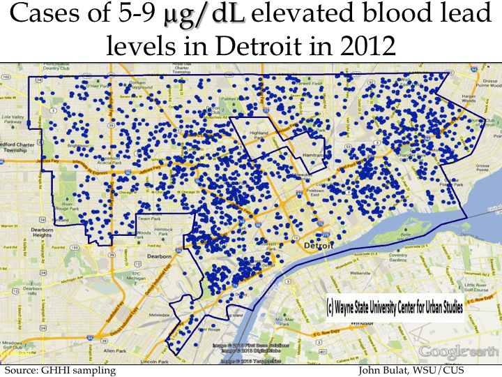
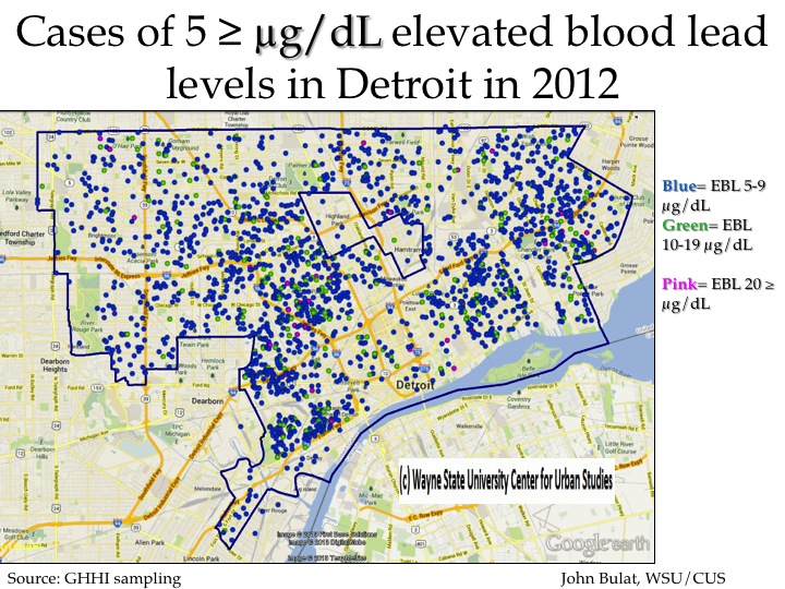
These first of these two above maps show where the lower levels of lead poisoning exist among Detroit’s children.  The ssecond map shows all the lead poisoning cases. While the highest concentrations are similar to the previous maps, the important point is that lead poisoning cases are occurring in every part of the city, consistent with the fact that  older housing—homes built before 1978 when lead was banned from house paint—exist all over Detroit.

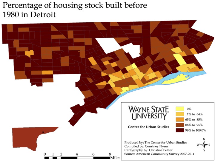
This is demonstrated by the next two maps.

Slide14


Slide15


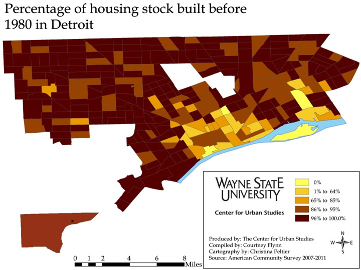
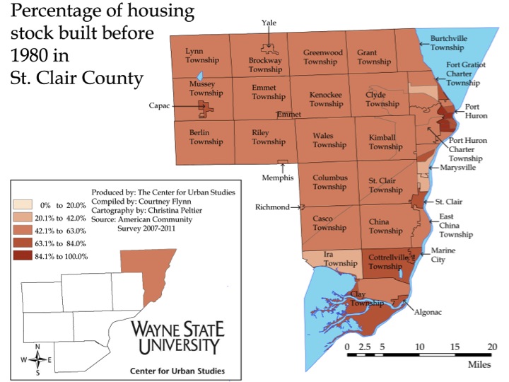
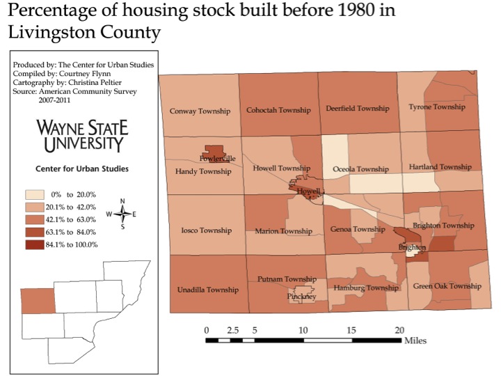
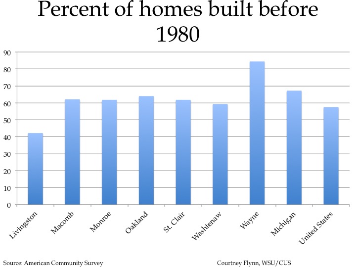
As can be seen in the first of the two maps above, much younger housing is located in the inner core where housing demolition and replacement has been intense since the 1940s and 1950s. However, the majority of the city is covered in dark brown, which represents Census tracts where between 96 and 100 percent of the homes were built before 1980. In Detroit, 62.2 percent of housing was built before 1950, a substantially higher percentage than any other county in Michigan.

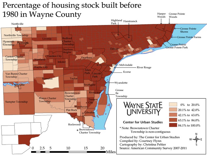
Importantly, the same risks exist in the inner suburbs of Wayne County as demonstrated by the second map above.

One crucial way of intervening early with lead poisoning is by testing of young children. The next three charts speak to this.

Slide17

Slide18


Slide19

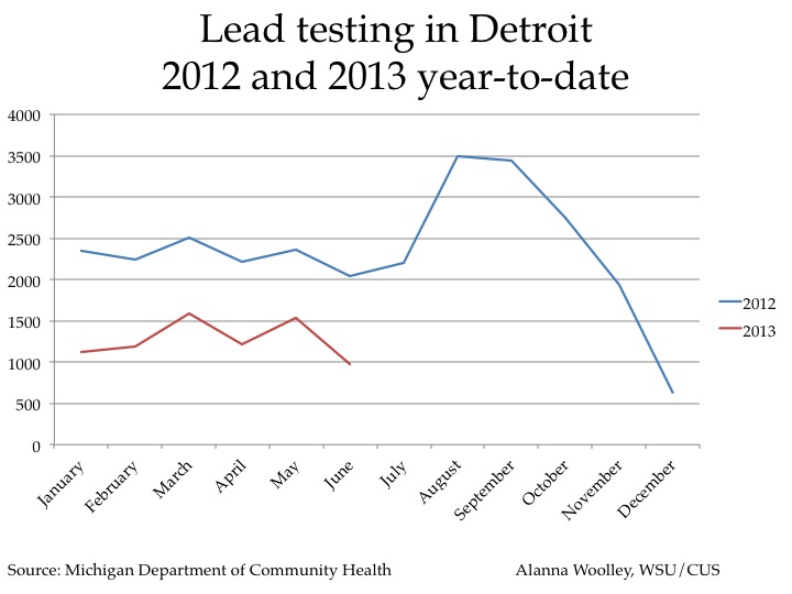
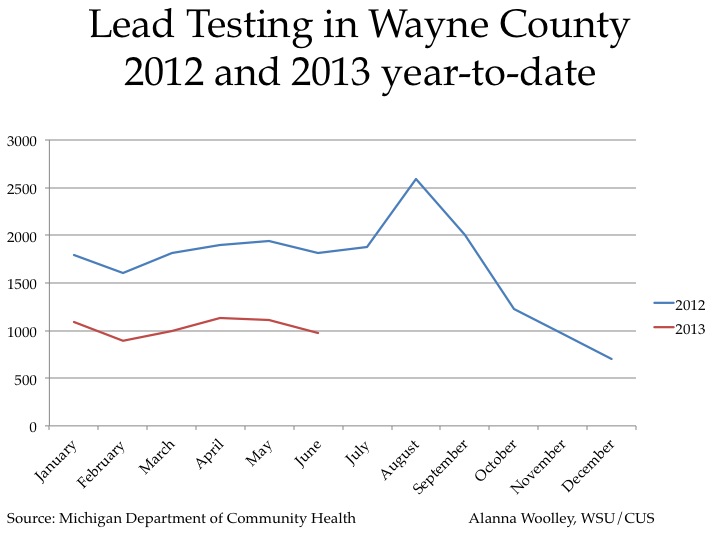
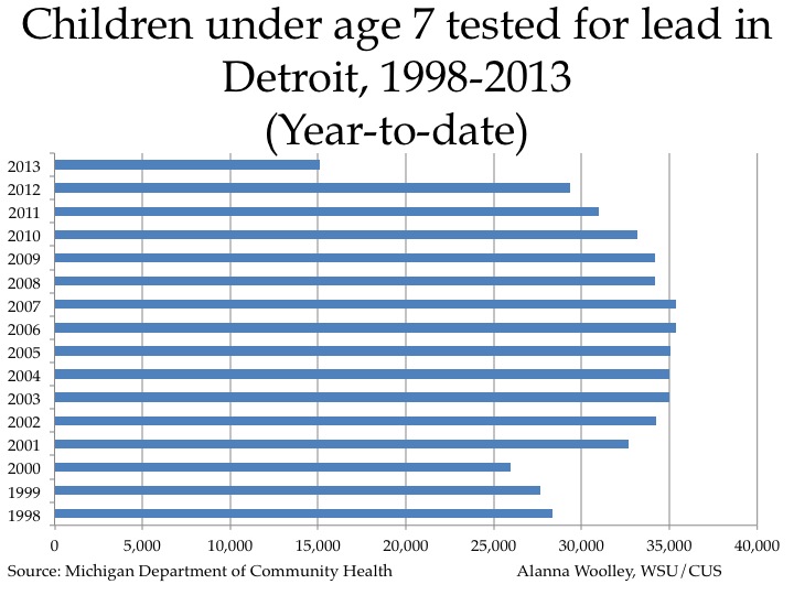
The two line charts above show lead testing in Detroit and Wayne County, respectively, over 2012 and 2013 (to date). The data for 2013 are substantially below those for 2012, reflecting drastic cuts in the public provision of testing since the closure of these service by the Detroit Department of Health and Wellness Promotion as part of cuts implement in 2012. We may expect some recovery in testing as children head back to school, but the bar chart above shows that testing in Detroit has consistently declined in volume over the last several years. (The 2013 numbers are just for the year to date.) Part of this decline may be because of a decline in Detroit’s population.

In addition to cuts in testing there have been cuts in case management, elevated blood level investigations, prosecution and abatement.

Given all these cuts in services and interventions, one might reasonably expect an increase in lead poisoning cases among young children. It is likely, however, that because fewer children are tested, fewer of those with lead poisoning will be identified. Social and health problems may appear to diminish if they are not measured properly.


Lead and Housing: Homes built before 1980

Here we complete our examination of  the percent of housing built before 1980 in the 7-county SEMCOG region. The intent is again to shed light on the potential for lead poisoning as lead was banned from house paint after 1978.

The overall percentages across the seven counties include:


•Livingston 42.2%
•Macomb: 62.1% 
•Monroe: 61.8%
•Oakland: 64.0% 
•St. Clair: 61.8% 
•Washtenaw: 59.3%
•Wayne 84.4%
•Livingston County had the lowest percent of homes built before 1980 of the seven-county region with 42.2 percent, according to the American Community Survey. The overall percentage of homes built before 1980 in Monroe, St. Clair and Washtenaw counties was more in line with the overall Macomb and Oakland county percentages.

 Overall, there is about a 42.2 percent difference between the percent of homes built before 1980 in Livingston (42.2%) and Wayne (84.4%) counties. 

Image

Image

Image

Image

In both Washtenaw and St. Clair counties nearly all the municipalities had between 42.1 and 63 percent of the homes built before 1980 up through 2011.  In Washtenaw County only Ann Arbor had a percentage of homes built before 1980 that put it in the highest bracket ( 84.1-100 percent). The only municipality in the same bracket in St. Clair County is Port Huron. In Monroe County, where majority of the municipalities are in the 63.1 to 84 percent bracket, only the City of Monroe has a percentage of homes built before 1980 in the highest bracket. Livingston County has no municipalities where between 84.1 and 100 percent of the homes were built before 1980.

In general the percentage of housing built before 1980 is rather substantial, indicating a fairly high risk for lead poisoning from lead-based paint even in the out-counties of the region. The significance of this is that it implies there will be a long term necessity for careful surveillance of young children’s blood lead levels and an equally strong need to maintain code enforcement relative to older dwellings lest lead based paint deteriorates and triggers more childhood lead poisoning cases. 

Image

Finally, here is a comparison of housing age in the region compared to the state and the nation. In the above chart the percent of homes built before 1980 is shown for each of the seven counties in Southeastern Michigan region, along with the state and national percentages. As can be seen, Wayne County has the highest percentage at 88.4 and the state of Michigan comes in second at 67.2 percent. The percent of homes built before 1980 in the U.S. is 57.5%; Livingston County has the lowest percent of homes built before 1980 at 42.2.   By this measure Wayne County’s and Detroit’s housing is very old compared to the state or nation, which would not mean as much if the housing were well maintained. However, because job losses and wage cuts have reduced incomes, the amount of disposable income for housing maintenance is much reduced. Therefore there are likely increasing health and safety risks not only from lead paint, but from other housing repair issues as well.   


Lead and Housing Age: Homes Built Before 1980

In the following post we will examine the percent of homes built before 1980 for the city of Detroit and Wayne, Oakland and Macomb Counties to examine the risk of lead poisoning among children. Prior to 1978 there was no ban on the use of lead based paint, and 1980 is the closest available Census data on housing age. The older the homes and the higher percentage of older homes, the higher the risk that lead based paint was used in the homes.

Detroit has the highest percent of homes built before 1980 of all the areas examined. Since Detroit has such a high percentage of older homes (a majority of the Census tracts in Detroit have 86 percent or higher of the homes built before 1980), the Detroit map uses different breakpoints in the legend than the County maps presented below.

Age1


There are only three Census tracts in Detroit where none of the homes in the city were built before 1980. These are locations such as Belle Isle and the Coleman A. Young International Airport, which generally do not have housing stock, though some people were found to have taken up residence in these areas.

One of the especially interesting features of this map is that much of the younger housing is located in the inner core where housing demolition and replacement has been intense since the 1940s and 1950s.

Much of the city is covered in dark brown, which represents Census tracts where between 96 and 100 percent of the homes were built before 1980.

Age2


Age3


Age4


According the maps presented above, Wayne County has the highest number of Census tracts with homes built before 1980; in total 84.4 percent of the county is made up of homes built before 1980.

A closer look shows that majority of these Census tracts fall within the Detroit City limits and the inner suburbs, such as Redford and Lincoln Park. According to the legend, between 84.1 and 100 percent of the homes in the darkest shade of brown, in areas like Detroit and Lincoln Park, were built before 1980. Inner suburbs of Oakland and Macomb such as Ferndale and Eastpointe, respectively, follow this same pattern. This means these inner suburbs are at substantial risk of lead poisoning of children, particularly when older housing stock is not fully maintained.

In Oakland and Macomb counties though there are far fewer Census tracts where over 84 percent of the homes were built before 1980. For example, Macomb Township, which has seen the highest population growth in the last two years, is mainly made up of Census tracts where 0-20 percent of the homes were built before 1980. In total, 62.1 percent of Macomb County is made up of homes built before 1980 and 64 percent of Oakland County is made up of homes built before 1980.


The Detroit Incinerator and its emissions

In 1986, Detroit built the world’s largest municipal trash incinerator; it officially opened three years later, in 1989.  According to the East Michigan Environmental Action Council, the incinerator was considered by many politicians and residents as something that would attract new businesses to Detroit because at the time, incineration was considered the safest and most cost-effective way to dispose of trash (http://www.emeac.org/2012/04/trash-and-incinerator-detroits-dirty.html).  Instead, the incinerator has been a controversial issue in Detroit politics over the past 20 years. According to environmentalreport.org and greatmichigan.org, the incinerator was able to be created through about $440 million in bonds that were issued for financing. It is said to burn about 2,800 tons of trash daily at a cost of about $150 per ton, according to to environmentalreport.org and greatmichigan.org,

The incinerator is located  near the intersection of the Chrysler and Edsel Ford Freeways (X marks the spot on the map); This is just outside Midtown Detroit, an area that has experienced a renaissance of new development and repopulation over the past few years.

The following table describes selected pollutants reported by facilities to the Michigan Department of Environmental Quality (MDEQ) in 2010. The chart which follows depicts the share of the overall reported pollutants attributable to Detroit Renewable Power. The incinerator generated approximately 25% of all pollutants reported by the 56 facilities in Detroit, Michigan, that made reports to MDEQ. It was also responsible for 30% of the carbon monoxide, 41% of the nitrogen oxide and 16% of the sulfur dioxide reported to the MDEQ.

As can be seen in the next chart, carbon monoxide, nitrogen oxide, and sulfur dioxide make up the overwhelming majority of chemicals emitted from the incinerator. Other pollutants reported to the MDEQ include ammonia, particulate matter, lead, and volatile organic compounds.

According to the Great Detroit Resource Recovery website,  the incinerator is below their regulation limit for the various pollutants it produces. It should be noted though that is information is an average from 2004-2006 and and does not include carbon monoxide emissions.


FUTURE POST:

Several Detroit environmental groups and residents have blamed the incinerator for Detroit’s high prevalence of asthma among children and adults.

We will examine this assertion more closely in a future post.

Great Lakes water levels

As has been shown in earlier posts, Michigan has experienced a hot and dry summer. These conditions have not only affected Michigan’s land, but also the Great Lakes. The chart above shows the historical long-term averages and record highs and lows for the each lake in the Great Lakes basin for the month of September. The month of September was chosen because it is the end of summer and the current month. Lake Michigan and Lake Huron are grouped as one throughout this post as they are hydraulically the same body of water. Also, throughout this post it must be kept in mind that Lake Superior is the largest and deepest of the lakes followed by Lake Michigan/Huron, Lake St. Clair, Lake Erie, and then Lake Ontario.

The above five charts show the historical data on water levels in the Great Lakes since 1918; each chart only looks at water levels in the month of September. All the charts show there has been an overall trend of water levels declining from where they are at in previous years. This trend began in 2009 for lakes Superior, Huron, and Michigan while the remaining three have seen water levels begin to steadily drop only about a year or two ago. Keith Kompoltowicz, chief of watershed hydrology at the U.S. Army Corps of Engineers Detroit office, said some researchers and media outlets like to look for a 15 or 30 year trend to the flucuation of the water levels. However, he said no short-term or long-term trends can be determined since U.S. Army Corps of Engineers has only been keeping data since 1918. Currently, U.S. Army Corp of Engineer data shows that if September, October, and November continue to experience low amounts of precipitation lakes Michigan and Huron will likely drop below record water levels. As water levels begin to drop this also has an affect on the ecosystems which live in and around these lakes.

Editorial: A shift in energy sources is needed

Michigan is facing hotter summers, warmer winters and decreasing rainfall. Levels of several of the Great Lakes are dropping.

Whether all of this is a result of a change in the weather or a result of climate change is debatable, but as a wise man once said, “When insurance is cheap, buy heavy.”

This week’s Drawing Detroit post on the sources of energy used to power Michigan indicates it is time for us to heed this advice. The post clearly shows that Michigan is now committed to an energy budget that drastically increases the risk of heating up the atmosphere, while it ships billions of our very hard earned dollars out of the state.

Shifting to other energy sources will decrease the risk of atmospheric warming and increase our income. Specifically, the post shows we are hugely dependent on coal imported from outside our state. It is already well understood coal is probably the greatest source of greenhouse gases heating up our environment.

If we substitute energy produced in Michigan for highly polluting coal imported from out of state, we get the double benefit of cleaner air and more income to the Michigan producers of this energy.

Happily, we all have the opportunity to step up and assure that this will happen by voting for the Michigan Energy, Michigan Jobs proposal on the ballot this November 6. This proposal will require Michigan electric utilities to increase to 25% the amount of retail electric sales that come from renewable sources, including wind, solar, biomass and hydropower. They must accomplish this by 2025.

So let’s buy some insurance, reduce greenhouse gases and increase Michigan jobs by voting yes to this proposal. LT

Energy consumption and production in Michigan

On August 27, ballot language for the Michigan Energy, Michigan Jobs proposal was approved. This proposal seeks to discover if registered Michigan voters are in favor of a constitutional amendment that requires utilities to obtain at least 25% of their electricity from clean, renewable energy sources. Given that this proposal is on the ballot, and that renewable and alternative energy resources are gaining more mainstream focus, Drawing Detroit has decided to create the following posts to explore the use of energy resources in the state.

The above figure shows that in 2009 the state of Michigan spent more money on coal-produced energy than on any other type of energy resource. Michigan produces energy resources such as nuclear power and biomass fuels in state while it imports all of its coal.

As stated previously, Michigan’s number one energy expenditure is on coal. This has been the trend for at least  the last 15 years, as shown by the graph above. While expenditures on the various types of energy resources shown in this graph have been increasing since 1984, coal expenditures have increased the most, remaining at least $6.5 million above petroleum, gasoline, and diesel expenditures, among others.

Michigan’s expenditures on energy use related to transportation gradually increased from 1970 to 2000.  After a slight drop in expenditures from 2000 to 2002, there was a dramatic increase in spending  from 2002 to 2008.  During this time period, total spending on transportation energy increased by approximately $10.4 billion.  After a decrease in spending of approximately $5.4 billion from 2008 to 2009, transportation expenditures began to increase again in 2010.

The above graph shows the approximate amount of energy, by type and in btus, that the state of Michigan produced in 2009.  Although Michigan’s energy expenditures are used mainly for coal, the above graph shows that Michigan does not produce any of the coal it used for energy in 2009. The main energy resource Michigan produced was nuclear energy; the state currently has three nuclear reactor plants in operation.

According to the Energy Information Administration (EIA), the drastic decrease in natural gas production from 2007 to 2008 seen on the graph was an anomaly that derived from an internal error from Michigan’s energy data reporting system. While the EIA has confirmed the 2008 number is correct, they are not as confident with data for 2007 and years prior.  While this anomaly accounts for the dip in natural gas energy in 2007, an overall look at the graph shows that crude oil production in Michigan began to decrease in 1986, the same year natural gas production began to increase. Overall the amount of fossil fuel resources produced in the state has been decreasing.

As previously stated, Michigan does not produce coal, but instead imports it. The above chart shows that Michigan relies on 10 states for its coal resources, with the majority of its coal coming from Wyoming and Montana; both these states produce the largest amounts of coal.

The above graph shows that other resources in Michigan are increasingly being used for energy.  Most recently, biofuels, which weren’t tracked until 1981, have begun to be used.  Also, it should be noted there was a decrease in nuclear energy production from 2008 to 2009 because the Donald C. Cook nuclear reactor shut down in September 2008 due to a damaged turbine; it did not return to service until November 2009.

The above graph depicts the amount of energy generated in the state according to how much money is spent on each resource. While coal is imported into the state, it is still the resource most commonly used for energy production, the resource used the most for consumption and the resource in which the most amount of funds are spent on.

This graph demonstrates how much energy Michigan residents consume according to energy resource type. Nuclear energy is the second most-used type of energy resource, but was still about 450 trillion Btus below the amount of coal energy consumed in the state in 2009.

The above graph focuses on the amount of energy used in the state of Michigan for electric purposes. True to the trend seen throughout the post, coal powered energy is the most commonly used resource for electric consumption, with nuclear energy coming in second and natural gas coming in third.  While the graph shows 0% of the state’s electric energy is produced by geothermal, solar, wind, and petroleum sources there were amounts produced by these sources, just not large enough to register to the amounts consumed by a resource like coal.

The climate situation in Michigan

The chart above, which has been provided by the Intergovernmental Panel on Climate Change Third Assessment Report, shows that temperatures in the northern hemisphere have been increasing since the 1900s. Despite the increase over the last 100 plus years, there was a slight drop in temperatures around the 1980s. However, since then the average temperature in the northern hemisphere has been increasing. The National Oceanic and Atmospheric Administration reports that in 2012 alone, Michigan has had 12 record high heat days.

The above chart shows the average yearly temperature in Michigan from 1895 to 2012. While there have been several ups and downs over the last 117 years, the average temperature to date in 2012 has proved to be the highest at 48.49 degrees. This figure, however, only takes the months January through July into consideration. The highest full yearly average in recent history was 46.93 degrees in 1998. The average yearly temperature in 2011 was about 4 degrees lower than the 1998 average.

The above chart shows average temperatures for May, June and July from 1980 to 2012. While the average temperatures over this time span do not show a consistent pattern, there is evidence that in recent years the average temperatures have been increasing. For example, for the month of July there was about a 10 degree average increase from 2009 to 2011; the climate then leveled off from 2011 to 2012. In May, there was an increase from 2008 to 2010 and in June there was an increase from 2009 to 2010.

The above charts show that not only have temperatures in Michigan been above average, but so have the water temperatures of the Great Lakes. Lakes Superior, which is the largest and deepest of the lakes, has experienced the highest above average temperatures of the five lakes. Lake Huron and Lake Erie (the smallest and shallowest) have experienced the least fluctuation from the average temperatures they have experienced in years past (1992-2011). The elevated water temperatures can be attributed to the higher air temperatures that Michigan and the Midwest region have been experiencing this year.

Michigan’s drought situation

According to the National Oceanic and Atmospheric Administration, July 2012 was the hottest month on record. Like every state in the U.S., Michigan experienced the extreme heat and has since been suffering drought conditions in certain areas. Due to the current climatic changes we have put together a series of posts that explores current and past precipitation and drought data.

This chart, provided by National Oceanic and Atmospheric Administration, displays the precipitation that fell in Michigan during the months of May and June for each year from 1900 to 2012. While precipitation amounts vary over time for the state, this chart shows precipitation amounts from May to June of 2012 are at about 150 mm, or 6 inches. In 2006 and 2007 precipitation amounts were at about 130 mm, or 5 inches. While May-June of 2012 hasn’t experienced the lowest amount of precipitation in the last 10 years, the precipitation numbers are lower than years 2008-2011 during the months of May-June.

In Michigan, July typically has less precipitation than June. This chart shows that over time the recent amount of precipitation the state has received has been in accordance with the long-term average amount of precipitation typically received during these two months. According to NOAA, the long-term trends for precipitation in June and July are about 3.1 and 2.9 inches respectfully.  The 2012 average for June of 3.09 and the 2011 average for July (which is the most recent data) is the lowest it has been since 2009. The precipitation amounts appear to spike and dip in a somewhat cyclical trend so this slight dip is relatively normal.

This drought map, reflecting conditions through July 24th 2012, shows several areas in the State of Michigan that are experiencing moderate drought or abnormally dry conditions. The majority of the Upper Peninsula is considered to be abnormally dry and much of the southern part of the state is considered to be experiencing severe drought; small portions in the southern areas of the state are also in extreme drought.

On July 25, 2012, the United States Department of Agriculture (USDA) deemed 76 counties across six Midwestern states as natural disaster areas due to drought conditions causing large crop losses for farmers.  In addition to counties declared as natural disaster areas on July 25, there are about 1,300 total counties across the Midwest states that have been deemed natural disaster areas. The Michigan counties currently deemed natural disaster areas are Berrien, Branch, Calhoun, Cass, Hillsdale, Jackson, Kalamazoo, Lenawee, Saint Joseph and Van Buren.

This chart shows the number of years with drought conditions in Michigan from 1913 to 2012. In the three most recent 25 year periods examined here, there were about 15 years in each period where Michigan was affected by drought; this is equivalent to about 60 percent of the time. In the time period from 1913 to 1937, when the state of Michigan was most affected by drought, 18 of the 25 years were affected by drought conditions; this is equal to 72 percent of the time.  While Michigan is experiencing extreme drought this year this chart shows droughts in Michigan have been fairly common over time.

Public water supply withdrawals in southeast Michigan

Michigan derives its water from the Great Lakes Watershed and a portion of this water is withdrawn for public supply.  According to the Michigan Department of Environmental Quality, public water supply refers to the diversion, treatment, and distribution of water for residential, public, commercial, and industrial consumption.  It generally excludes agricultural, thermoelectric, and self-supplied water for industrial use.  This chart illustrates the source of these withdrawals in 2006, the most recent year of verified data.   According to this chart, water from the Great Lakes were used for 76 percent of Michigan’s water supply withdrawals in 2006, ground water was used for 23 percent of the withdrawals and surface water was used for 1 percent.

The vast majority of Michigan’s public water supply was derived from the Great Lakes in 2006, and only small fractions of the total water supply was derived from surface water (streams, inland lakes, etc.) and groundwater.  However, these proportions change when looking at southeast Michigan.  The chart below illustrates the greater reliance on Great Lakes water for public supply in the 10-county region of southeast Michigan.  These counties draw 91 percent of their public water supply from Great Lakes sources, compared to the statewide percentage of 76 percent. A smaller percentage of southeast Michigan’s withdrawals come from groundwater (7%) than the state as a whole (23%).  Reliance on surface water is small and relatively equal to the state at large.

This chart illustrates the disproportionate withdrawals of Great Lakes water by the 10 counties that make up southeastern Michigan. St. Clair and Wayne counties rely the heaviest on public water supply withdrawal.  Public water supply withdrawal data in southeast Michigan are thus characterized heavily by the Detroit Public Water Supply System’s intake plan.  By extension, it is important to note that a county’s withdrawal does not necessarily reflect its consumption.

This chart illustrates the 10-county region’s reliance on surface and groundwater sources for public water supply.  While surface and groundwater withdrawals are not negligible in southeast Michigan, they are dwarfed by Great Lakes withdrawals.  Oakland County withdraws the greatest volume of water from groundwater sources at 22.92 MGD. Washtenaw County withdraws the greatest volume of surface water for public supply at 12.58 MGD.

This chart plots the total volume of public water supply withdrawal by the top four counties in southeast Michigan from 1997 through 2006.  Total withdrawal levels have varied somewhat over time, but not substantially.  Wayne County displays a visible decline during this time frame and, despite strains associated with sprawl and population dispersal in this time span, withdrawals for public water supply have not grown in these counties.

To view information related to pollution in the Great Lakes check back with Drawing Detroit.