Monroe, St. Clair Counties Rank Highest for Green Infrastructure; Majority is Agricultural Land

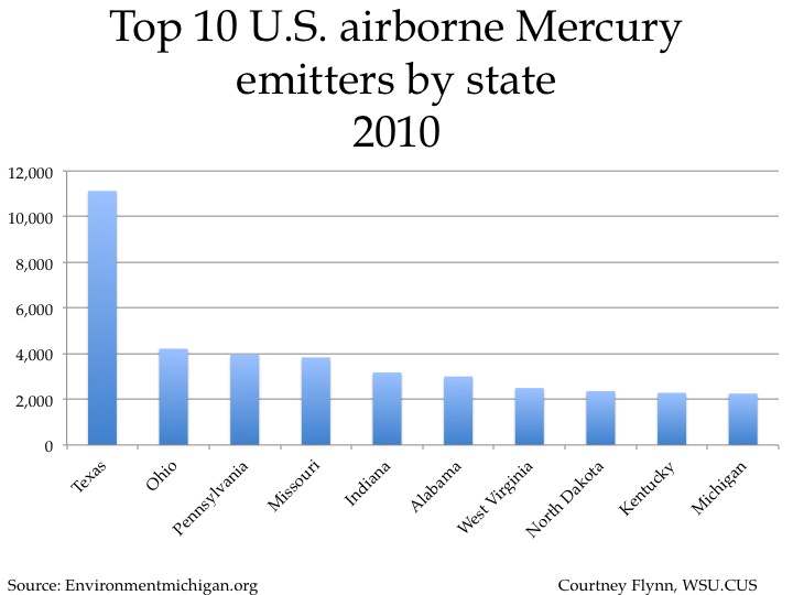
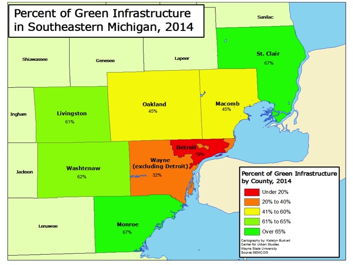
In Southeastern Michigan there was about 180,000 acres of green infrastructure in 2014, according to the Southeastern Michigan Council of Governments (SEMCOG), and the regional planning agency is looking to improve and grow that number. This green infrastructure represents both natural ecosystems (wetlands, forests and parks), agricultural land and constructed versions, such as community gardens and bioswales. Both Monroe and St. Clair counties had the highest percentage of total green infrastructure in 2014 at 67 percent. Wayne County, both including and excluding Detroit, had the lowest percentage of green infrastructure. Excluding Detroit, Wayne County was made up of 32 percent of green infrastructure; including Detroit Wayne County was made up of 30 percent green infrastructure. In general, one can think of green infrastructure as the inverse of developed land, where houses, businesses, roads and other infrastructure exists.

Of this overall green infrastructure it is important to identify what it is comprised of. Below we will see how the tree canopy varies from county to county and how these variations are affected by the presence of parks and agricultural land.

The data provided for this post was found in SEMCOG’s 2014 Green Infrastructure Vision document.

Metro-Detroit Green Infrastructure

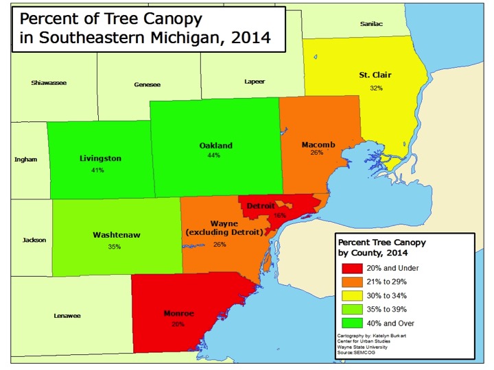
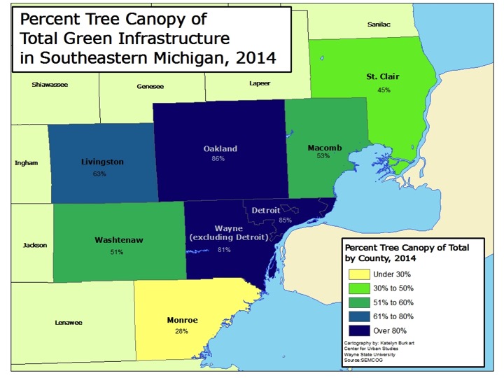
In total, Oakland County had the highest percentage of overall tree canopy at 44 percent; the county’s tree canopy made up 86 percent of its total green infrastructure. Oakland and Livingston counties were the only two in the region that had a tree canopy above the American Forest’s overall standard of 40 percent. The American Forest is the country’s oldest conservation non-profit, and SEMCOG bases its green infrastructure goals on their standards.

The county with the lowest overall tree canopy was Monroe; it had a tree canopy of 20 percent. This 20 percent of total tree canopy made up 28 percent of its total green infrastructure. This is largely because of the greater portion of land devoted to agriculture, as discussed below.

The city of Detroit had a total tree canopy of 16 percent, which is below American Forest’s standard for tree coverage in an urban area. Nevertheless this represents 85 percent of Detroit’s green infrastructure. American Forest calls for a 25 percent tree canopy coverage in an urban area. In a suburban residential the organization’s standard is 50 percent, and in a central business district that standard is 15 percent.

Metro-Detroit Tree Canopy

Metro-Detroit Tree Canopy and Green Infrastructure

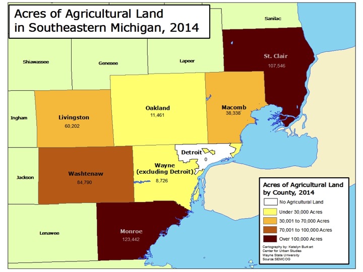
While tree coverage is an important aspect of green infrastructure, it is not the only thing that can make a community “more green.” As discussed above, Monroe County had the highest percentage of overall green infrastructure yet the lowest percentage of tree canopy coverage. As shown below, this is, in part, because there was more than 123,000 acres of agricultural land in Monroe County in 2014. Monroe County had the highest amount of agricultural land in 2014 in the region followed by St. Clair County, which had about 107,000 acres of agricultural land. St. Clair County, like Monroe County, was made up of 67 percent green infrastructure. According to SEMCOG, Monroe County ranks seventh in the state in the total number of acres of vegetables (6,707) and corn, soy and wheat (169,792). St. Clair County ranked sixth in the state in the number of farms producing organic products and eighth in state for the total number of acres of soybeans it produced in 2014 (64,224).

According to SEMCOG, agricultural land is defined as “rural land used with the growing of food as the primary function, but can also provide ecological benefits.” SEMCOG classified Detroit as having 0 acres of agriculture, but this does not include the number of community gardens, which have been growing in the city through individual and organizational efforts.

While Detroit had 0 acres of agriculture land, Wayne County had 8,726 acres of agricultural land, which was the smallest amount in the region.

Metro-Detroit Agriculture Land

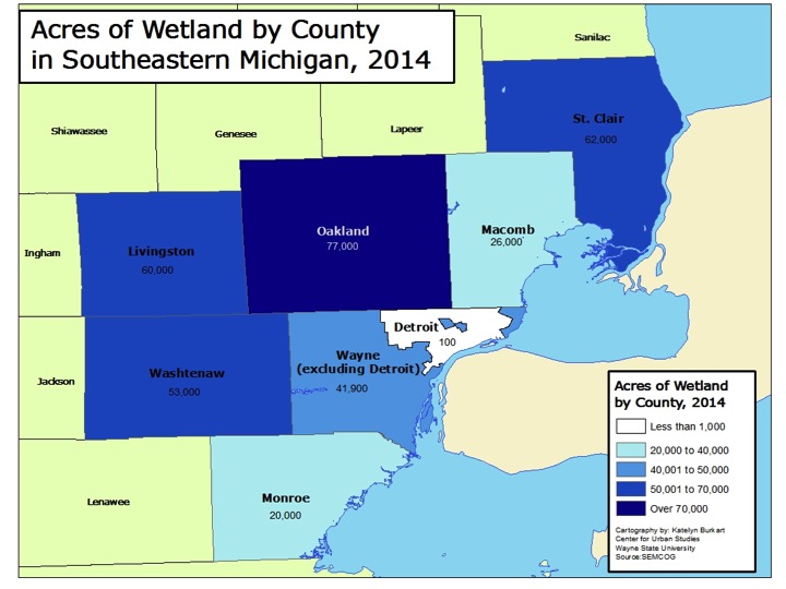
For total acreage of agricultural land in the region, Oakland County had amongst the smallest amount of coverage in the region but for wetland coverage it had the greatest amount. Oakland County had 77,000 acres of wetland in 2014. St. Clair (62,000 acres), Livingston (60,000) and Washtenaw (53,000) counties all had more wetland coverage than Wayne County. However, the 41,900 acres of wetland coverage in Wayne County was nearly five times the amount of agricultural land in the county. Additionally, of those 41,900 acres, 100 were located in Detroit.

Monroe County had the least amount of wetland coverage at 20,000, which is about 100,000 less acreage than it had of agricultural land.

Metro-Detroit Wetlands

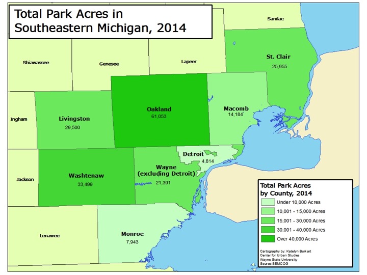
Another factor into the total amount of green infrastructure present in a county is park land, which includes city, country, metro and state parks. Oakland County had the highest amount of park acreage at 61,053. Oakland County is home to five state park/recreation areas, three metroparks, 13 county parks and numerous local parks at the municipal level. Washtenaw County had the second highest acreage of park coverage at 33,499 acres, which was nearly half of Oakland County’s coverage. Like Oakland County, Washtenaw County is home to three metroparks and 13 county parks. Washtenaw County also has 20 nature preserves, numerous parks at the local level and nine state park/recreation areas.

Wayne County had about 26,000 acres of total park acreage, about 5,000 of which was located in Detroit. Belle Isle made up nearly a fifth of Detroit’s park acreage; it is 982 acres.

Metro-Detroit Parks

The amount of green infrastructure established in a community and a region is important because it can not only serve as a catalyst for economic growth but also because it serves as the base for ensuring citizens have access to clean water and air, fresh food and amenities that promote healthy and sustainable lifestyles. There is a recognition that additional green infrastructure is needed in Southeastern Michigan, which is why SEMCOG has created a green infrastructure vision. This vision aims to benchmark the current green infrastructure in the region and then identify policies that will allow for stronger and more connected infrastructure networks, more accessibility and cleaner air and water quality.

Lenawee County has highest percentage of children with elevated lead levels

The data discussed in this post is preliminary data on the lead poisoning of Michigan’s children in 2015 and was supplied by Michigan Department of Health and Human Services (MDHHS) at the county and zip code level, as well as data for the city of Detroit. At the county level, MDHHS also provided an approximate percentage of children who had blood lead levels at 5 ug/dL (micrograms per deciliter of blood) and above. Population data was only available by Zip Code Tabulation Area (ZCTA) (which are somewhat inconsistent with zip codes), preventing the calculation of percentage of children affected for the zip code data.

At 10 percent, Lenawee County had the highest percentage of its population under 6, county-wide, with an elevated blood lead level at 5 ug/dL, according to preliminary 2015 data supplied by MDHHS. The city of Adrian is located in rural Lenawee County and within the boundary zip code of 49221. There were 67 children under the age of 6 with elevated blood lead levels greater than or equal to 5 ug/dL in that zip code, according to data supplied by MDHHS.

The city of Detroit had 7.5 percent of its population of children under the age of 6 with elevated blood lead levels greater than or equal to 5 ug/dL . However, Wayne County (excluding Detroit) had less than 2 percent of its population of children under the age of 6 with elevated blood lead levels greater than or equal to 5 ug/dL. All seven counties in Southeastern Michigan had less than 2 percent of its population of children under the age of 6 with elevated blood lead levels. At the more local level though, the second map below shows that zip codes in the Port Huron area had between 55-99 children under the age of 6 with blood lead levels greater than or equal to 5 ug/dL. Portions of southern Oakland and Macomb counties, along with Ann Arbor/Ypsilanti area in Washtenaw County, had zip codes with no more than 14 children under the age of 6 with blood lead levels greater than or equal to 5 ug/dL. In Oakland County, the areas around Pontiac and Southfield, along with the area around the Detroit-Metro Airport in Wayne County had slightly higher numbers of children under the age of 6 with blood lead levels greater than or equal to 5 ug/dL; these numbers maxed out at 29, per zip code.

According to the Centers for Disease Control, 5 ug/dL is used a reference level by experts “to identify children with blood lead levels that are much higher than most children’s levels.” The CDC has recommended that public health actions be initiated in children under age 6 with blood lead levels above 5 µg/dL. Babies and young children can be more highly exposed to lead because they often put their hands and other objects that can have lead from dust or soil on them into their mouths.

Michigan Lead Data_County

Michigan Lead Data_Zip

When viewing the elevated blood lead levels in Lenawee County overall and at the more local level of zip codes, we see that the number of children under the age of 6 with elevated blood lead levels in Adrian contributed to the county as a whole having among the highest percentage of elevated lead levels. In 2015, according to MDHHS data, the zip code containing the city of Adrian had 67 children under the age of 6 with elevated blood lead levels.

Aside from Adrian, Detroit and the Port Huron area, the central portions of Muskegon County and Grand Rapids had substantial numbers of children with elevated blood lead levels in certain zip codes.

Adrian Lead Data

There were five zip codes in the city of Detroit in 2015 with more than 100 children under the age of 6 with elevated blood lead levels greater than or equal to 5 ug/dL. These zip codes were: 48238, 48204, 48210, 48209 and 48212. Four of these zip codes are aligned in a row on the west side of Detroit, including parts of neighborhoods such as Southwest Detroit. In total, 1,618 children under the age of 6 were reported to have elevated blood lead levels in Detroit in 2015.

Detroit Lead Data

In the southwestern portion of Grand Rapids the zip code of 49507 had 188 children under the age of 6 with elevated blood lead levels greater than or equal to 5 ug/dL. In total, the city had no more than 523 children under the age of 6 with elevated blood lead levels. The only other city with areas with numbers as high or greater was the city of Detroit, according to data supplied by MDHHS.

Grand Rapids Lead

The city of Flint is important when discussing elevated blood lead levels across the state of Michigan. Due to the water crisis that has been plaguing the city, children’s lead levels have gained national attention. The effect on children of lead in Flint’s water is unlikely to be correctly indicated by the 2015 numbers from MDHHS, first, because many children had not been tested, and second, because lead may not be found in their blood a certain amount of time after they quit drinking water containing lead. This is not to say the lead did not impact the children, but it may have been excreted or taken up into organs or bones. Many thousands of children may have been exposed to lead from the water, though the exact number is still unknown.

The 2015 data supplied by MDHHS shows that the highest number of children poisoned in Flint were in zip code 48503, which had 36 children under 6 with lead levels greater than or equal to 5 ug/dL. Portions of the zip codes of 48504, 48505, 48506 and 48507 are also within Flint’s city limits; these zip codes had 28, 15, 18, and 13 cases in 2015, respectively.

Flint Lead

While elevated blood lead levels in children in the city of Flint are being linked to lead found in the drinking water, as caused by the erosion of the city’s pipes, most lead poisoning in Michigan is related to lead in paint. In 1978, the federal government banned consumer uses of lead-containing paint, but some states banned it even earlier. Lead from paint, including lead-contaminated dust, is one of the most common causes of lead poisoning, and is almost exclusively the source of lead poisoning in the Detroit area, as discussed in a previous Drawing Detroit post.

Lead paint often deteriorates as housing ages, shedding dust and flakes, which becomes available to children to ingest. So the age of housing is a proxy for the risk of lead poisoning. The first map below shows that there are more than 50 counties across the state where 60 percent or more of the housing stock-either owner or renter occupied-was built prior to 1980. About 93 percent of all houses in Detroit and Flint were built before 1980, according to Census data. For the city of Grand Rapids 81.2 percent of the housing stock was built prior to 1980, and for the city of Adrian that percentage is 74.9. The second map below shows the percentage of renter-occupied housing units by county. It will require further examination for a conclusion about the statewide data, but certainly in Detroit lead poisoning tends to be higher in renter-occupied housing. This fact offers an opportunity in that it would be possible to use more assertive code enforcement to require landlords to abate lead paint hazards that are so pervasive in Michigan’s older housing. Several communities in Michigan have tested this approach, which has been very effective in other major cities.

Owner 1980

Renter 1980

Shift Toward Natural Gas Outweighs Shift Toward Renewable Energy Sources

While there has been a shift toward renewable energy sources over the last 10 years, there has also been an increase in usage of natural gas as an energy source. According to the U.S. Energy Information Administration, Michigan, California and New York all shifted away from oil and coal as sources for energy consumption and instead increased their usage of renewable energy sources. California and New York also increased their usage of natural gas as an energy source. The shift toward natural gas usage began in 2009 when the price gap between coal and natural gas production narrowed because of the increased supply of natural gas extracted from shale, according to the U.S. Energy Information Administration. Another, secondary, reason the shift occurred on a national basis, according to the U.S. Energy Information Administration, is because the generation of coal-powered energy has been declining as a result of stricter regulations by the U.S. Environmental Protection Agency.

In this post energy consumption and production between 2003 and 2013 is compared for Michigan, New York and California.

Between 2003 and 2013 New York’s consumption of coal as an energy source decreased the most of the three featured states by 217.5 trillion BTUs. This decrease was made up, and then some, by increased usage of natural gas (190.3 trillion BTUs-the highest of the three states) and renewable energy (50.9 trillion BTUs). Natural gas and renewable energy were the only two energy sources for which New York increased consumption of between 2003 and 2013. According to U.S. Census data, residents of the state of New York are increasingly relying on natural gas as a heat and electricity source. In the last 10 years that reliance on natural as a heating source has increased by about 500,000 households, according to Census data. New York also had the largest decrease in usage of oil between this time at 525.1 trillion BTUs.

In California natural gas consumption increased by 166.4 trillion BTUs between 2003 and 2013. According to the state, the increased consumption is, in part, being used as an alternative for petroleum in cars, trucks and buses as the use of alternative transportation options grow. Additionally, two-thirds of households in California use natural gas to heat their home, according to the U.S. Energy Information Administration.

California experienced the largest increase of renewable energy usage between 2003 and 2013 at 103.8 trillion BTUs. This increase, according to the U.S. Energy Information Administration, can be attributed to the state’s policies that made it the first state in the country to receive 5 percent of its utility-scale electricity from solar power and partially because of its mandate to reduce green house gas emissions through various efforts.

Michigan experienced an increase of its usage of renewable energy by 98.9 trillion BTUs between 2003 and 2013. Like California, Michigan also passed a mandate for increased renewable energy usage. The Clean, Renewable, Energy Efficiency Act stated that by 2015 utility providers must obtain at least 10 percent of the energy they sell from renewable sources.

With Michigan’s increased usage of renewable energy sources, and a small amount of nuclear power, it experienced a decrease in coal, natural gas and oil consumption.

Of these three states though, Michigan was the only one to experience an increase in nuclear energy consumption (10.9 trillion BTUs) and a decrease in natural gas consumption. As can be seen in the production comparison chart, this is related how much of each energy source was produced in Michigan between 2003 and 2013. Although Michigan is consistently one of the top five states in the country to consume natural gas as an energy source, its production has been declining for the last 30 years, according to the U.S. Energy Information Administration.

All three states also experienced a substantial overall decline in energy consumption from 2003 through 2013, probably because of conservation and the severe impacts of the Great Recession on the state and its industrial production.

Energy Consumption Change

Between 2003 and 2013 New York’s consumption of coal as an energy source decreased the most of the three featured states by 217.5 trillion BTUs. This decrease was made up, and then some, by increased usage of natural gas (190.3 trillion BTUs-the highest of the three states) and renewable energy (50.9 trillion BTUs). Natural gas and renewable energy were the only two energy sources for which New York increased consumption of between 2003 and 2013. According to U.S. Census data, residents of the state of New York are increasingly relying on natural gas as a heat and electricity source. In the last 10 years that reliance on natural as a heating source has increased by about 500,000 households, according to Census data. New York also had the largest decrease in usage of oil between this time at 525.1 trillion BTUs.

In California natural gas consumption increased by 166.4 trillion BTUs between 2003 and 2013. According to the state, the increased consumption is, in part, being used as an alternative for petroleum in cars, trucks and buses as the use of alternative transportation options grow. Additionally, two-thirds of households in California use natural gas to heat their home, according to the U.S. Energy Information Administration.

California experienced the largest increase of renewable energy usage from 2003 and 2013 at 103.8 trillion BTUs. This increase, according to the U.S. Energy Information Administration, can be attributed to the state’s policies that made it the first state in the country to receive 5 percent of its utility-scale electricity from solar power partially because of its mandate to reduce green house gas emissions through various efforts.

Michigan experienced an increase of its usage of renewable energy by 98.9 trillion BTUs between 2003 and 2013. Like California, Michigan also passed a mandate for increased renewable energy usage. The Clean, Renewable, Energy Efficiency Act stated that by 2015 utility providers must obtain at least 10 percent of the energy they sell from renewable sources.

With Michigan’s increased usage of renewable energy sources, and a small amount of nuclear power, it experienced a decrease in coal, natural gas and oil consumption.

Of these three states though, Michigan was the only one to experience an increase in nuclear energy consumption (10.9 trillion BTUs) and a decrease in natural gas consumption. As can be seen in the production comparison chart, this is related to how much of each energy source was produced in Michigan between 2003 and 2013. Although Michigan is consistently one of the top five states in the country to consume natural gas as an energy source, its production has been declining for the last 30 years, according to the U.S. Energy Information Administration.

All three states also experienced a substantial overall decline in energy consumption from 2003 through 2013, probably because of conservation and the severe impacts of the Great Recession on the states and its industrial production.

Energy Consumption Change

The below charts show the change in consumption and production of energy sources between 2003 and 2013.

In Michigan, we see there was a decrease in natural gas, oil and coal consumption between 2003 and 2013. At the same time, the amount of energy consumed through all three of these sources heavily outweighed the amount produced in both 2003 and 2013. The chart also shows how in 2003 oil was the most relied upon energy source (969.4 trillion BTUs) but in 2013 that shifted to natural gas (832.1 trillion BTUs of natural gas and 823.4 trillion BTUs of oil), despite the fact that natural gas consumption and production in the state is decreasing. The amount of which natural gas usage decreased between 2003 and 2013 was almost entirely replaced by the increased usage of renewable energy (118.6 decreased natural gas usage) and 103.8 trillion BTUs increased renewables, respectively). The decreased production of natural gas (119.5 trillion BTUs) was not entirely replaced by the production of renewable energy sources (75.7 trillion BTUs) though.

The consumption of renewable energy is increasing faster than the rate of production. As noted earlier though, wind produces ones of the largest amounts of renewable energy in Michigan (consumption of wind power energy is equivalent to the amount produced), and the number of wind farms in the state is expected to grow from 21 to 27, as six additional farms are in the process of being developed, according to the state of Michigan.

Production and consumption of nuclear energy in the state varied the least in the state between 2003 and 2013.

Energy by Source Production Change

Just as with Michigan, the chart below shows New York’s shift from oil to natural gas for consumption between 2003 and 2013. In 2003 1131.3 trillion BTUs of natural gas was consumed in New York and 1761 trillion BTUs of oil. By 2013 though, the natural gas used increased to 1321.6 trillion BTUs and, the amount of oil decreased to 1235.9 trillion BTUs.

For renewable energy, consumption increased from 359.3 trillion BTUs to 410.2 trillion BTUs. In 2003 in New York, oil, natural gas, nuclear and coal energy sources were all used more than renewable energy sources, despite the fact the amount of renewable energy sources produced in that year was higher than the amount of coal, natural gas and oil produced in the state. By 2013 coal use had declined substantially, while renewable production and use was increasing.

New York Energy Change

Although California’s consumption of oil decreased between 2003 and 2013, the state still used it more than any other source in 2013. In 2003, 3523 trillion BTUs of oil were consumed, while this declined to 3246.6 trillion BTUs by 2013. The shift toward increased use of natural gas and renewable energy sources can be seen, but those numbers still do not exceed oil consumption. The use and production of renewable energy sources in California has continuously outweighed that of coal and nuclear energy. But the increased use and production of renewable energy sources still falls short of the use and production of natural gas. Between 2003 and 2013 the use of natural gas increased by 166.4 trillion BTUs and the use of renewable energy increased by 103.8 trillion. Production of natural gas increased by 166.4 trillion BTUs and production of renewables increased by 42.9 trillion BTUs.

California Energy Change

In sum, the shift toward utilization and production of renewable energy sources is evident. With regulations on coal and oil growing stronger, and policies continuing to shift toward increased production and use of renewables, there is a definite move toward renewable energy. For now, however, the bigger move is that these states are substituting natural gas for oil and coal.

It is encouraging and fascinating, however, that there are substantial overall reductions in energy usage with New York clearly the leader.


Michigan Relies Heavily on Coal-Powered Energy

Of the 15 states featured in this energy series, only one state produced more energy than it consumed. In 2013, North Dakota produced 1,840.1 more trillion BTUs than it consumed. This surplus of energy is due to the state’s production of natural gas and oil. These instances of energy surplus production are two of only three where a featured state produced more trillion BTUs of a fossil fuel type energy source than was consumed in that state. The third instance was in Illinois where coal production trumped consumption.

Coal

Illinois

Production: 1149.6

Consumption: 1026.9

Natural Gas

North Dakota

Production: 317.9

Consumption: 83.8

Oil

North Dakota

Production: 1820.9

Consumption: 217.8

In this part of our energy series we further explore the net difference between production and consumption of energy sources. The sheer numbers show that the featured states relied upon coal, oil and natural gas as energy sources, despite their inabilities to produce the amount of energy they need to consume.

Overall, Michigan consumed 2155.5 more trillion BTUs of energy than it produced in 2013. Our production was 23.3 percent of our consumption. Only Missouri and Georgia produced a smaller percent of the energy it consumed. These states, along with Michigan, are exporting a huge share of their income to energy producers elsewhere. California had the largest absolute difference at 4,437.3 trillion BTUs, but California did produce 35 percent of its energy.. The state that came closest to North Dakota in terms of breaking even for energy consumption v production was South Dakota. Still, South Dakota consumed 114.1 more trillion BTUs than it produced.

In this post a nuclear energy chart is not included because each state produced nuclear energy as a power source consumed that same amount, meaning there was no net surplus or deficit. The amount of nuclear energy consumed and produced is included in the overall production v consumption chart below though.

The states featured in this series are:

  • Michigan
  • Illinois
  • Iowa
  • Indiana
  • Minnesota
  • Missouri
  • Nebraska
  • North Dakota
  • Ohio
  • South Dakota
  • Wisconsin
  • New York
  • Georgia
  • Oregon
  • California

Energy Comparison

There was only one state of the 15 featured in this post were more coal-powered energy was produced than consumed in that state. This state was Illinois, where 1149.6 trillion BTUs of coal-powered energy was produced and 1026.9 trillion BTUs was consumed. This net surplus of coal-powered energy is an anomaly in this post because, as the chart shows, reliance upon coal for consumption much outweighs how much is produced. In total, in the featured states, 7211.8 trillion BTUs of coal-powered energy is consumed while less than half of that (3023.8 trillion BTUs) is produced. There are also 10 different states where no coal-powered energy is produced there, yet, 2,628.1 trillion BTUs, or 36 percent of the coal-powered energy consumed by these 15 featured states, is consumed there.

Missouri had the largest difference between the amount of coal-powered energy it produced and consumed in 2013. According to the U.S. Energy Information Administration, there was 9.1 trillion BTUs of coal-powered energy produced in Missouri in 2013 but 806.5 trillion BTUs consumed in that same year, meaning there was a net difference of 797.4 trillion BTUs. With such a large difference, Missouri must bring in coal from elsewhere to fuel its coal powered plants. According to the U.S. Energy Administration, Wyoming was the main provider of this energy source to Missouri. Is this the right measure. Michigan had the second largest difference between the amount of coal-powered energy it produced and consumed in 2013 at 658.2 trillion BTUs. Michigan did not produce any coal-powered energy in 2013 but 658.2 trillion BTUs were consumed there in 2013. According to the U.S. Energy Information Administration, Michigan primarily relies on Wyoming and Montana for its coal needs, although other states, such as Kentucky and West Virginia also provide this resource to the state. For about 90 years, between 1860 and 1949, Michigan did produce a substantial amount of coal through its coal mines, however they are not longer active, according to the U.S. Energy Information Administration, leaving Michigan to seek this resource elsewhere.

Coal Energy

Natural gas is yet another fossil fuel based energy source where consumption typically outweighs production for these states. Of the 15 states discussed in this series, North Dakota is the only one where more natural gas was produced than consumed. In 2013, 317.9 trillion BTUs of natural gas were produced in North Dakota and 83.8 trillion BTUs were consumed, meaning there was a net surplus of 234.1 trillion BTUs. The production of natural gas in North Dakota has been rising since 2007 due to the large increase in the use of shales to produce this energy source, according to the U.S. Energy Information Administration.

California had the largest difference between natural gas production and consumption in 2013 at 2,196.2 trillion BTUs. Although California was one of the largest producers of natural gas of these featured states (287.3 trillion BTUs), those numbers still paled in comparison to the amount of natural gas it utilized (2,483.5 trillion BTUs). According to a recent LA Times article, natural gas is now the single highest source of power generation in California. Various interstate pipelines from Arizona, Nevada, Wyoming and Oregon bring natural gas into California for consumption, according to the U.S. Energy Information Administration.

For Michigan, there was a net difference of 702.2 trillion BTUs of natural gas consumption; 129.9 trillion BTUs of natural gas were produced in Michigan in 2013 and 832.1 trillion BTUs were consumed there. According to the U.S. Energy Information Administration, Michigan is regularly one of the top 5 users of natural gas for residential purposes. While Michigan has a large number of gas wells (about 10,000), production in the state has been declining since 1997. Due to this, much of the natural gas consumed in Michigan is obtained through pipelines that cross through the state from Ohio, Indiana and Wisconsin, with the end destination of these pipelines being the northeastern states and Canada, according to the U.S. Energy Information Administration.

Slide07

Just as with natural gas, North Dakota again was the only featured state to produce more oil than was consumed in 2013, according to the U.S. Energy Information Administration. In 2013, 1820.9 trillion BTUs of oil were produced there in 2013 and 217.8 trillion BTUs were consumed there. California had the largest net difference between oil consumption and production in 2013. For a net difference of 2092.6 there was 3246.6 trillion BTUs of oil consumed in California and 1153.8 trillion produced there. Despite California producing about 6 percent of the country’s crude oil, its rate of consumption of the fossil fuel outweighs the rate of production. This means, California must rely on other geographic locations to supply its needs. According to the U.S. Energy Information Administration, foreign countries (particularly Saudi Arabia, Iraq and Ecuador) supply more than 50 percent of the crude oil refined in the state. Additionally, North Dakota, Utah, New Mexico and Wyoming also supply crude oil for refining and consumption.

In Michigan in 2013, there was 823.4 trillion BTUs of oil consumed and 44.7 trillion BTUs produced, leaving a net difference of 778.7. The majority of the oil consumed in Michigan takes the form of gasoline. Michigan also has the highest residential consumption of liquid petroleum gasoline (LPG) in the country as a form of heating fuel. While there is a modest amount of oil produced in the state, it does not compare to the amount consumed, which is 18 times higher.

Slide09

Overall, according to the U.S. Energy Information Administration, it is typical of a state to consume about as much renewable energy as it produces. However, there are instances where a surplus of renewable energy is produced; this only occurs though because of additional biofuel production. In Iowa, 674.9 trillion BTUs of renewable energy were produced and only 384.7 trillion BTUs were consumed. The excess came from the biomass feedstock that was used to produce ethanol, which was then blended into motor fuel. Illinois, Indiana, Minnesota, North Dakota, South Dakota and Wisconsin also produced more renewable energy than was consumed, although not as much as Iowa. Again, this was directly related to biofuel production used to create ethanol.

Of the 15 states featured, California both produced and consumed the highest amount of renewable energy. California produced 762.4 trillion BTUs of renewable energy and consumed 872.6 trillion BTUs. For consumption, nearly 5 percent of California’s utility electricity was produced from solar power in 2013, and other renewable sources such as wind and hydroelectric were also used for consumption. In terms of production, California produces about 8 percent of the country’s wind-powered electricity and is also home to the world’s largest complex of geothermal plants, according to the U.S. Energy Information Administration.

Michigan ranked in about the middle for the 15 states in terms of energy production and consumption. In 2013 179 trillion BTUs was produced in Michigan and 195 trillion BTUs was consumed. Aside from biofuel production, which created 95.5 trillion BTUs of energy, wind-powered energy was the largest production source for renewable energy in the state in 2013; 26.7 trillion BTUs was created. With more than 100 hydroelectric power plants, this form of renewable energy also contributed to the 13.5 trillion BTUs of renewable energy produced in the state in 2013.

Renewable Energy

In this post we saw the vast difference between a state’s consumption of energy and its production, and rarely did these states produce more than they consumed, relying upon other states and imports for their energy. A reliance on fossil fuels for energy was evident in 2013 and next week we will show how this reliance was even heavier in 2003. For the final post of this series we will show how Michigan, New York and California have changed in their reliance on certain energy sources from 2003 and 2013.


Michigan Relies on Natural Gas the Most as an Energy Source

Last week we saw a large variation on the amount of energy produced between 15 carefully selected states, based on information provided by the U.S. Energy Administration. This week, we look at the major energy sources the 15 featured states consume energy from. Those featured states are:

  • Michigan
  • Illinois
  • Iowa
  • Indiana
  • Minnesota
  • Missouri
  • Nebraska
  • North Dakota
  • Ohio
  • South Dakota
  • Wisconsin
  • New York
  • Georgia
  • Oregon
  • California

(If one of the above states is not colored in a map it means it produced zero energy for that source. The other 35 states are not highlighted though because they were not chosen for comparison; this does not mean they didn’t utilize a source of energy).

The sources of energy discussed in this post are: coal, natural gas, motor gasoline, biomass and other renewables (which include solar and wind power).

Slide04

Michigan used more natural gas for energy consumption in the state in 2013 than any other source. In 2013 828.5 trillion BTUs of natural gas were consumed in Michigan; 129.9 trillion BTUs of natural gas were produced in the state in that same year. Of the featured states, the most amount of natural gas was consumed in California at 2,483.5 trillion BTUs. The featured state where the least amount of natural gas was consumed in 2013 was North Dakota at 83.8 trillion BTUs. South Dakota wasn’t far behind though, 84.5 trillion BTUs was consumed there in 2013.

Natural Gas Consumption

Motor gasoline is another consumption category which the U.S. Energy Administration chose to highlight in its data category breakdowns (others mentioned but not included in this post include residual fuel, liquefied petroleum gas and jet fuel). California again came out on top in terms of consumption, 1636.6 trillion BTUs of motor gasoline was consumed within the state in 2013. In Michigan, 515.5 trillion BTUs of motor gasoline were consumed in 2013; nine of the other featured states consumed less motor gasoline than Michigan in 2013. The state where the lowest amount of motor gasoline was consumed in 2013 was South Dakota at 49.8 trillion BTUs.

Gas Consumption

Nuclear power was another energy source that was not produced by all of the featured states, and, as can be seen in the map below it wasn’t an energy source that was consumed in every featured state either. Of the energy sources discussed in this post, nuclear energy was the only source not consumed by every featured state. The featured states where there was no nuclear energy utilized were Indiana and North Dakota; these states also didn’t produce any. Illinois utilized the highest amount of nuclear energy in 2013 of the featured states at 1014.9 trillion BTUs. All nuclear energy produced in these featured states was consumed there. This means Michigan not only produced 302.2 trillion BTUs of nuclear energy but also that that amount was consumed there.

Nuclear Consumption

When examining which states consumed the highest amount of renewable energy sources the western states fared better when comparing consumption of these energy sources. California consumed the most amount of biomass of the featured states in 2013 at 294.7 trillion BTUs. It also consumed the highest amount of “other renewable” energy sources (which include wind and solar) at 351.2 trillion BTUs. The amount of hydroelectricity consumed in California was 226.6 trillion BTUs. Oregon and New York were the only states where more hydroelectricity was consumed, 315.8 and 238.3, respectively. Oregon was also the only other featured state (aside from California) that consumed more biomass, “other renewable” and hydroelectricity than coal in 2013. In Oregon in 2013, 71.4 trillion BTUs of biomass, 77.3 trillion BTUs of “other renewables” and, as noted, 315.8 trillion BTUs of hydroelectricity was consumed. About 40 trillion BTUs of coal-powered energy was consumed in Oregon in 2013.

In Michigan 13.5 trillion BTUs of hydroelectricity, 148.8 trillion BTUs of biomass and 33.1 trillion BTUs of “other renewables” was consumed in 2013. Overall, Michigan consumed slightly more renewable energy than it produced, that net gain was due to biomass consumption.

Biomass Consumption

Hydroelectric Consumption

Renewable Consumption

Over the past two weeks we have presented the basics for energy consumption and production by source in a select number of states. Next week, we will begin our deeper dive into the energy production surpluses and deficits on a state-to-state basis, showing reliance on certain energy sources despite the state’s lack of or limited production of it.


Michigan Produces More Nuclear Energy than other Sources

Over the next four weeks we will be looking at the energy production and consumption of various states throughout the U.S. to highlight how energy is produced and our reliance on it for consumption. For this series we featured 15 different states, including Michigan. These state are:

  • Michigan
  • Illinois
  • Iowa
  • Indiana
  • Minnesota
  • Missouri
  • Nebraska
  • North Dakota
  • Ohio
  • South Dakota
  • Wisconsin
  • New York
  • Georgia
  • Oregon
  • California

(If one of the above states is not colored in a map it means it produced zero energy for that source. The other 35 states are not highlighted though because they were not chosen for comparison; this does not mean they didn’t produce a source of energy).

These states were chosen either because of their proximity to Michigan, their similarity in size or because they represent a benchmark state with higher production and consumption of renewable energy sources.

In this series we show how Michigan compared to the featured states for energy production and consumption in 2013 (the most recent data from the U.S. Energy Information Administration) and, later, how each of these state’s consumption has changed between 2003 and 2013.

In this post we show how each state’s energy production, in trillion BTUs, differs by source. The production sources shown are: coal, natural gas, biofuels and other renewables (which include solar and wind power). Just because a state produces a certain energy source does not mean all of that energy created in the state is consumed there. For example, you will see in this post that Michigan, along with Iowa, Minnesota, South Dakota, Wisconsin, New York, Georgia, Oregon and California, do not produce coal as a form of energy, but each consume it (as will be seen next week).

US Energy Production

Of the 15 states highlighted in this series Michigan was not the top energy producer for any of the sources. On a national basis Michigan ranked 26th for energy production, producing .8 percent of the country’s energy. Of the 14 other states featured in this post, seven states produced more energy than Michigan did in 2013. North Dakota produced the highest amount of energy at 2,632.3 trillion BTUs, with crude oil being its primary production source. Missouri produced the least amount at 191.8 trillion BTUs.

(On a national basis, Texas produced 19.8 percent of the nation’s energy, giving it the highest level of energy production.)

Nuclear Energy Production

At 302.2 trillion BTUs in 2013, Michigan produced more nuclear energy than any other source of energy. Michigan has three operating nuclear power plants.

The only other featured states that produced a higher amount of nuclear energy in 2013 were Illinois (1014.9), New York (467.7), and Georgia (343.8). States that did not produce nuclear energy were Indiana, North Dakota and Oregon.

Coal Energy Production

More trillion BTUs of coal powered energy were produced by the states featured in this post, and on an overall national basis, than any other source of energy. Interestingly enough though, 10 out of the 15 states featured didn’t produce coal-based energy. Of the five states that did produce coal powered energy though, Illinois produced the highest amount in 2013 at 1149.6 trillion BTUs; Indiana followed at 883.3 trillion BTUs.

Natural Gas Production

Natural gas was a key source for energy produced in Michigan, and in 2013 it produced 129.9 trillion BTUs of it; North Dakota (317.9), California (287.3) and Ohio (196.3) were the only three states featured that produced more units of natural gas than Michigan did. States that did not produce any natural gas as an energy source were Iowa, Minnesota, Missouri, Wisconsin and Georgia. While not noted on the map, Oregon did produce a small of energy from natural gas in 2013, .8 trillion BTUs.

Crude Oil Energy Production

For crude oil production Michigan produced 44.7 trillion BTUs in 2013; North Dakota produced the most at 1,820.9. The only featured states to produce no energy from crude oil in 2013 were Iowa, Minnesota, Wisconsin, Georgia and Oregon.

Biofuel Production

Alternative Energy Production

Biofuels and other renewable forms of energy were the sources of energy production that each state featured produced in 2013. For biofuels, Michigan was more on the low end, producing 37.2 trillion BTUs; New York, Georgia and Oregon were the only other three states featured that produced less. Of the states featured, Iowa produced the highest amount of biofuel energy at 498.3 trillion BTUs.

For other renewable energy production, Michigan ranked somewhere in the middle of the featured states. In 2013 it produced 141.9 trillion BTUs of other renewable forms of energy, which include solar and wind energy (currently Michigan has 21 wind farms). California produced the most at 739.6 trillion BTUs, followed by Oregon at 452.4. Of the energy produced by Oregon, other renewables made up for 99 percent of its energy production.


Next week we will view how much energy each featured state consumes and by what source.

Wayne Disposal releases highest amount of mercury in the region

According to the Agency of Toxic Substances and Disease Registry, exposure to mercury, a naturally occurring element, can cause gastrointestinal, developmental, neurological, ocular, and renal damage. While the most common way humans are exposed to mercury is through consumption of fish and shellfish, we are also exposed to it when coal is burned. According to the Environmental Protection Agency, the largest human cause of mercury emissions comes from burning coal. With this in mind, the EPA issued a mandate for mercury emissions from coal-fired power plants to be limited by 2015. By 2016 the mandate is to be fully implemented and mercury emissions are to be reduced by 90 percent, according to the EPA.

As presented by EnvironmentMichigan.org, above the top 10 mercury emitters by state (this includes coal-fired power plants and other emitters) are shown from 2010. Michigan came in at number 10, with facilities emitting 2,253 pounds of mercury into the atmosphere. Ohio, Indiana, and Pennsylvania were the three Great Lakes States that came in above Michigan. Texas was the state with the overall highest mercury emissions at 11,127 pounds.

Unlike the previous chart, this one shows the 2010 emissions for coal-fired power plants. In parallel with the first chart, Ohio, Indiana and Pennsylvania’s coal-fired power plant emissions were higher than Michigan’s.
In 2010, according to the Natural Resources Defense Council, Michigan based coal-fired power plants emitted 1,924 pounds of mercury into the air. In comparison, the following Great Lakes states produced these emissions from coal-fired power plants: Ohio power plants emitted 2,865 pounds, Pennsylvania emitted 2,720 pounds, Indiana emitted 2,174 pounds, Illinois emitted 1,484 pounds, Wisconsin emitted 1,269 pounds, Minnesota emitted 873 pounds and New York emitted 239 pounds.

The map above displays 2012 mercury releases for the 15 facilities in southeast Michigan that are permitted to release mercury. According the EPA, a chemical release means the material is emitted into the air or water or placed in a type of landfill for disposal.
DTE, released a total of 2,127.8 pounds of mercury from its five power plants in the region. The largest contributor to mercury releases from power plants was the DTE Monroe Power Plant at 985.7 pounds. The St. Clair DTE Power Plant released 426.26 pounds of mercury and the Belle River DTE Power Plant, just a few miles south of the St. Clair location, released 364.7 pounds of mercury in 2012. The Trenton Channel DTE Power Plant released 232.91 pounds and the River Rouge location released. 138.25 pounds.
The largest mercury releaser in 2012 was not a coal-fired power plant,
but a hazardous waste landfill:  Wayne Disposal had the highest mercury releases on a single permit, 2,192.48 pounds. The second largest mercury release site in the region, The Monroe power plant released 965.7 pounds of mercury in 2012, which is higher than what the Natural Resources Defense Council reported was emitted in 2010. Although information from 2010 was presented above, this map offers information from 2012 to show the most recent emissions. This same data was not readily available for 2010 and 2011.

Washtenaw, Macomb counties import most amount of trash

From Washington to Massachusetts to Canada, garbage trucks have been bringing trash into the state of Michigan to fill landfills across the state. The data in this post shows where much of this trash comes from and what counties in the seven-county region take in the largest amount of municipal waste.

The above chart shows the overall volume, in cubic yards, of waste disposed of in Michigan since fiscal year 2004. The overall disposal of municipal solid waste decreased from 2004 (63,183,512) to 2013 (44,914,993) and with that decrease there has also been a decrease in the amount of imported trash. In 2004, 18.1 percent of all waste disposed of in Michigan was from Canada and 10.3 percent was from other states. In 2013, 17.1 percent was from Canada and 6.2 percent was from other states.

The map above further demonstrates that Canada is Michigan’s highest importer of trash. According to the DEQ, in 2012 Canada brought in  6,764,907 cubic yards of trash. In addition, Ohio, the second-highest exporter of trash to Michigan, sent 1,428,651 cubic yards to regional landfills.

When further breaking down the data, it can be seen that Wayne County, in 2012, generated and disposed of the most waste. However, it was Washtenaw County, followed by Macomb County to import the most waste. Located in Washtenaw County, Veolia ES Arbor Hills, which is now an Advanced Disposal Services landfill, had the second highest amount of waste (4,578,334 cubic yards) deposited in it. The Veolia landfill imported 1,657,156 cubic yards of Oakland County’s waste, and 1,864,878 cubic yards of Wayne County’s waste. In comparison, it imported less than 3,000 cubic yards of Canadian waste; and it disposed of 337,506 cubic yards of its own waste. Located in Macomb County, Pine Tree Acres landfill  had the largest amount of waste by volume disposed of in it in 2012, with 4,818,600 cubic yards of municipal waste deposited, according to the Michigan Department of Environmental Quality. Of the waste disposed there,  Canada exported 3,466,060 cubic yards. This was more than the 917,962 cubic yards of waste Macomb County residents generated, and then disposed of, into their own landfill. According to the U.S. EPA, the average American generates about 4.43 pounds of waste a day, which totals about 1,617 pounds a year. That amount contributed to the 2.6 trillion pounds of garbage generated by the world in 2012. Of that amount of waste, 46 percent of it was made up of organic matter, according to the World Bank. To read more about where the world’s trash goes to and what its made of click here.

Reported lead releases into the environment up dramatically from 2002 to 2012 in Southeast Michigan

A number of national and international environmental incidents in the early 1980s led to the federal Emergency Planning and Community Right-to-Know Act (EPCRA) in 1986. EPCRA mandates all facilities that handle or produce at least 10,000 pounds of any of 650 chemicals known to be harmful to humans or the environment annually report any releases into the environment This information is made available to the public via the Toxic Release Inventory (TRI).

In this post we will examine releases of two of those 650 chemicals – lead and lead-based compounds. For those interested in learning the effects of lead please click here.

Below is a map showing the location of the 2012 releases of lead and lead-based compounds in the Southeast Michigan area.

In Southeast Michigan, 38 of 87 reporting facilities indicated they had no on-site releases into the land, water or air (These are 0’s on the map). The largest releases Southeast Michigan was Wayne Disposal, in Belleville, which reported more than 52,000 pounds of lead or lead-based compounds. How much of this stays in landfills versus gets released by air or water is not reported. This facility is a landfill that receives toxic waste, including being the only recipient of polychlorinated byphenols (PCBs) in the State of Michigan. In addition to skilled waste handlers, power generation is another top contributor to lead releases, with DTE and other generating plants along rivers and lakes releasing large quantities of lead and lead-based compounds, well over 60,000 pounds.

Wayne Disposal, the region’s largest reporter of releases lead and lead-based-compounds (52,318 pounds), is located in Wayne County, along with about 35 other facilities. It may be reasonable to assume that the vast majority of this went into their landfill, but no data is provided about the specifics beyond the amounts. There are a total of 36 facilities reporting in Wayne County; altogether these facilities reported releasing a total of 54,366.91 pounds in 2012, as shown on the map below. There is a concentration of facilities reporting releases of lead and lead-based-compound in and near Southwest Detroit. However, the largest reported releases in Detroit were from the GM Detroit-Hamtramck Assembly Plant, which is bisected by the southern border of Hamtramck and Detroit.

Releasing just over 455 pounds of lead-based compounds into the air in 2012, the GM Detroit-Hamtramck Assembly Plant is large, as well as near areas of dense settlement. Using software developed by the U.S. Military and adapted for use by the Environmental Protection Agency, we used dominant weather conditions to determine the approximate area in which these compounds, emitted from on-site stacks, may fall. The result is shown on the map below. The tri-color cone is the area most likely to be impacted because of dominant weather conditions (Winds 10 mph, 58oF, partly cloudy). The circle includes areas impacted by changing wind directions. Additional clouds, wind or precipitation could create a wider pattern of impact. Within the circle, live 5,963 people in 1,997 housing units (2010 Census). There are also three schools (Hanley, Holbrook and Oakland International) and one park with athletic facilities (Veterans in Hamtramck). Oakland International Academy falls under the cone of dominant exposure.

This set of estimates are based on a centroid in the northern area of the site, near cooling towers, but the results could vary depending on the specific location on the site where releases occur. There appear to be several large stacks and many small stacks on the site.  Some stacks are located further east on the site, which would yield estimates that cover more residential areas in Detroit.

Releasing just more than 455 pounds of lead-based compounds in 2012, the GM Detroit-Hamtramck Assembly Plant is large, as well as near areas of dense settlement. Using software developed by the U.S. Military and adapted for use by the Environmental Protection Agency, we used dominant weather conditions to determine the approximate area in which these compounds, emitted from on-site stacks, may fall. The result is shown on the map below. The tri-color cone is the area most likely to be impacted because of dominant weather conditions (Winds 10 mph, 58oF, partly cloudy). The circle includes areas impacted by changing wind directions. Additional clouds, wind or precipitation could create a wider pattern of impact. Within the circle, live 5,963 people in 1,997 housing units (2010 Census). There are also three schools (Hanley, Holbrook and Oakland International) and one park with athletic facilities (Veterans in Hamtramck). Oakland International Academy falls under the cone of dominant exposure.

NOTE:The software Aloha and Marplot were used to used to estimate the spread of lead pollution in the area.  In Aloha lead pollution can not be estimated so mercury was used as a proxy. The weight of lead per cubic inch is 0.39 lbs; the weight of mercury is 0.49 lbs. per cubic inch.

To better understand the increase in lead pollution, we examined how lead was released into Wayne County. TRI documents releases into all mediums of the environment, breaking them down into details. Aggregating the categories into the three major environmental mediums – air, water and land, we can see that which methods of lead pollution has changed dramatically over the decade. In 2002, air pollution was the predominant medium, accounting for 99 percent of all lead pollution (455 pounds in total from stack releases and fugitive emissions). Since 2002, this amount has increased in aggregate (1,453 pounds in 2012, a 319 percent increase); however, the proportion of reported lead releases into the air has decreased in relation to the total, from 99 percent in 2002 to 3 percent in 2012.

The dramatic increase in reported lead releases has come from land releases – or that stored in landfills or otherwise held on site. In 2012, 96 percent of the total emissions for the region came from a single facility – Wayne Disposal, a toxic waste facility located on the Wayne/Washtenaw border near Belleville. As explained earlier, a facility must report if it handles more than 10,000 pounds of a toxic chemical, whether or not the facility releases the chemical or handles it without a release. Opened in 1997, Wayne Disposal was not handling enough lead or lead-based compounds in 2002 to require TRI reporting. By 2004, Wayne Disposal was handling enough to trigger reporting requirements. Eight years later, it is the largest single reporter in the region, reporting more than 52,000 pounds of lead or lead-based compounds. In future posts we plan to investigate the sources of the lead maintained at the facility. In general, we expect to find that most of the lead is from lead-based paint that is part of demolition debris from older houses in the metropolitan area.


The effects of lead poisoning

What is lead poisoning?

  • Lead is a home health and safety hazard that can harm a child’s brain, causing lifelong learning and behavior problems. When lead dust is ingested or inhaled, even in miniscule amounts, it can cause significant and irreversible brain damage as well as other health problems. Lead dust equivalent of only three granules of sugar can begin to poison a child.1

What are the sources of lead in Detroit?

  • There are two main sources of lead within dwellings – paint and water pipes, though recent research has indicated a substantial portion may come from air pollution, particularly in the summer. In Detroit, most childhood lead poisoning comes from paint. Other sources of lead include soil, particularly around older buildings contaminated by flaking external paint, and adjacent to industrial facilities using (or previously having used) lead or demolished buildings.2
  • Homes built before 1978 have a good chance of containing lead-based paint. In 1978, the federal government banned consumer uses of lead-containing paint, but some states banned it even earlier. Lead from paint, including lead-contaminated dust, is one of the most common causes of lead poisoning.3 Approximately 94% of all houses in Detroit were built before 1980.4

How do kids get poisoned?

  • Deteriorating lead-based paint (peeling, chipping, chalking, cracking, damaged, or damp) is one of the key causes of lead poisoning.  It is especially hazardous when found on surfaces that children can chew or that get a lot of wear-and-tear, such as windows and window sills, doors and door frames, stairs, railings, banisters, and porches. Toddlers who crawl through dust laden floors are particularly vulnerable.3
  • Air-borne lead paint particles can also be inhaled as dust.  Lead can also be ingested through drinking water that has been contaminated as a result of lead pipework or lead-based solder. 12
  • Lead is particularly dangerous to children because their growing bodies absorb more lead than adults do and their brains and nervous systems are more sensitive to the damaging effects of lead. Babies and young children can also be more highly exposed to lead because they often put their hands and other objects that can have lead from dust or soil on them into their mouths.5

What are the impacts of lead poisoning?

In children, the main target for lead toxicity is the nervous system. Even very low levels of lead in the blood of children can result in:

  • Permanent damage to the brain and nervous system, leading to behavior and learning problems, lower IQ, and hearing problems
  • Slowed growth
  • Anemia5

In rare cases, ingestion of lead can cause seizures, coma and even death.5

Lead poisoning can also result in:

  • Inattentiveness, hyperactivity, disorganization, aggression, and increase risk of delinquency
  • Headaches, loss of appetite, agitation, clumsiness, or somnolence6

A lead poisoned child is:

  • Seven times more likely to drop out of high school7
  • For every 5 μg/dl increase in blood lead levels at six years of age, the risk of being arrested for a violent crime as a young adult increased by almost 50%.13
  • Fifty percent more likely to do poorly on the MEAP6

More than half of the students tested in Detroit Public Schools have a history of lead poisoning, which affects brain function for life, according to data compiled by city health and education officials.  About 60 percent of DPS students who performed below their grade level on 2008 standardized tests had elevated lead levels.7

Groups of children that have been followed from womb to adulthood show that higher childhood blood lead levels are consistently associated with higher adult arrest rates for violent crimes.8

Prevalence of Lead Locally and Nationally

  • Detroit is one of the worst cities in the country when it comes to lead poisoning. Although only 20% of Michigan’s children younger than 5 years lived in Detroit in 2010, childhood lead poisoning in Detroit has consistently accounted for more than 50% of the state’s total lead burden.9
  • In 1998, 15,769 children under 6 tested in Detroit had elevated levels of lead in their blood.  In 2012 this number was 2,755 children.14
  • In 2012, 7,560 children under 6 tested statewide had elevated levels of lead in their blood.10

Information Sources

  1. Olden, K., PhD. “Environmental Risks to the Health of American Children.” Preventative Medicine 22 (1993): 576-578.
  2. Department of Housing and Urban Development, Office of Healthy Homes and Lead Hazard Control. “Healthy Home Rating System—Operating Guidance.” http://portal.hud.gov/hudportal/documents/huddoc?id=operating_guidance_hhrs_v1.pdf
  3. United States Environmental Protection Agency. (2013). http://www2.epa.gov/lead/protect-your-family#sl-home
  4. U.S. Census Bureau Selected Housing Characteristics, 2007-2011 American Community Survey 5-Year Estimates, Detroit city, Michigan (http://factfinder2.census.gov/faces/tableservices/jsf/pages/productview.xhtml?pid=ACS_11_5YR_DP04)
  5. United States Environmental Protection Agency. (2013).  http://www2.epa.gov/lead/learn-about-lead#lead
  6. Zubrzycki, J. “Lead-Exposure Problems Spotlighted in Detroit.” Education Weekly Vol. 32, Issue 5 (2012): 6-9.
  7. Lam, T. and Tanner-White, K. “High lead levels hurt learning for DPS kids.” Detroit Free Press (May 16, 2010).
  8. Drum, K. “America’s Real Criminal Element: Lead.” Mother Jones (Jan. 3, 2013).
  9. Zhang, N., PhD, Baker, H., MPH, Tufts, M., MPH, Raymond, R., MS, Salihu, H., MD, PhD, and Elliott, M., PhD. “Early Childhood Lead Exposure and Academic Achievement: Evidence From Detroit Public Schools, 2008–2010.” American Journal of Public Health 103.3 (2013): 72-77.
  10. Michigan Department of Community Health Healthy Homes and Lead Poisoning Prevention Program 2012 Data Report on Blood Lead Testing and Elevated Levels, Childhood Lead Poisoning Data Facts All Counties in Michigan — Calendar Year 2012 — Children less than Six Years of Age: http://www.michigan.gov/documents/mdch/2012AnnualDataReportOnBloodLeadLevels_419508_7.pdf
  11. Farfel, M., Orlova, A., Lees, P., Rohde, C., Ashley, P., and Chisolm, J. “A Study of Urban Housing Demolitions as Sources of Lead in Ambient Dust: Demolition Practices and Exterior Dust Fall.” Environmental Health Perspectives Vol. 111, Issue 5 (2003): 1228-1234).
  12. United States Environmental Protection Agency. (2013). http://water.epa.gov/drink/info/lead/
  13. Wright, J., Dietrich, K., Ris, M., Hornung, R., Wessel, S., Lanphear, B., Ho, M., and Rae M. “Association of Prenatal and Childhood Blood Lead Concentrations with Criminal Arrests in Early Adulthood.” PLOS Medicine (May 27, 2008).
  14. Robert Scott, Michigan Department of Community Health (2013).