Southeastern Michigan Anticipating Water Rate Increases

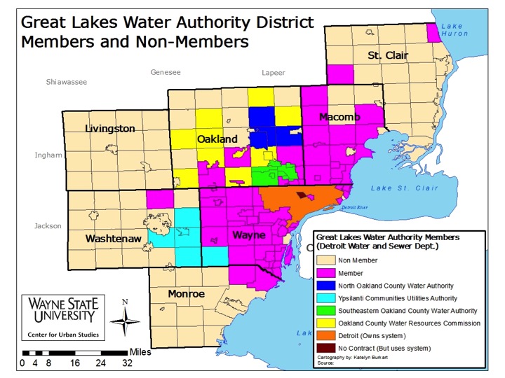
With the proposed wholesale water rate changes for the newly formed Great Lakes Water Authority (GLWA)-which now provides water and sewer services to 127 former Detroit Water and Sewer Department (DWSD) customers-only one of the 89 tri-county customers is expected to experience a rate decrease above 10 percent. That community is the city of Novi and the anticipated decrease between 2016 and 2017 is 23.7 percent. The only other government entities expected to experience a decrease are Bruce Township, the city of Warren and the Southern Oakland County Water Authority (which is made up of Royal Oak, Berkley, Clawson, Huntington Woods, Pleasant Ridge, Southfield, Beverly Hills, Lathrup Village, and Bingham Farms). The reason for Novi’s expected wholesale water rate decrease is because of a water reservoir that went online in the city in July of 2015. This reservoir allows the city to hold up to 1.5 million gallons of water; it is filled nightly when demand and costs are lower and discharged at peak hours during the day, according to the Hometown Life article.

While wholesale rate decreases are expected to occur for a select few communities, wholesale rate increases are anticipated to be the norm for the region. The overall average wholesale rate increase for the region is expected to be about 6.1 percent, but Royal Oak Township’s expected increase is estimated to be about 20 percent. New Haven and Romeo were the only other two government entities in the GLWA that are expected to experience a wholesale water rate increase above 10 percent. New Haven is expected to experience an increase of about 14 percent, and Romeo is expected to have an increase of about 12 percent.

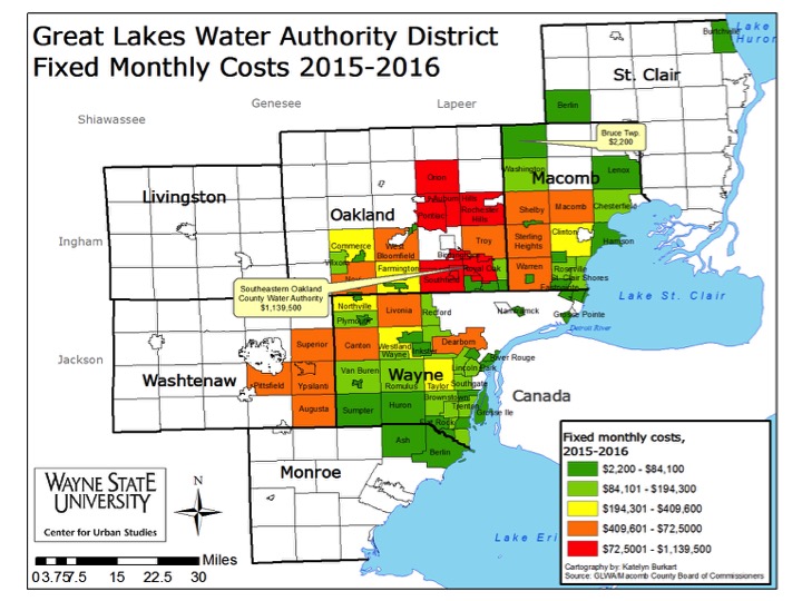
Charges for water service are a combination of a monthly fixed cost (which are associated with infrastructure costs) and metered usage. According to an interview the Detroit News held with the GLWA, monthly fixed costs make up about 60 percent of what the GLWA charges a community, and the remainder is metered usage. At the time of this post it is unclear why fixed costs vary so vastly from one government entity to another. However, this is a question Drawing Detroit will be further investigating.

GLWA

GLWA Rate Change

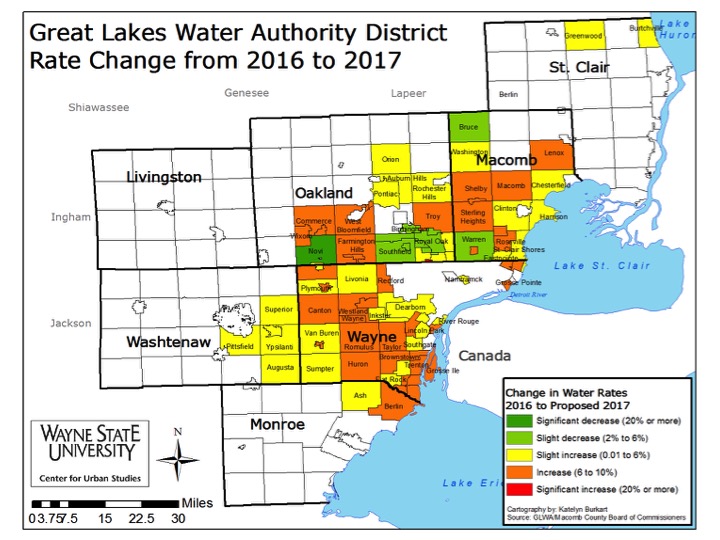
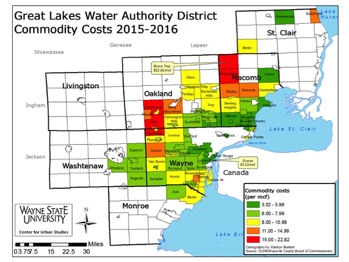
While both Novi and Bruce Township are expected to have wholesale rate decreases, they are two of 22 communities in the GLWA that had 2016 commodity costs above $10 per million cubic feet (mcf). Bruce Township had the highest commodity price per mcf of all the GLWA customers at $22.82 per mcf. Additionally, the township’s fixed wholesale monthly cost was $2,200 in 2016. In 2017 that fixed monthly cost is expected to increase to $2,300, and the commodity price is expected to be $21.44 per mcf. This represents a 6 percent wholesale rate decrease. For Novi, the 2016 cost per mcf is $16.99 with a fixed monthly cost of $560,000; for 2017 those numbers are expected to decrease to $12.96 per mcf and $475,000, respectively.

Royal Oak Township, which is expecting a 20 percent rate increase, has a current commodity cost per mcf of $6.85 and a fixed monthly cost of $10,300. Those numbers are expected to be $8.23 per mcf and $12,400, respectively.

As noted throughout this post, the 2017 rates and costs discussed here are expected; the GLWA has yet to vote on the regional rates and costs. The vote is expected to come in the coming weeks though so the wholesale rates and fixed costs can become effective on July 1, 2016. The proposed figures used for this post were made public by the GLWA in March of 2016.

Additionally, while wholesale rates were discussed in this post, each individual community has the opportunity to set water rates above the wholesale rates set by the GLWA. These rates are known as the retail rates and are ultimately what the customers pay.

GLWA Commodity Costs

GLWA Fixed Costs

The city of Detroit was not included in this post because when the GLWA was formed the city of Detroit was able to maintain operations of its water and sewer infrastructure. DWSD still legally owns the water and sewer infrastructure it used to service the now GLWA members with, but the creation of this regional authority allows the GLWA to lease water and sewer infrastructure from the city of Detroit for 40 years at a cost of $50 million a year.

Northville Public Schools have top ACT scores in region

For several years Michigan has required juniors in high school to take the ACT as part of their preparation for college. The overall results recently became available. For the 2014-15 academic year, Washtenaw County had the overall highest average ACT composite scores at 22.5, but it was the Northville Public School District in Wayne County that had the highest composite score for the 110 districts in Southeastern Michigan. At 24.6 (out of 36 points), Northville Public Schools had the highest ACT composite score and it was the Pontiac City School District in Oakland County that had the lowest score in the region at 14.3. The Pontiac City School District was one of nine districts in the region with ACT scores below 16. Another one of the nine school districts with an ACT score below 16 was the Detroit Public School District with an ACT composite score of 14.9. Wayne County had six of those nine districts with ACT composite scores below 16.

With a state average ACT composite score of 19.9 for the 2014-15 academic year there were 52 districts in the region that outranked the overall state score. Livingston County had the highest percentage of districts with ACT composite scores above the state average of 19.9 at 100 percent and Macomb County had the lowest percentage of districts at 24 percent.

The ACT test has been given across the United States as one way to measure a high school student’s readiness for college. It is a standardized college entrance exam where students are tested on math, English, social studies and natural sciences. In 2007 when the state started using the ACT test as the state-wide accepted exam. The 2014-15 academic year was the last year Michigan students were given the ACT though as a standardized test, and instead they will be taking a revamped SAT test, one that the state has concluded is more in line with college readiness standards, is lot less expensive, but some say is also more difficult.

Michigan also uses a standardized test for assessment of students’ academic progress. The current test is the M-STEP (Michigan Student Test of Educational Progress), which replaced the MEAP (Michigan Educational Assessment Program). This week is when M-STEP testing begins in Michigan schools.

SEMI_ACTScores

MISchools_ACTScores

Metro-Detroit’s Home Prices Continue to Grow

  • From November 2015 to December 2015, the unemployment rate across the state remained stable and the city of Detroit’s increased (monthly);
  • The Purchasing Manager’s Index for Southeast Michigan decreased from November 2015 to December 2015 (monthly);
  • Commodity Price Index increased from November 2015 to December 2015 for Southeast Michigan (monthly);
  • Standard and Poor’s Case-Shiller Home Price Index for the Detroit Metropolitan Statistical Area shows home prices are about $6,800 higher than in December of 2014.

Slide03


According to the most recent data provided by the Michigan Department of Technology, Management, and Budget, the unemployment rate for the State of Michigan remained constant at 4.5 percent between November and December of 2015. During this same period, unemployment in the City of Detroit increased from 10.6 percent in November to 10.9 percent in December.

Slide05

Since March of 2015 the number of people employed in the city of Detroit increased by 4,895, for a total of 214,282 people employed in the city in December of 2015. In the last year, the month of March had the lowest number of people employed in Detroit. Employment went down slightly in December.

Slide07

The above chart shows the number of people employed in the auto manufacturing industry in the Detroit Metropolitan Statistical Area (MSA) (Detroit-Warren-Livonia) from January 2015 to December 2015. In that time frame the number of people employed in this industry increased by 1,100, from 104,900 to 106,000.

Slide09

The Purchasing Manger’s Index (PMI) is a composite index derived from five indicators of economic activity: new orders, production, employment, supplier deliveries, and inventories. A PMI above 50 indicates the economy is expanding.

According to the most recent data released on Southeast Michigan’s Manager’s Index, the PMI for December 2015 was 54.8, an decrease of 2.3 point from the prior month. It was also a decrease of 9.4 from December of 2014.

Slide11

The Commodity Price Index, which is a weighted average of selected commodity prices, was recorded at 47.2 points in December 2015, which was 1.7 points higher than the previous month and 7 points lower than December 2014.

Slide13

The above charts show the Standard and Poor’s Case-Shiller Home Price Index for the Detroit Metropolitan Statistical Area. The index includes the price for homes that have sold but does not include the price of new home construction, condos, or homes that have been remodeled.

According to the index, the average price of single-family dwellings sold in Metro Detroit was $103,770 in December 2015. This was an increase of $6,800 from December of 2014. Note also that there were continuing increases at the end of 2015.


Percentage of Special Education Students Higher in Urban, Rural Districts in Southeastern Michigan

In the state of Michigan, 13.3 percent, or about 206,000 students, were considered to be Special Education students for the 2014-2015 school year. Many urban and rural districts had a higher percentage of special education students than their suburban counterparts in Southeastern Michigan. However, according to a 2014 Bridge article, special education designations vary from district-to-district; it comes down to a very local decision.

According to the state of Michigan there are 13 disability types that may cause a student to be considered a special education. These disability types are:

  • Autism Spectrum Disorder
  • Cognitive Impairment
  • Deaf-Blindness
  • Early Childhood Development Delay
  • Emotional Impairment
  • Hearing Impairment
  • Physical Impairment
  • Severe Multiple Impairment
  • Specific Learning Disability
  • Speech and Language Impairment
  • Traumatic Brain Injury
  • Visual Impairment
  • Other Health Impairments

At the county level (which is represented by data provided for the county intermediate school district or regional education service agencies), the St. Clair County Regional Education Agency had the highest percentage of special education students at 14 percent and the Livingston Education Service Agency had the lowest at 12 percent.

SEMI Special Education1

Of the 100 public school districts in Southeastern Michigan, Mount Clemens School District had the highest percentage of special education students during the 2014-2015 school year at 26.5%. In Macomb County, 36 percent of the school districts had a higher percentage of special education students than the state average of 13.3 percent. Macomb and Oakland counties each had eight school districts with a percentage of special education students that was higher than the state average. It was St. Clair County though that had the highest percentage of public school districts with a higher percentage of special education students over the state average. Of the seven public school districts in St. Clair County four had more than 13.3 percent of its student body designated as special education. Capac Community Schools had the highest percentage in the county at 17 percent.

In Wayne County, the Wyandotte School District had the highest percentage of special education students at 24.7 percent. The Detroit Public Schools had 18.2 percent of its student body categorized as special needs during the 2014-2015. The Wayne County public school districts that had a higher percentage of special education students than the Detroit Public Schools were:

  • Garden City Public Schools (18.8%)
  • Redford Union Schools (19.9%)
  • Southgate Community School District (18.9%)

Below are the public school districts in each county, not already discussed, with the highest percentage of special education students

  • Monroe County- Jefferson Public Schools (15%)
  • Oakland County- Pontiac Public Schools (19.2%)
  • Washtenaw County- Whitmore Lake Public School District (21.1%)

Southeastern Michigan Special Education

While special education designations remain a local decision, Michigan Lt. Gov. Brian Calley recently called for special education reform, including “breaking down the walls between general education and special education” and creating a multi-tied system of support that is centered around the philosophy that each student is unique. Calley said he doesn’t want a child’s education to be tied to their diagnosis, but rather their specific needs. For more on this click here.

Part III: Metro-Detroit Region Working Toward Wide Spread Transit

In our last two posts we discussed several regional authorities that governments and voters in Southeast Michigan have approved, especially in the wake of Detroit’s financial problems. In this post, we will consider regional efforts to coordinate and fund mass transportation in the area. Transportation planning in Metro-Detroit has long been a fragmented issue. Currently, the Regional Transportation Authority (RTA), which was created through Public Act 387 of 2012, is placing the finishing touches on its Regional Master Plan. This plan is to include main transportation routes along Woodward, Gratiot and Michigan avenues, along with connector lines going east to west throughout Wayne, Oakland, Macomb and Washtenaw counties. It is these four counties that the RTA encompasses and, in order to have sufficient funding for a robust regional transportation system, the RTA is expected to put a ballot initiative before the voters of these four counties (Detroit included) asking for a yet-to-be-determined amount of funding through a millage. According to Public Act 387 of 2012, the RTA can receive money through voter approved millage funding and/or an additional fee that may accompany state driver registration fees. Ballot initiatives can only be placed on ballots during presidential or gubernatorial elections.

Decisions on how and when to seek public funding are made through the RTA’s Board of Directors. This is a 10-member Board, with each Board member serving three-year terms. The County Executives of Wayne, Oakland and Macomb counties each appoint two board members, the Chair of the Washtenaw County Board of Commissioners appoints two members, the Mayor of Detroit appoints one member and the Governor appoints one member. The Governor’s appointee serves as chair but does not vote, according to the RTA’s website.

Prior to the establishment of the RTA, the Suburban Mobility Authority for Regional Transit (SMART) was created in 1967, and it still operates in portions of Wayne, Oakland and Macomb counties. Up until recently, SMART did not coordinate with the Detroit Department of Transportation (DDOT), and because of the way SMART initiatives can be placed on the county ballots (by individual counties), Macomb County is the only county in which all communities support the suburban transit authority and are all thereby affected by the authority’s ballot initiatives. In Oakland and Wayne counties, communities have the option to “opt-out” of supporting the authority.

The percentage of opt-out communities as of February 2015 was as follows:

  • Wayne County: 38.6%
  • Oakland County: 57.6%
  • Macomb County: 0%

source

SMARTBus

Most recently, the County Board of Commissioners in Wayne, Oakland and Macomb counties placed a 4-year 1 mill request for the Suburban Mobility Authority for Regional Transit (SMART) on the ballot in August of 2014. The 1 mill request, which included an increase from the original 0.59 mills, was approved throughout the tri-county region as follows:

  • Wayne County: 63.45% yes
  • Oakland County: 73.6% yes
  • Macomb County: 59.6% yes


While SMART, RTA, DDOT and the Ann Arbor Transportation Authority (AATA) are now expected to coordinate with one another, it has taken about 100 years for the region to develop even a semblance of a coordinated regional transit system.


Starting with streetcars in the early 1900s, Southeastern Michigan once had the largest transportation system in the country, according to Tobi Voigt of the Detroit Historical Society in a 2015 Detroit Free Press article. Although the streetcars were once nearly all privately owned, in 1922 the voters of Detroit voted to buy the streetcars, lines and all other materials that made them operational at a cost of $19.8 million. Having bought an aging system, and then with the Great Depression and World War II, the once vibrant streetcar system could no longer be maintained with the funds the city had. The aging infrastructure, however, did not deter people from using the system. According to Voigt, during World War II ridership actually doubled because of widespread difficulty in obtaining gas, tires and vehicles during World War II.


While World War II meant increased ridership, post-World War II meant the beginning of a more developed highway system and more wealth to afford vehicles. These societal changes lead to the retirement of Detroit’s last streetcar on April 8, 1956.


Following streetcars came busses, a mode of transportation still used today. Similar to today’s operations, the DDOT (formerly the Detroit Department of Street Railways) attempted to coordinate with a regional entity—then called the Southeastern Michigan Transportation Authority (SEMTA). Created by the Michigan Legislature in 1967, SEMTA was intended to provide service to the seven county region. However, SEMTA did not have the authority to ask voters for operating funds. This, combined with decreasing ridership and President Ronald Reagan’s decision to cut federal funding to regional transit authorities in 1985, caused SEMTA to cut down to bare bones operations. By 1989, SEMTA became SMART, an authority with the power to seek millage funding.


With its 2012 creation, the RTA is now the entity charged with coordinating and planning for public transportation in Wayne, Oakland, Macomb and Washtenaw counties; applying for state and federal transportation dollars; and dispersing those dollars to the appropriate entities.


Despite the RTA’s status as the “official” regional transportation authority, collaboration between it, SMART, DDOT and the AATA is expected to take place so truly robust, connected and coordinated system can exist.


Regionalism never strongly existed in the Metro-Detroit area until the financial downfall of Detroit began, and even though we are now seeing a surge in regional coordination, the coordination between those regional entities remains fragmented.


Washtenaw County gains 770 residents while Livingston loses more than 1,000

Last week, we explored migrations in and out of the tri-county region using 2012-13 IRS tax returns. This week, we highlight the remaining four counties in Southeastern Michigan (Livingston, Monroe, St. Clair and Washtenaw) where there was a total net gain of 32 residents. All counties, except Livingston, experienced net gains. Washtenaw County had the highest net gain of residents at 770, while Livingston County had a net loss of 1,085. Even with such gains and losses, the data presented in this post shows that majority of the migration in and out of a these counties occurred within the state’s boundaries.

WashtenawCountInMigration

WashtenawCountyOutMigration

Washtenaw County experienced a net increase of 770 new residents, according to 2012-13 tax returns. The IRS data shows that, there were 9,596 tax returns filed by new Washtenaw County residents and 8,826 filed by former Washtenaw County residents. Former Wayne County residents contributed the most to the population influx with 2,529 of them moving to Washtenaw County. Oakland County contributed the second highest number of new residents at 891, followed by Livingston County at 649. In total, of the 9,596 new residents who moved into Washtenaw County, 5,881 were from other Michigan counties. From outside of Michigan, Cook County, Illinois (where Chicago is located) contributed the highest number of new residents at 344; Los Angeles County in California contributed 130 new residents to Washtenaw County.

When viewing the number of residents who left Washtenaw County for elsewhere, 2,225 residents moved to Wayne County (Washtenaw County had a net gain of 304 residents from Wayne County). Additionally, Washtenaw County lost 915 residents to Oakland County (a net loss of 24), and 536 residents to Livingston County (a net gain of 113). In total, Washtenaw County lost 5,785 residents to other Michigan counties, for a net gain of 96.

From outside of Michigan, Washtenaw County lost 284 residents to Cook County, Illinois (net gain of 58). Washtenaw also lost 142 residents to Los Angeles County, California (a net loss of 12).

LivingstonCountInMigration

LivingOut

Livingston County lost 4,452 residents, according to 2012-13 IRS data, while gaining 3,367, for a net loss of 1,085 residents. Among the new Livingston County residents, 1,027 were from Oakland County, 536 from Washtenaw County, and 469 from Wayne County. In total, 3,285 Michigan residents moved to Livingston County during the 2012-13 time frame. Cook County, Illinois contributed the highest number of new residents to Livingston County, at 44 from an out-of-state county.

While Livingston County gained the largest number of residents from Oakland County, it also lost the most residents to the same county: it lost 1,292 residents, for a net loss of 265 residents to Oakland County. Livingston County lost 903 of its residents to Wayne County (a net loss of 434) and 649 of its residents to Washtenaw County. In total, 4,157 former Livingston County residents moved elsewhere in the state, for an in-state net loss of 872. Outside of Michigan, Cook County, Illinois gained former Livingston County residents at 37, for a net loss of 7.

MonroeCountyInMigration

MonroeOut

Monroe County had a net gain of 143 residents, according to 2012-13 IRS tax returns. This rural county lost 2,350 residents to other counties while gaining 2,493 new residents. Monroe County’s largest population gain came from Wayne County at 852 residents; its second largest gain was from Lucas County, Ohio (Lucas County, which borders Monroe County, is home to Toledo) at 738. Wayne County and Lucas County were also the two counties that gained the most former Monroe County residents. Monroe lost 879 residents to Wayne County (net loss of 27) and 694 residents to Lucas County (a net gain of 141).

In total, Monroe County gained 1,564 residents from other Michigan counties and lost 1,485 residents to other Michigan counties for a net gain of 79 residents.

StClairCountyInMigration

StCOut

St. Clair County lost 2,232 residents and gained 2,192 residents, according to 2012-13 tax returns. The highest population gain for the county came from Macomb County with 1,001 residents, followed by Oakland County at 249. There were 141 former Wayne County residents who moved to St. Clair County. Pasco County, Florida (Tampa Bay area) contributed the largest number of new out-of-state residents to St. Clair County (28).


More former St. Clair County residents moved to Macomb County than anywhere else (1,194), resulting in a net loss of 193 residents to Macomb County. Oakland County gained the second highest number of St. Clair County residents at 210 (net gain) of 39. In total, 2,034 residents moved to St. Clair County from other Michigan counties and while 2,124 moved out, for a net loss of 90 residents. Maricopa County (Phoenix area), Arizona was the out-of-state county that gained the highest number of former St. Clair County residents at 25.

Overall, across Southeastern Michigan, there was a net gain of 5,770 residents. However, majority of the migration in and out of each county in the seven county region occurred between neighboring counties.


IRS Tax returns show Wayne County nets population gain

At first glance of filed 2012-13 IRS tax returns, it appears that, combined, Wayne, Oakland and Macomb counties gained about 5,500 residents. However, a deeper look into this information shows that majority of those leaving one county for another are actually just moving over the county line. Of the three counties, Wayne County was the only one to experience a net gain, while Oakland County was nearly equal in the number of residents leaving and moving in and Macomb County experienced a net loss.

The information provided in this post is from 2012-13 filed IRS tax returns.

Wayne County In Migration

Wayne County Out Migration

According to the 2012-13 tax returns, Wayne County lost 26,264 residents and gained 34,320, for a total net gain of 8,056. Former Oakland County residents were responsible for majority of the gain at 10,402, followed by Macomb County residents at 6,625 and Washtenaw County at 2,225. From out of state, Illinois’ Cook County (where Chicago is located) contributed the most number of new residents to Wayne County at 449.

While Wayne County gained the most number of Oakland County residents, it also lost majority of its residents to Oakland County as well. Wayne County lost 8,074 to Oakland County. Macomb County gained the second largest number of former Wayne County residents at 4,407. Outside of Michigan Cook County, Illinois gained the largest number of Wayne County residents at 355. Other counties across the country that gained more than 100 Wayne County residents were Clark County, Nevada (Las Vegas area, 126 people), Los Angeles County, California (172), San Diego County, California (138), Broward County, Florida (Ft. Lauderdale/Miami metropolitan area, 113) and Maricopa, Arizona (Phoenix area, 211 former Wayne County residents).

Oakland County in migration

Oakland County out migration

Oakland County lost nearly as many residents as it gained in 2012, according to the 2012-13 tax returns. According to the data, there were 29,124 tax returns filed by new Oakland County residents and 30,001 filed by former Oakland County residents. Of those that left, Wayne County received the most at 10,402, followed by Macomb County at 5,499. In terms of out-of-state migration, Cook County again received the highest number of residents at 600. Additionally, Los Angeles County, California (251) and Maricopa County, Arizona (214) also received a high number of residents from Southeastern Michigan. While Oakland and Wayne County residents had similar migration patterns when they left Michigan, we do see that there was a greater presence of Oakland County residents in northern California and Oregon.

Of the 29,124 residents gained in Oakland County, former Wayne County residents contributed to about a third of that number (8,074) and Macomb County residents contributed and additional 5,688 residents. From out of state, there were 592 former Cook County, Illinois residents who moved to Oakland County.

Macomb County in migration

MacOut

According to 2012-13 filed tax returns Macomb County had a net loss of 1,452 residents, with 15,925 new tax returns being filed for the county and 17,377 being filed by former residents. Wayne County received the highest number of former Macomb County residents at 6,625, followed by Oakland County at 5,668. Cook County, Illinois and Maricopa, Arizona were the only two counties outside of Michigan to receive more than 100 former Macomb County residents (140 and 129, respectively).

Macomb County gained more Oakland County residents than Wayne County residents, according to 2012-13 filed tax returns. During this time period 5,499 former Oakland County residents relocated to Macomb County and 4,409 former Wayne County residents relocated there. From outside of Michigan, Maricopa County, Arizona contributed the most number of residents at 160, followed by 145 Cook County, Illinois. Macomb County experienced a net gain of residents from both Maricopa County, Arizona and Cook County, Illinois.

While majority of the migration within the tri-county region took place between neighboring counties, the 2012-13 tax returns do show that Michiganders were leaving the state, particularly to places like Arizona, Florida, California and Illinois. However, the information also shows that there was out-of-state migration in the tri-county region at that time too, and in some cases it meant there was a net gain.

Next week, we will examine migration patterns for the remaining counties that make up Southeastern Michigan.

Poverty in Metro-Detroit spreading through the suburbs

Between 2009 and 2014, poverty levels in the region’s urban communities, such as Detroit, Pontiac and Highland Park, increased, just as they did for some of their suburban neighbors. One might assume that the city of Detroit had the region’s highest percentage of residents living below the poverty level in 2014 due to the amount of press coverage it receives regarding poverty, crime, and various economic indicators. However, the city of Hamtramck, an immediate neighbor to Detroit, actually had the highest percentage of residents living below the federal poverty level in 2014.

This post will examine the percent of residents throughout the region below the poverty level in 2009 and 2014. Both the change in percent and concentration will be shown with various maps. For reference, according to the U.S. government, the Federal Poverty Level (FPL) in 2014 for a family of four was $23,850; in 2009 the FPL was $22,050 for a family of four.

DetroitPoverty2009


DetroitPoverty2014

In 2014, the cities with 30 percent or more of residents living below the poverty line were:

  • Ypsilanti: 30.6%
  • Inkster: 37 %
  • Pontiac: 37.8%
  • Detroit: 39.4%
  • Highland Park: 47.6%
  • Hamtramck: 48.5%


As mentioned above, in 2014, the city of Hamtramck had the highest percentage of individuals living below the poverty line at 48.5 percent; in 2009, that number was 38.4 percent. In the city of Detroit, the percentage of individuals living below the poverty line increased from 33.2 percent in 2009 to 39.4 percent in 2014.


Each county within the Southeastern Michigan region, with the exception of Livingston County, experienced an increase in the number of communities with a higher percentage of residents living below the poverty line between 2009 and 2014. For example, in 2009, a majority of St. Clair County had less than 10 percent of its residents living below the poverty level, but by 2014 that shifted to between 10-19 percent of residents. There were some communities within that county, though, such as Fort Gratiot and Port Huron Township, which experienced a decrease in the percentage of people living below the poverty level. The higher poverty levels in St. Clair County shifted to the more rural area (the northern part of the county) and to the waterfront communities. Overall, the percentage of individuals living below the poverty line in St. Clair County in 2014 was 15.2 percent.


Another visible increase in the percentage of residents living below the poverty level was in the southern portion of Macomb County. Here, cities such as Eastpointe, Sterling Heights, Center Line and Utica all went from having less than 10 percent of their populations living below the poverty level to between 10 to 19 percent of the populations living below the poverty level. For Eastpointe, just under 10 percent of the population lived below the poverty level in 2009 and in 2014 that percentage increased to 23.5 percent. In Sterling Heights, 7.9 percent of the population lived below the poverty level in 2009, and in 2014 that number increased to 13 percent. Macomb County’s overall poverty rate was 12.2 percent in 2014.

The increase in the percentage of individuals living below the poverty line took place in Wayne County as well, with Redford, Flat Rock, Inkster, Wayne, and the southwest portion of the county all experiencing visible changes. Overall, Wayne County had a poverty rate of 24 percent in 2014.

While several communities throughout the region did experience an increase in the percentage of residents living below the poverty line there were, as noted above, some that experienced a decrease. For example, in 2009, 10.5 percent of the population in Howell Township in Livingston County lived below the poverty line and in 2014 that number was 4.6 percent.

Among the counties in Southeastern Michigan, Livingston County had the lowest percentage of individuals living below the poverty level in 2014 at 5.4 percent. The percentage of individuals living below the poverty level in Oakland County in 2014 was 9.9 percent and in Monroe County it was 11.8 percent.

SEMichiganPoverty2009

SEMichiganPoverty2014

Poverty, while being largely concentrated in the city of Detroit, has shifted outward toward the suburbs between 2009 and 2014, as illustrated above. In Wayne County, areas of Detroit, such as downtown, have experienced decreases in the percentage of individuals living below the poverty line while places such as Westland, Romulus and the western portion of the county have experienced an increase. To the north of Detroit, communities in southern Macomb County, such as Eastpointe, and in southeastern Oakland County, such as Hazel Park and Oak Park, have also experienced an increased percentage in the number of residents living below the poverty line.


Ann Arbor, while not experiencing a shift the magnitude of Detroit’s, has also seen its populations living below the poverty levels shift to nearby areas like Pittsfield and Scio. Additionally, in Ann Arbor, poverty concentration has decreased in the northeastern portion of the city and dispersed throughout the entire city.


While the region has experienced a slight shift and a clear growth in concentrated poverty, this isn’t an uncommon trend for other metropolitan areas throughout the Midwest region. According to “Architecture of Segregation: Civil Unrest, the Concentration of Poverty, and Public Policy,” a new study by the Century Foundation, concentrated poverty has spread from within the boundaries of metropolitan cities and into the inner ring suburbs. This has been attributed, in part, to the gentrification and increased taxes of urban communities, which has resulted in the movement of residents who are living below the poverty level to inner ring suburbs with aging infrastructure.

DetroitPovertyChange

DetroitPoverty2009

DetroitPoverty2014


DetroitPovertyConcentration2010

PovertyDetroitDD2014


Between 2010 and 2014, pockets of Detroit neighborhoods experienced a decline in the percentage of individuals living below the poverty line while others experienced increases upwards of 20 percent. Concentrations of poverty in Detroit increased in areas such as Cody/Rouge, the neighborhoods bordering Grosse Pointe Farms, along the borders of Hamtramck, and the Southwest neighborhoods of the city.

Only about a dozen census tracts had less than 20 percent of individuals living below the poverty line in 2010. A majority of these census tracts were located on the city’s west side, west of Palmer Park and near Rosedale Park, along with about four bordering the Grosse Pointes on the east side. By 2014, a majority of those census tracts experienced at least a 5 percent increase in the percentage of residents living below the poverty level.


The neighborhoods along Woodward Avenue north of Highland Park, such as Palmer Park and Green Acres, experienced some of the largest decreases in the percentage of individuals living below the poverty level in the city of Detroit between 2010 and 2014. The Midtown, East Riverside, and Corktown areas also experienced decreases in the percentage of residents living below the poverty level.


In spite of the positive trends in these neighborhoods, however, high poverty census tracts have dramatically increased in the city of Detroit since 2000, according to the Century Foundation study cited earlier. By 2014, the majority of the census tracts in the city of Detroit had between 40 and 59.9 percent of residents living below the poverty level. As such, even with the improvements made, poverty concentration continues to be a challenge in the city of Detroit.

It is policies, both new and recent, that have helped contribute to the increase in concentrated poverty. From the investment into new infrastructure, rather than fixing what already stands, to urban sprawl and the disproportionate building of homes for the middle class and wealthy to the income increases being felt by the rich, but maintaining stagnant for the poor, there are policies in place that allow the growth of poverty and concentrated poverty to occur.


Sexually Transmitted Infections (STI) in Southeastern Michigan: Chlamydia rate decreasing in Wayne County, but nearly double Michigan’s rate

In examining three major Sexually Transmitted Infections (STI) we find Chlamydia experienced rate increases in five of the seven counties in Southeastern Michigan between 2004 and 2014, according to the Michigan Department of Community Health. Oakland and Wayne counties were the only two that didn’t experience rate increases for this sexually transmitted infection (STI). These two counties were inline with the state trend; Michigan experienced a chlamydia rate decrease between 2004 and 2014, from 484.3 per 100,000 people to 452.5. According to the Centers for Disease Control, the increase in chlamydia rates was a national trend, as it increased about three percent from 2013 to 2014.


Chlamydia and gonorrhea were most commonly diagnosed in 15-24 year-olds throughout the country, according to the Centers for Disease Control. This is an ongoing national trend that a Centers for Disease Control Doctor Gayle Bolan said is occurring, in part, because of sexual relationships beginning at an early age, according to NBC News. Overall STI rates are increasing nationally because budget cuts to STI programs, changed behavior of gay and bi-sexual men and better reporting mechanisms, Bolan said. She said chlamydia is the most affected by better reporting mechanisms, as it has always been amongst the most common STI, while syphilis rates seem to be increasing because of the changed behavior of gay and bi-sexual men.

Also, officials from Rhode Island to Kent and Wood counties on Michigan’s west side are attributing their STI rate increases to “hook-up” apps like Tinder because of the increased opportunities they allow for casual sex.


In Michigan as a whole, not only are chlamydia rates decreasing, but so are gonorrhea rates; conversely, syphilis cases are increasing. This trend is similar with regional trends.


Chlamydia was the only sexually transmitted infection for which data were recorded for all seven counties at three time periods (2004-2008 average; 2009-2013 average and 2014). The sexually transmitted infection of syphilis has counties lacking data for all three time periods. Data on gonorrhea for all seven counties is available only for the 2004-2008 and 2009-2013 time periods. It is unclear if missing data is due to data suppression or low numbers.

All rates are per 100,000 residents.

Detroit Chlamydia Rates 2008

Detroit Chlamydia rates 2013

Detroit Chlamydia Rates 2014

St. Clair County experienced the largest chlamydia rate increase of all seven counties from a 2004-2008 average rate of 275.7 per 100,000 per residents to a 2014 rate of 402.4,. In 2014, though, it was Wayne County that had the highest overall Chlamydia rate per 100,000 residents at 811.1, a rate nearly 400 points higher than the states. The 2014 rate of 811.1 decreased from 1076.5 for the 2009-2013 average and from 1007.3 for the 2004-2008 average rate.

As noted earlier, Wayne and Oakland counties were the only two in the region to experience a rate decrease for chlamydia between 2004 and 2014. Oakland County’s average chlamydia rate for 2004-2008 was 300.5, and the 2014 rate was 280.7. Between the 2009-2013 average and 2014 Oakland County also experienced a rate decrease, from 297.6 to 280.7.

The state’s chlamydia rate for 2014 was 452.5, a decrease from 484.3 per 100,000 people for the 2004-2008 average and a decrease from 490.7 per 100,000 people for the 2009-2013 average.

Detroit Gonnorhea rates 2008

Detroit Gonnorhea rates 2013

Detroit Gonnorhea rates 2014

Between 2004 and 2014, of the counties with available data, Wayne County experienced the largest gonorrhea rate decrease from 376.6 for the 2004-2008 rate average to 231.4 for the 2014 rate per 100,000 people. Even so Wayne County had the second highest gonorrhea rate in the state in 2014 (Kent County had the highest rate at 255), according to the Michigan Department of Community Health, but the highest percent distribution of gonorrhea cases in the state came from Wayne County, with 42.4 percent of cases coming from there. The rate decreases for the other three counties with information available-Macomb, Washtenaw and Oakland-ranged between 9 and 15 points between 2004 and 2014. Washtenaw County’s 2014 gonorrhea rate was 72.9, decreasing from the 88.5 average from 2004-2008. Macomb County’s rate of 55.8 per 100,000 in 2014 was a decrease from the 64.7 average rate of 2004-2008. Oakland County’s 2014 rate of 49.6 per 100,000 was a decrease from the 78.7 average rate of 2004-2008.

St. Clair, Livingston and Monroe counties were missing rate data on gonorrhea for 2014. Between the 2004-2008 and 2009-2013 averages St. Clair and Monroe counties both experienced rate increases per 100,00 people and Livingston County experienced a rate decrease. For the 2004-2008 rate averages St. Clair County’s rate was 45, Monroe’s was 41.8 and Livingston County’s was 10.7. The 2009-2013 rate for St. Clair County was 46.6, Monroe 42.2 and Livingston County was 10.5.


Slide11 Slide12


Detroit Syphillis Rates 2014

For syphilis data, Wayne, Oakland and Macomb Counties were the only three with consistent data between 2004 and 2014. According to the Michigan Department of Community Health, Wayne County had the highest rate of the three counties in 2014 at 32.4 per 100,000 people; this was an increase from 21.9 for the 2009-2013 average and an increase from 20.5 from the 2004-2008 average. Macomb County’s syphilis rate per 100,000 people in 2014 was 9 and Oakland County’s rate was 12.1. These two counties also experienced rate increases from the 2004-2008 average and the 2009-2013 average. For the 2004-2008 average, Macomb County’s rate was 5.6 and Oakland County’s rate was 7.6. For the 2009-2013 average, Macomb County’s rate was 7.5 and Oakland County’s rate was 7.8.

Washtenaw County had data recorded for the 2004-2008 average and the 2009-2013 average. This information that Washtenaw County’s rate between those two time periods experienced a miniscule rate increase, from 7.8 for the 2004-2008 average to 7.9 for the 2009-2013 average.


In 2014, Michigan’s syphilis rate was 11.3, an increase from both the 2004-2008 average (7.5) and the 2009-2013 average (7.6). The 2014 rate is nearly a third of Wayne County’s 2014 syphilis rate.

Cancer incidence rates declining across Southeastern Michigan

Overall cancer rates declined across all counties in Southeastern Michigan in the last decade. Cancer rates also declined for nearly all major categories—breast, colon/rectal, lung/bronchial and prostrate—in most counties. The category “all other sites” of cancer, however, increased between the 1998-2002 period and the 2008-2012 period for four of seven counties. These counties were Livingston, Macomb, Washtenaw and Wayne.

Slide03

Slide21

For the total average cancer incidence rates per 100,000 people Monroe County had the largest decrease at nearly 100 between 1998 and 2012; the 1998-2002 average was 478.6 and the 2008-2012 average was 378.8. Oakland and St. Clair counties had similar rate decreases (73.8 and 84.1, respectively) between that time. For the 1998-2002 average Oakland County’s overall cancer incidence rate was 565.9, and St. Clair County’s rate for this time was 581. For the 2008-2012 averages, Oakland County posted a rate of 492.1 and St. Clair County posted a rate of 496.9.

From 477.6 to 471.9, Washtenaw County had the lowest decrease at 5.7. It was Livingston County that had the lowest average rate for 2008-2012 at 441.1 per 100,000 people; Livingston County’s average rate for 1998-2002 was 451.5.

For Wayne County, the average cancer incidence rate per 100,000 people was 568.2 for 1998-2002 and 525.5 for the 2008-2012 average.

Slide05

Slide06

Livingston, St. Clair and Oakland counties all experienced a decrease in their average breast cancer rates between 1998 and 2012. From 1998-2002 Oakland and St. Clair counties had the highest breast cancer rates with Oakland County reporting a breast cancer rate of 84.6, and St. Clair County a rate of 83.7. St. Clair County had the largest decrease from the 1998-2002 to 2008-2012 average; the rate dropped 20.4 points, from 83.7 to 63.3.

Washtenaw County only experienced a 2 point decrease across those two time periods; it had the highest average rate for the 2008-2012 time period of 73.1.

Slide08

Slide09

Average colon and rectum cancer incidence rates throughout the seven county region decreased between 1998 and 2012, with Monroe County posting the largest rate decrease. For the 1998-2002 average rate per 100,000 people Monroe County’s average incidence rate was 60.2, and for the 2008-2012 average the rate per 100,000 people was 35.8; the overall decrease was 24.4. For the 2008-2012 period St. Clair County had the highest average rate per 100,000 people at 51.6, though it had experienced a very substantial reduction from 74.2 in the 1998-2002 period.

Slide11

Slide12

Lung and bronchus average cancer incidence rates in all seven counties decreased between 1998 and 2012, with St. Clair County experiencing the largest decrease at 17.3, from 90.1 to 72.8. Wayne County had the highest rate at 82.9 for 2008-2012, compared to 90.1 for 1998-2002.

Slide14

Slide15

Monroe County had the largest average prostate cancer incidence rate decrease per 100,000 between 1998 and 2012 of 36.1; the 1998-2002 rate was 76.7 and the 2008-2012 rate was 40.6. Oakland County also experienced a large rate decrease from the 1998-2002 average to the 2008-2012 average; the Oakland County rates went from 104.7 to 79.4. Despite the 25.3 average rate decrease Oakland County’s average prostate rate remained the highest in the region for 2008-2012 at 79.4.

Slide17

Slide18

When looking at all other average cancer incidence rates for the region four of the seven counties experienced rate increases per 100,000 people. Those four counties were Livingston, Macomb, Washtenaw and Wayne counties. Washtenaw County had the largest average rate increase at 15.1 per 100,000 between 1998 and 2012, from 216.4 to 231.5. Monroe County had the largest average incidence rate decrease between 1998 and 2012 at 22. Monroe County’s 2008-2012 average rate was 185.4, the lowest rate in the region, and its 1998-2002 rate was 207.4. Overall, Macomb County had the highest average incidence rate for 2008 to 2012 at 246.4; its 1998-2002 rate was 241.7.