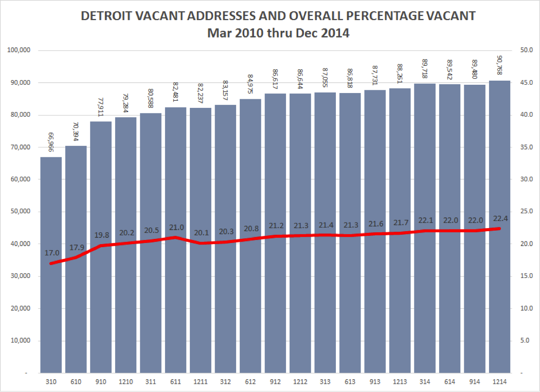
In examining three major Sexually Transmitted Infections (STI) we find Chlamydia experienced rate increases in five of the seven counties in Southeastern Michigan between 2004 and 2014, according to the Michigan Department of Community Health. Oakland and Wayne counties were the only two that didn’t experience rate increases for this sexually transmitted infection (STI). These two counties were inline with the state trend; Michigan experienced a chlamydia rate decrease between 2004 and 2014, from 484.3 per 100,000 people to 452.5. According to the Centers for Disease Control, the increase in chlamydia rates was a national trend, as it increased about three percent from 2013 to 2014.
Chlamydia and gonorrhea were most commonly diagnosed in 15-24 year-olds throughout the country, according to the Centers for Disease Control. This is an ongoing national trend that a Centers for Disease Control Doctor Gayle Bolan said is occurring, in part, because of sexual relationships beginning at an early age, according to NBC News. Overall STI rates are increasing nationally because budget cuts to STI programs, changed behavior of gay and bi-sexual men and better reporting mechanisms, Bolan said. She said chlamydia is the most affected by better reporting mechanisms, as it has always been amongst the most common STI, while syphilis rates seem to be increasing because of the changed behavior of gay and bi-sexual men.
Also, officials from Rhode Island to Kent and Wood counties on Michigan’s west side are attributing their STI rate increases to “hook-up” apps like Tinder because of the increased opportunities they allow for casual sex.
In Michigan as a whole, not only are chlamydia rates decreasing, but so are gonorrhea rates; conversely, syphilis cases are increasing. This trend is similar with regional trends.
Chlamydia was the only sexually transmitted infection for which data were recorded for all seven counties at three time periods (2004-2008 average; 2009-2013 average and 2014). The sexually transmitted infection of syphilis has counties lacking data for all three time periods. Data on gonorrhea for all seven counties is available only for the 2004-2008 and 2009-2013 time periods. It is unclear if missing data is due to data suppression or low numbers.
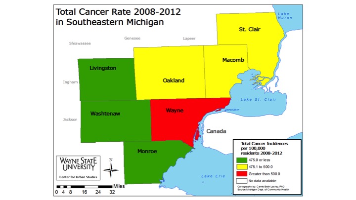
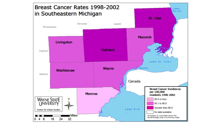
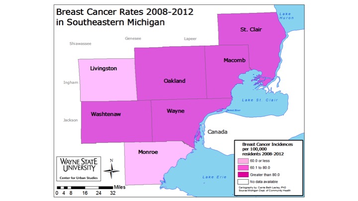
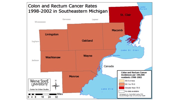
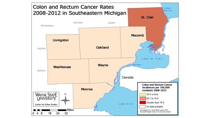
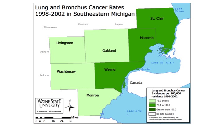
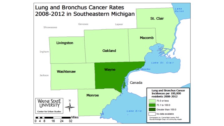
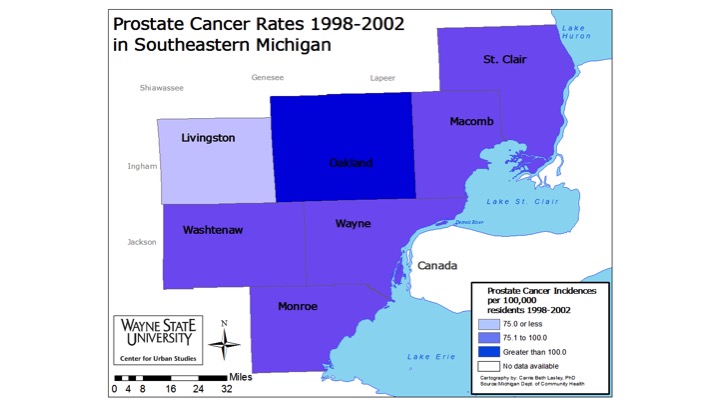
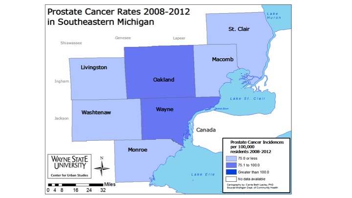
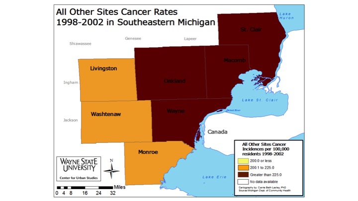
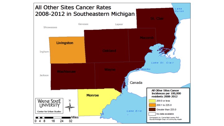
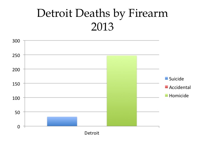
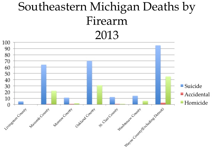
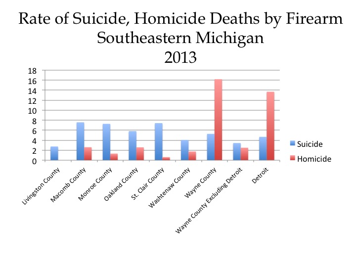
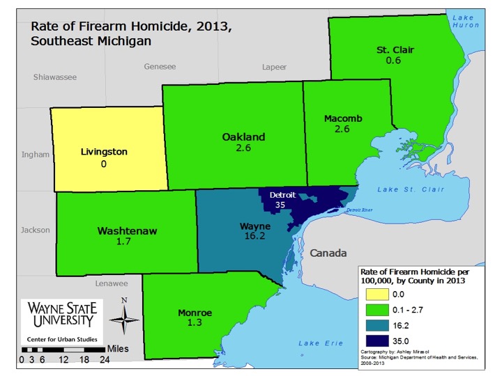
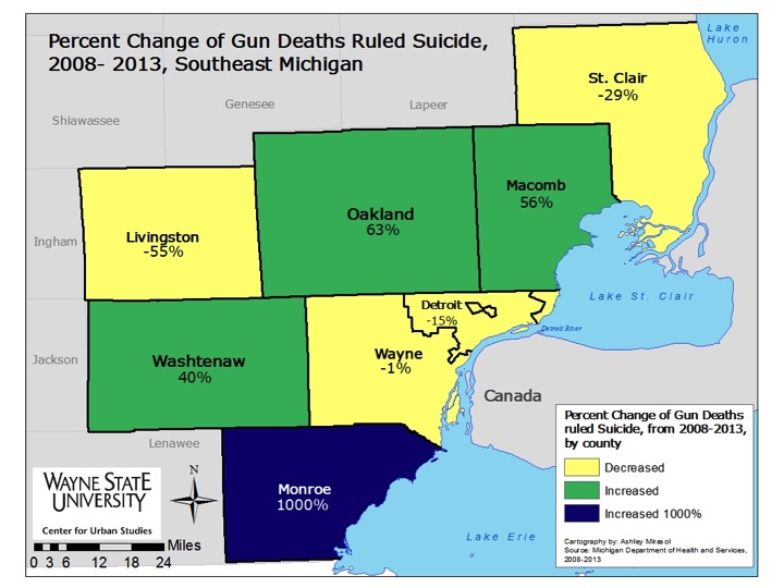
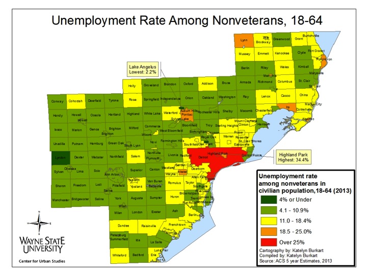
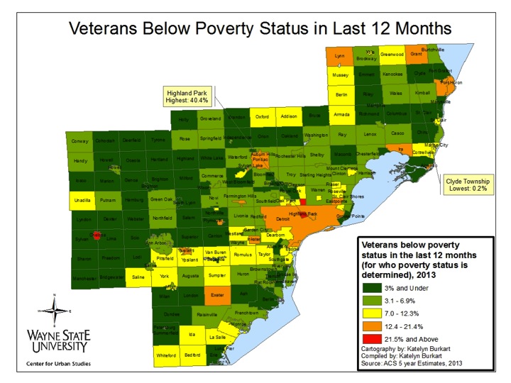
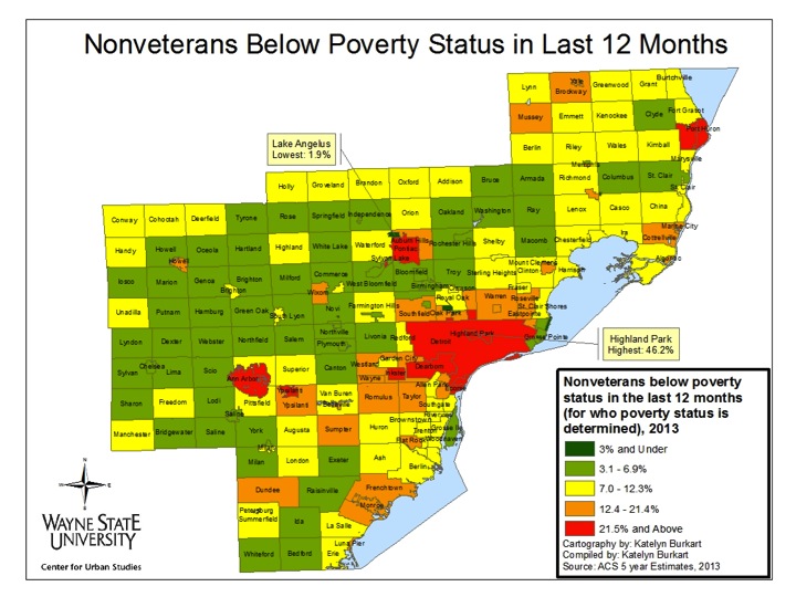
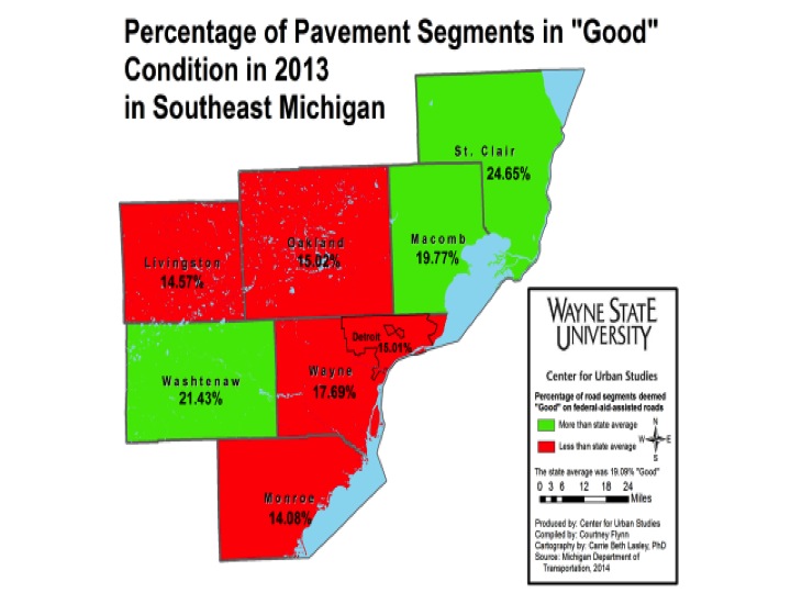
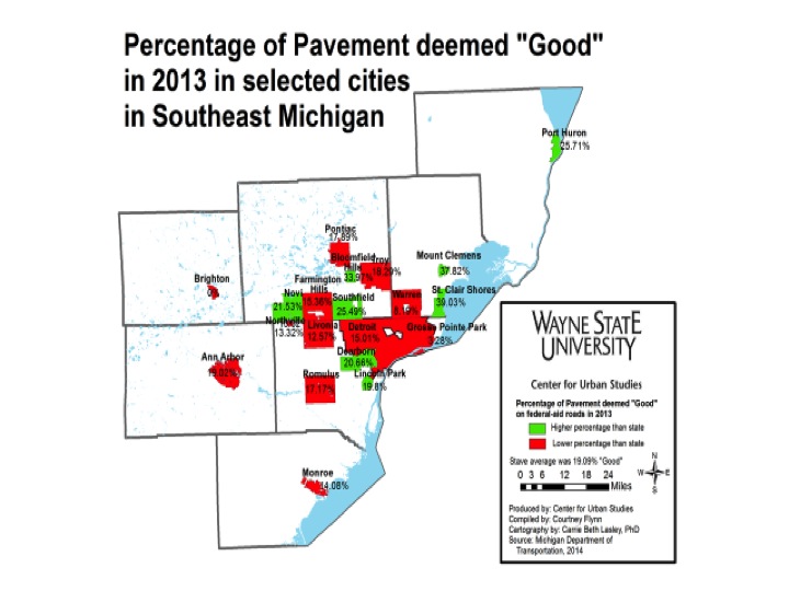
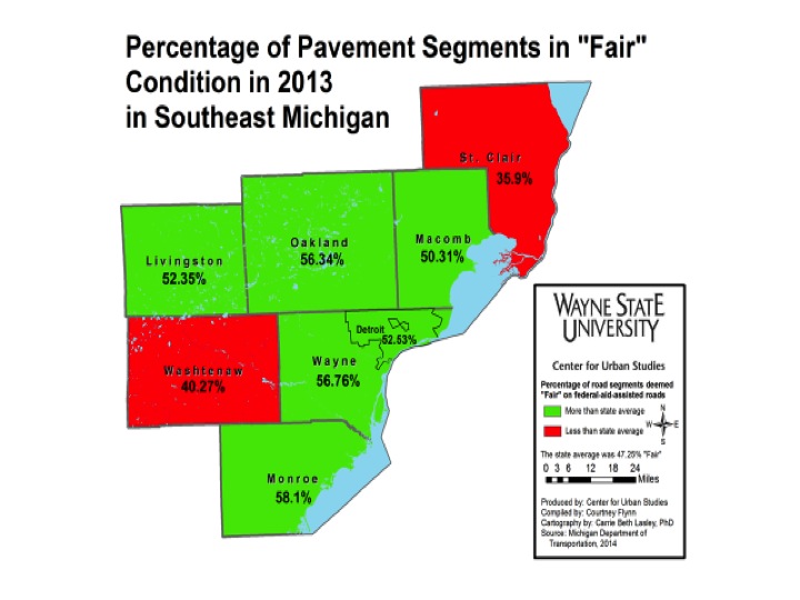
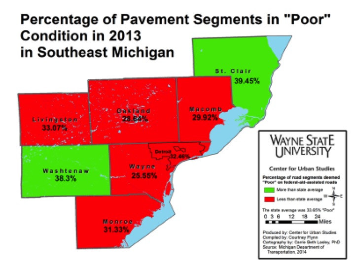
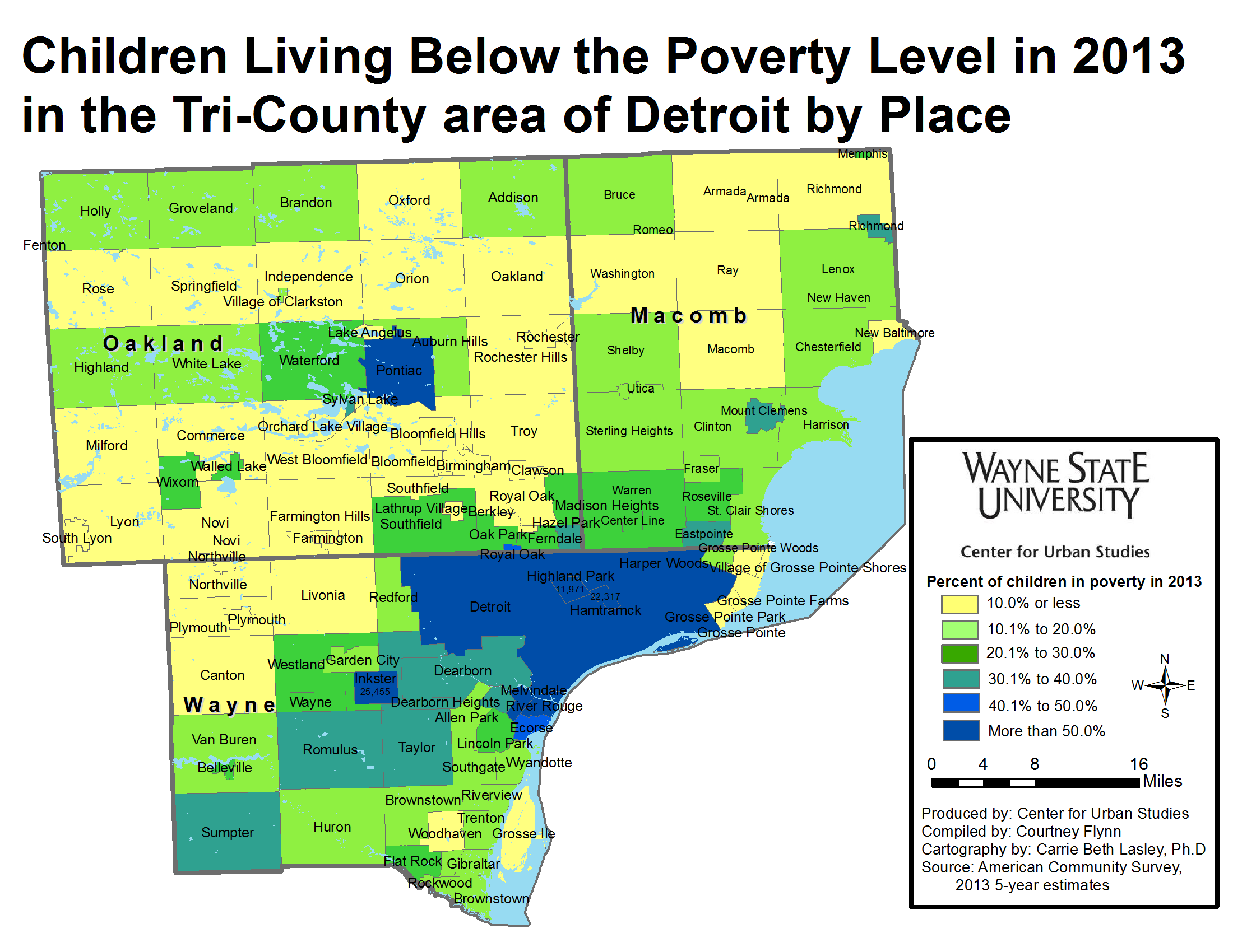
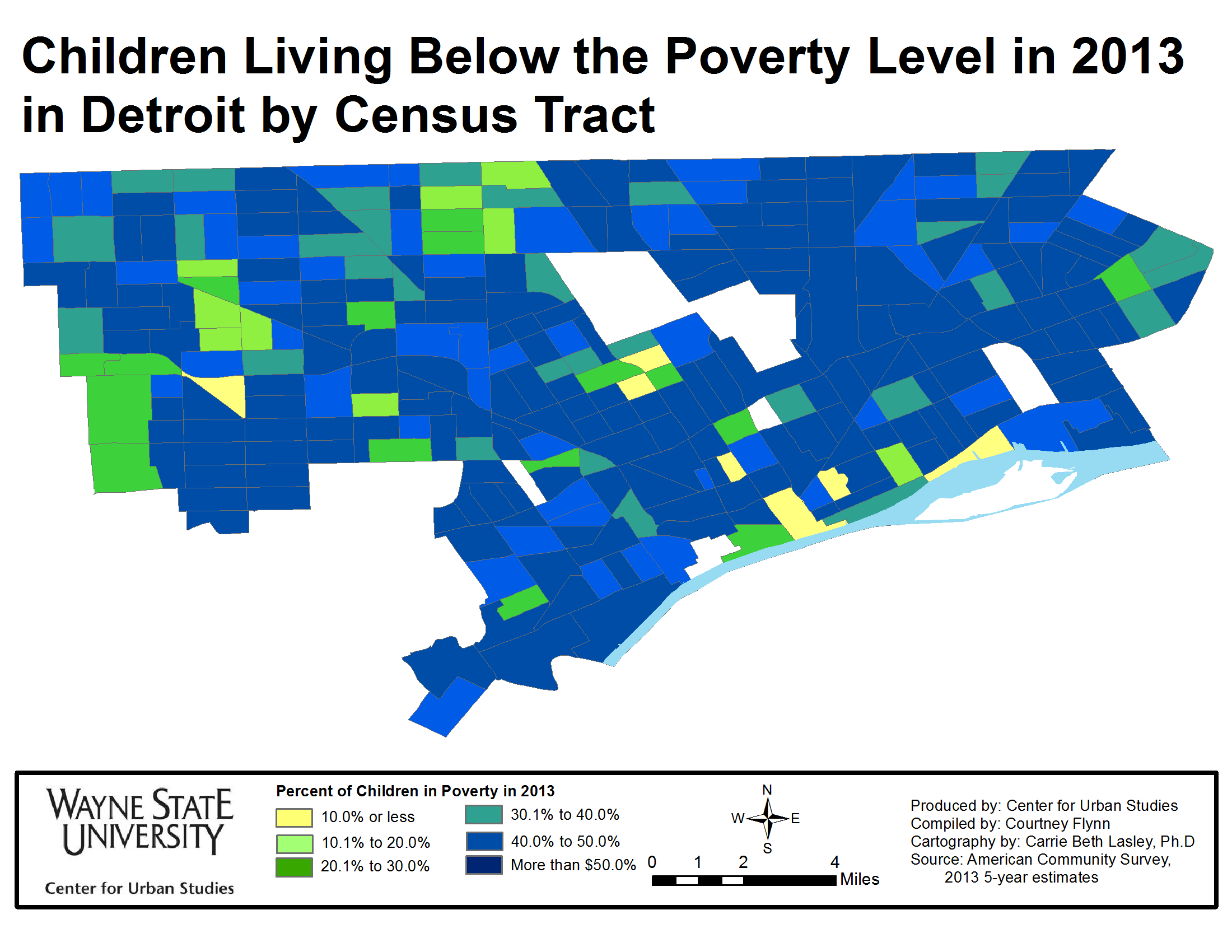
All rates are per 100,000 residents.


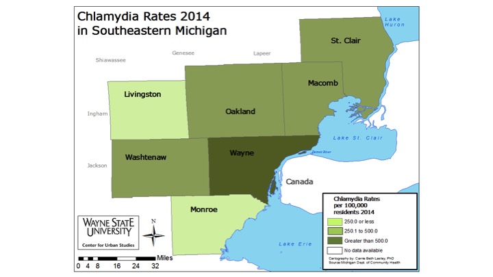
St. Clair County experienced the largest chlamydia rate increase of all seven counties from a 2004-2008 average rate of 275.7 per 100,000 per residents to a 2014 rate of 402.4,. In 2014, though, it was Wayne County that had the highest overall Chlamydia rate per 100,000 residents at 811.1, a rate nearly 400 points higher than the states. The 2014 rate of 811.1 decreased from 1076.5 for the 2009-2013 average and from 1007.3 for the 2004-2008 average rate.
As noted earlier, Wayne and Oakland counties were the only two in the region to experience a rate decrease for chlamydia between 2004 and 2014. Oakland County’s average chlamydia rate for 2004-2008 was 300.5, and the 2014 rate was 280.7. Between the 2009-2013 average and 2014 Oakland County also experienced a rate decrease, from 297.6 to 280.7.
The state’s chlamydia rate for 2014 was 452.5, a decrease from 484.3 per 100,000 people for the 2004-2008 average and a decrease from 490.7 per 100,000 people for the 2009-2013 average.
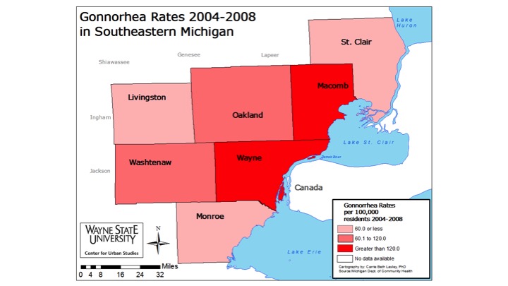
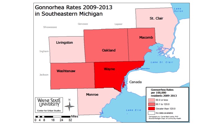
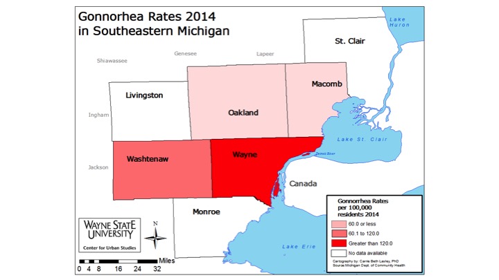
Between 2004 and 2014, of the counties with available data, Wayne County experienced the largest gonorrhea rate decrease from 376.6 for the 2004-2008 rate average to 231.4 for the 2014 rate per 100,000 people. Even so Wayne County had the second highest gonorrhea rate in the state in 2014 (Kent County had the highest rate at 255), according to the Michigan Department of Community Health, but the highest percent distribution of gonorrhea cases in the state came from Wayne County, with 42.4 percent of cases coming from there. The rate decreases for the other three counties with information available-Macomb, Washtenaw and Oakland-ranged between 9 and 15 points between 2004 and 2014. Washtenaw County’s 2014 gonorrhea rate was 72.9, decreasing from the 88.5 average from 2004-2008. Macomb County’s rate of 55.8 per 100,000 in 2014 was a decrease from the 64.7 average rate of 2004-2008. Oakland County’s 2014 rate of 49.6 per 100,000 was a decrease from the 78.7 average rate of 2004-2008.
St. Clair, Livingston and Monroe counties were missing rate data on gonorrhea for 2014. Between the 2004-2008 and 2009-2013 averages St. Clair and Monroe counties both experienced rate increases per 100,00 people and Livingston County experienced a rate decrease. For the 2004-2008 rate averages St. Clair County’s rate was 45, Monroe’s was 41.8 and Livingston County’s was 10.7. The 2009-2013 rate for St. Clair County was 46.6, Monroe 42.2 and Livingston County was 10.5.
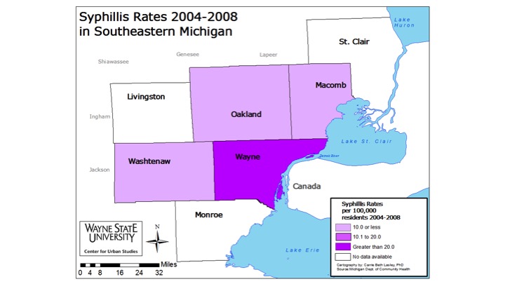

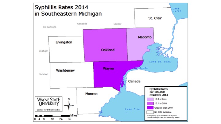
For syphilis data, Wayne, Oakland and Macomb Counties were the only three with consistent data between 2004 and 2014. According to the Michigan Department of Community Health, Wayne County had the highest rate of the three counties in 2014 at 32.4 per 100,000 people; this was an increase from 21.9 for the 2009-2013 average and an increase from 20.5 from the 2004-2008 average. Macomb County’s syphilis rate per 100,000 people in 2014 was 9 and Oakland County’s rate was 12.1. These two counties also experienced rate increases from the 2004-2008 average and the 2009-2013 average. For the 2004-2008 average, Macomb County’s rate was 5.6 and Oakland County’s rate was 7.6. For the 2009-2013 average, Macomb County’s rate was 7.5 and Oakland County’s rate was 7.8.
Washtenaw County had data recorded for the 2004-2008 average and the 2009-2013 average. This information that Washtenaw County’s rate between those two time periods experienced a miniscule rate increase, from 7.8 for the 2004-2008 average to 7.9 for the 2009-2013 average.
In 2014, Michigan’s syphilis rate was 11.3, an increase from both the 2004-2008 average (7.5) and the 2009-2013 average (7.6). The 2014 rate is nearly a third of Wayne County’s 2014 syphilis rate.